The Tag Selection plugin provides a user-friendly and visually customizable way to let users select one or more tags in your Bubble Native mobile app.
Whether you're building a filter menu, category selector, onboarding form, or multi-choice input — this element integrates seamlessly with your app's design and logic.
You can define tags dynamically using text-based input (labels and values), style them visually to match your app, and respond to selection changes through Bubble workflows and states.
Support for both single and multi-select modes, a reset action, and dynamic appearance settings makes this plugin both flexible and easy to use.
Prerequisites
This plugin is designed specifically for the mobile version of the Bubble editor. To test the plugin on your mobile device, use the TestFlight app available at: https://testflight.apple.com/join/VykzdCs6
⚠️
Please note that the testing app is currently available for iOS only.
How to Use (Step by Step)
Place the element on your page from the Visual Elements panel.
In the property editor (right side), fill in the following fields:
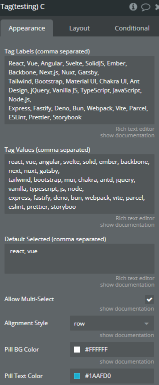
Tag Labels: A comma-separated list of what you want the user to see (e.g. React, Vue, Angular)
Tag Values: A comma-separated list of internal values (e.g. react, vue, angular)
Default Selected Values(optional): Values that should be pre-selected (e.g. vue)
Allow Multiple Selection: Yes or No
Customize the visual style (colors, borders, alignment, etc.) if needed.
Element Properties
The Tag Selection element allows users to select one or more tags from a customizable list.
It supports both single and multiple selection modes, with full styling control over tag appearance — including colors, borders, and layout.
Selections are reflected in real time through exposed states and can be reset programmatically using built-in actions.
Ideal for filters, category selectors, onboarding flows, and interactive forms in Bubble Native apps.
Name (as seen in Bubble)
Description
Type
Tag Labels
Comma-separated list of labels shown in each tag (e.g. React, Vue, Angular)
Text
Tag Values
Comma-separated list of internal values for tags (same order as labels)
Text
Default Selected Values
Comma-separated list of preselected tag values (must match values)
Text
Allow Multiple Selection
Choose whether users can select more than one tag
Boolean
Alignment Style
Layout style: row (left-aligned) or tree (centered wrap)
Text
Pill Color
Background color of an unselected tag
Color
Pill Text Color
Text color of an unselected tag
Color
Pill Selected Color
Background color of a selected tag
Color
Pill Selected Text Color
Text color of a selected tag
Color
Pill Border Color
Border color of an unselected tag
Color
Pill Border Width
Border thickness of an unselected tag
Number
Pill Border Radius
Corner roundness for all tags (e.g. 30 for full round)
Number
Pill Selected Border Color
Border color for a selected tag
Color
Element States
State Name (as seen in Bubble)
Description
Type
Selected Tags
Returns a comma-separated list of selected tag values (e.g. react,vue,angular)
Text (string)
Element Event
Name
Description
On Tag Select
Fires every time the user selects or deselects a tag.