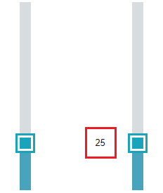
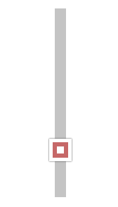
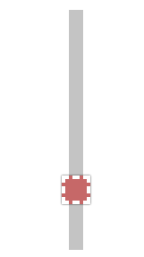
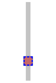
Demo to preview the settings
Introduction
This plugin gives your users an easy way to select a value by dragging a slider vertically. It comes with a set of modern themes out of the box but also allows for extended customization to fit your layout.

How to setup
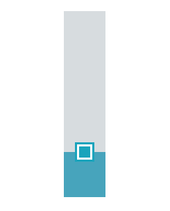
The plugin comes with 1 element: VerticalRangeSlider. Install the plugin and drag it’s element on the page.
If you intend to show value labels attached to the pointer, set the width of the element to at least 160px.
If you don’t intend to show the value labels, you can make the element narrower.
The plugin options are grouped into “Settings” where you define functional attributes, and “Style
options” where you define the look and feel.
Element Properties: Settings
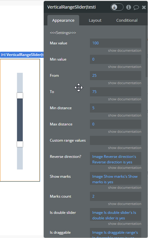
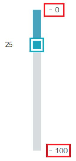
- Max value: sets the maximum value of the range.
- Min value: sets the minimum value of the range.
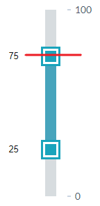
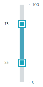
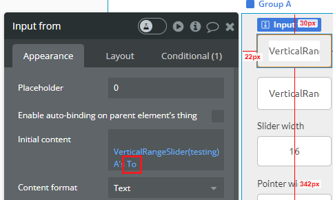
- From: sets the starting point of the first pointer.
- To: sets the starting point of the second pointer (Works only if “Is double slider” is set to yes)
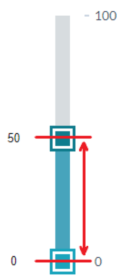
- Min distance: the min distance between the pointers (Works only if “Is double slider” is set to yes)
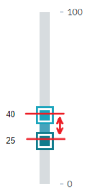
- Max distance: the max distance between the pointers (Works only if “Is double slider” is set to yes. Set it to 0 to disable)
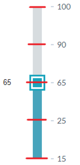
- Custom range values: a comma-separated list of values that the pointers can take. For example: 15,50,90,100. In this example, the pointers will jump between these values (Works only if “Is double slider” is set to no).
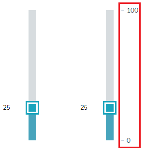
- Reverse direction: reverses the values of the slider
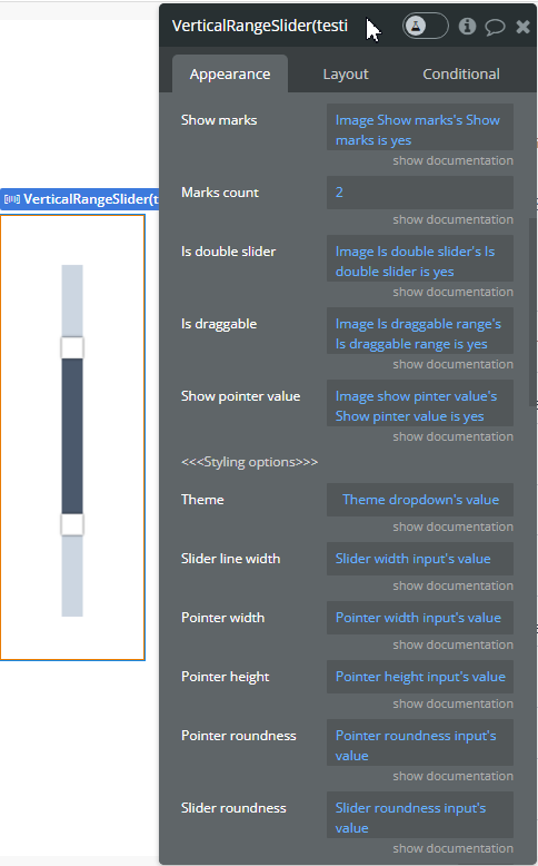
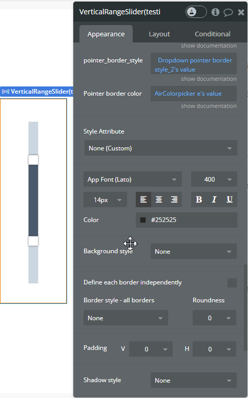
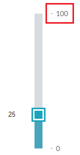
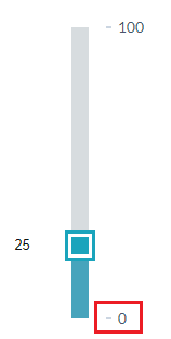
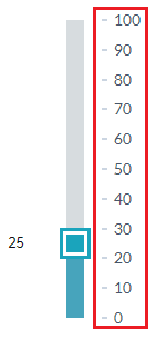
- Show marks: show milestone values along the slider
- Marks count: how many milestone values to show in total along the slider
- Is double slider: adds a second pointer to the slider
- Is draggable: allows you to click on the area between two sliders and drag it (Works only if “Is double slider” is set to yes)
- Show pointer value: shows the values of the pointers
Styling options
Themes
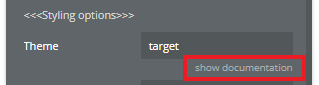
The plugin comes with 7 modern themes out of the box. You can see all possible values for them by clicking the “Show documentation” under the themes area in the element editor.
Custom styles
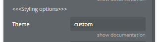
If you want to style the slider from scratch set the theme to “custom”. This will apply the custom styling rules that you will define further below.
To save yourself time you can first check each prebuilt theme to see if it suits your needs, and if it doesn’t - create your own style using the styling options below.
Other styling options
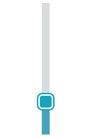
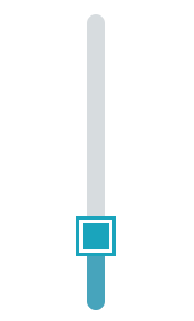
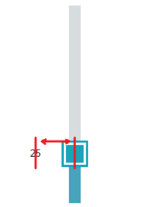
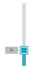
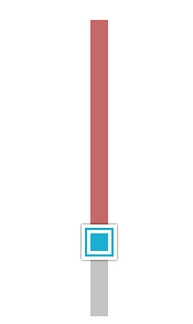
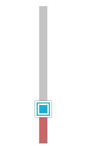
- Slider line width: the width of the line (not the pointer)
- Pointer width
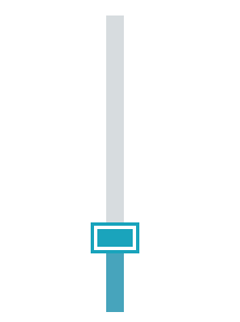
- Pointer height
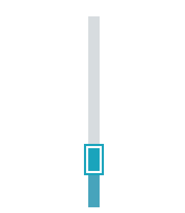
- Pointer roundness
- Slider roundness (line edges)
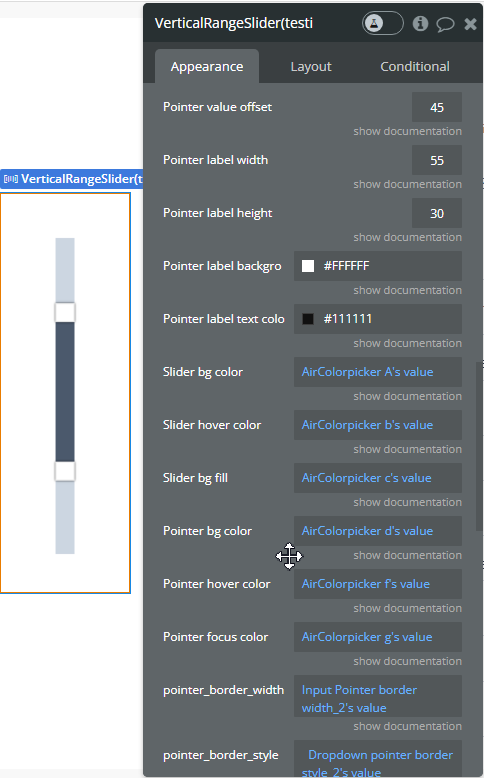
- Pointer value offset: the distance between the value of the pointer from the pointer (Works if “Show pointer value” is set to yes)
- Pointer label width: the width of the rectangle that shows the value of the pointer (Works if “Show pointer value” is set to yes)
- Pointer label height
- Pointer label background color
- Pointer label text color
- Slider bg color: the color of the upper part of the slider line (Works only when theme is set to custom)
- Slider hover color: the color of the upper part of the slider line on hover (Works only when theme is set to custom)
- Slider bg fill: the color of the lower part of the slider line (Works only when theme is set to custom)
- Pointer bg color: the color of the pointer(s) (Works only when theme is set to custom)
- Pointer hover color: the color of the pointer(s) when hovered over (Works only when theme is set to custom)
- Pointer focus color: the color of the pointers(s) when clicked (Works only when theme is set to custom)

- Pointer border width (Works only when theme is set to custom)
- Pointer border style (Works only when theme is set to custom. Some styles are visible only if the width is high, e.g. “double”)
- Pointer border color (Works only when theme is set to custom)
Element Events
Range slider changed
This event fires each time there is a change in the value of any of the sliders. The event fires even with the slightest change, therefore be mindful of you’re using it on your website.
Exposed States
From: represents the value of the lower slider
To: represents the value of the upper slider (if double slider mode is activated)
You can use these states to display the values of the slider in any element of your page.
For that create the element where you want to display the value, and set it’s source to the plugin’s from or to states.
Element Actions
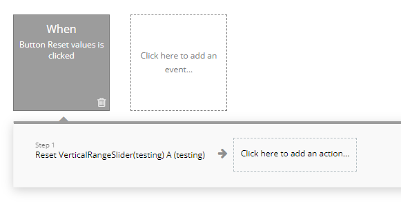
Reset: resets the values of the slider to defaults. You can set the defaults in the plugin’s options as the from and to fields.
A good use case for this action is a button that resets the slider on click.
To set it up create a button and add a workflow to it with the Reset action from the plugin’s elements.