
✅
Demo to preview the settings
✅
Introduction
A very beautiful lightweight cross-browser date/time picker. Huge set of customization with multi-date and range support. Responsive and accessibility friendly.
Use this plugin to unobtrusively add a date/time picker into your app. It makes it easier to help visitors quickly select dates, times, and/or date ranges on the booking, schedule, and event calendar web apps.
A huge set of customization with multi-date and range support, and responsive and accessibility friendly.
It works in all modern browsers: IE 10+, Chrome, Firefox, Safari 8+, Opera 17+.
Please visit the plugin forum thread: https://forum.bubble.is/t/new-plugin-air-date-time-picker/14328 for more details about the updates

How to setup
Place the element on the page and fill in the fields. You can find a more detailed configuration of the element on the plugin demo page.
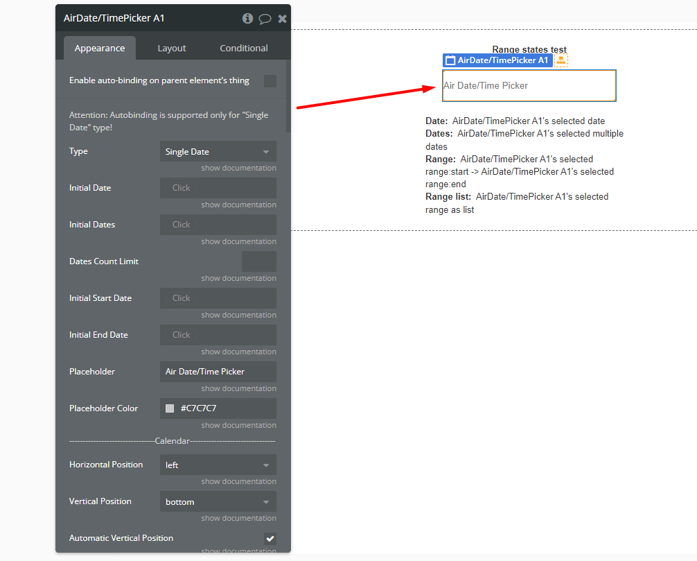
Plugin Element — Air Date/Time Picker
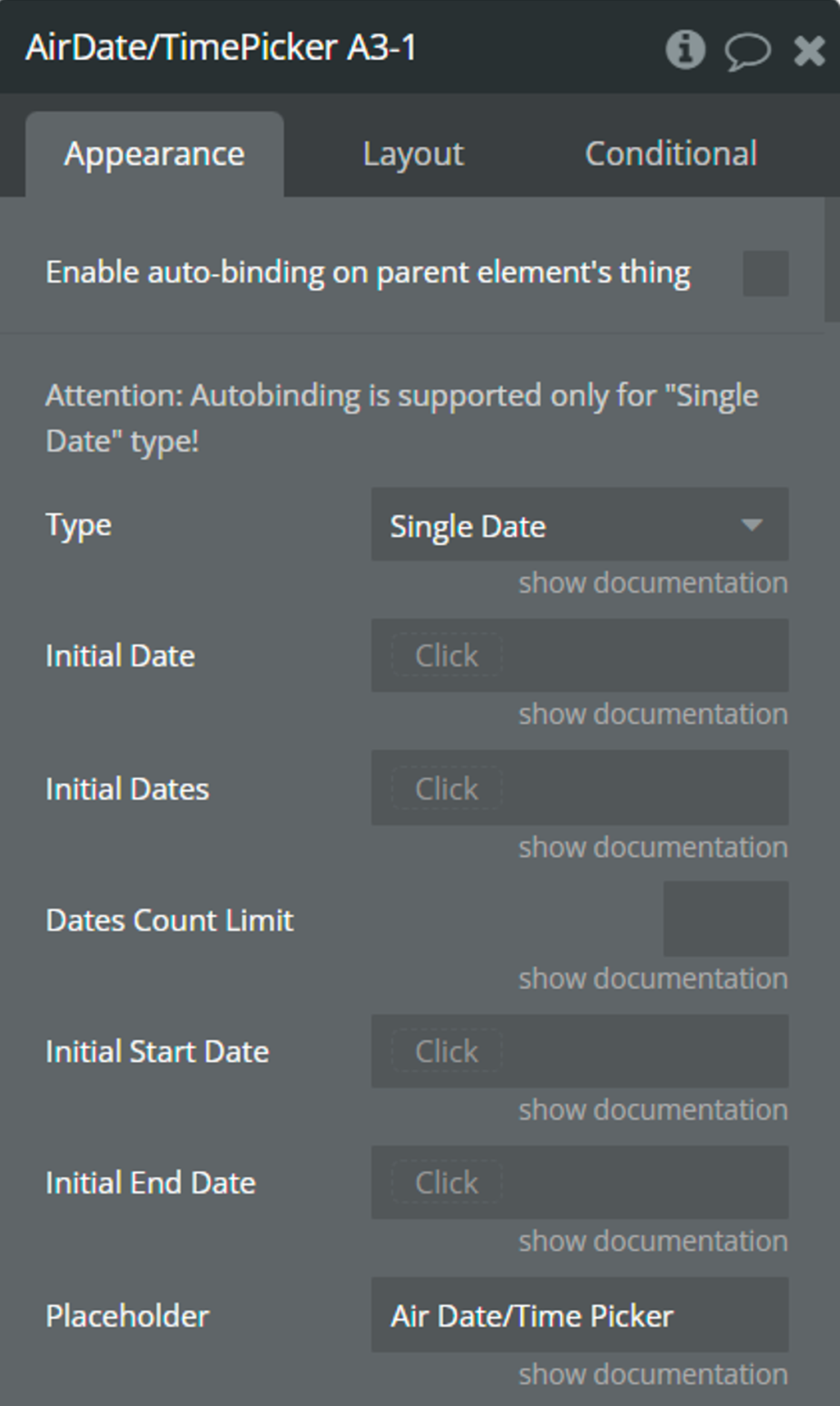
Element fields
Title | Description | Type |
Type | Determines the type of dates with which the picker will work.
☝️Available types: Single Date, Multiple Dates, Range, and Only Timepicker. | Dropdown |
Initial Date | The initial selected date for the picker.
⚠️This date is used for the "Single Date" and "Only Timepicker" types. | date (optional) |
Initial Dates | The initial list of selected dates for the picker.
⚠️These dates are used for the "Multiple Dates" type. | list of dates (optional) |
Dates Count Limit | This value will limit the number of selected dates for the "Multiple Dates" type. | number (optional) |
Initial Start Date | The initial start date of the range.
⚠️This date is used for the "Range" type. | date (optional) |
Initial End Date | The initial end date of the range.
⚠️This date is used for the "Range" type. | date (optional) |
Placeholder | This value is displayed when the picker is empty. | text (optional) |
Placeholder Color | Color of placeholder. | Color |
Horizontal Position | Horizontal position of the calendar relative to the plugin element.
☝️Available positions: left, center, right. | Dropdown |
Vertical Position | Vertical position of the calendar relative to the plugin element.
☝️Available positions: top, bottom. | Dropdown |
Automatic Vertical Position | If checked, the calendar will automatically select a vertical position depending on the available space. | Checkbox |
Mobile Device Mode | "Always" - the calendar will appear as a modal window with slightly enlarged dimensions. "Auto" - the calendar will appear as a modal window with slightly enlarged dimensions only on mobile devices. "Never" - the calendar will appear as a dropdown.
☝️Available positions: Always, Auto, Never. | Dropdown |
Default View | The initial representation of the calendar.
☝️Available views: Days, Months, Years.
👉Check more details here. | Dropdown |
Minimum View | The minimum possible representation of the calendar.
⚠️"Minimum View" can't be less than the "Default View".
☝️Available views: Days, Months, Years.
👉Check more details here. | Dropdown |
Minimum Date | The minimum possible date to select. | date (optional) |
Maximum Date | The maximum possible date to select. | date (optional) |
First Day Of Week | The first day of the week. | Dropdown |
Today Date Color | Color of the today in the calendar. | Color |
Highlight Color | Color of the selected days in the calendar. | Color |
Weekdays' Names Color | Color of weekdays' names in the calendar. | Color |
Show Other Months | If checked, dates from other months will be displayed in the “days” view. | Checkbox |
Select From Other Months | If checked, it will be possible to select dates from other months. | Checkbox |
Move To Other Months | If checked, then selecting dates from another month will cause a transition to this month. | Checkbox |
Language | Language of the calendar.
☝️Supported languages: Czech, Danish, German, English, Spanish, Finnish, French, Hungarian, Dutch, Polish, Portuguese, Romanian, Russian, Slovak, Thai, Turkish, Ukrainian, Chinese, and Korean. | Dropdown |
Enable Custom Language | This option allows using one's definition of language. Define it in the field below. | Checkbox |
Custom Language Definition | Custom translations for picker's elements.
👉See an example here. | text (optional) |
Toggle Selected | If checked, then clicking on the active cell will remove the selection from it. | Checkbox |
Keyboard Navigation | Checkbox | |
Auto Close | If checked, the calendar will be hidden after selecting the date. | Checkbox |
Display Calendar Always | Makes the calendar permanently visible. | Checkbox |
Date Format | The order in which the date is displayed. | Dropdown |
Day Format | The format in which the day will be displayed. | Dropdown |
Month Format | The format in which the month will be displayed. | Dropdown |
Year Format | The format in which the year will be displayed. | Dropdown |
Dates Separator | Symbol-separator between dates for the "Range" and "Multiple Dates" types. | text |
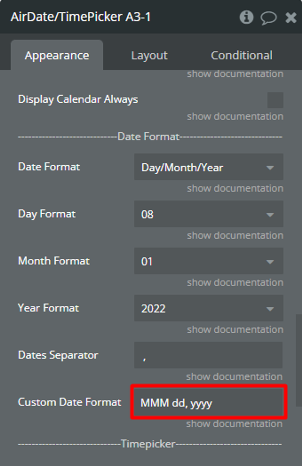
Custom Date Format | text (optional) | |
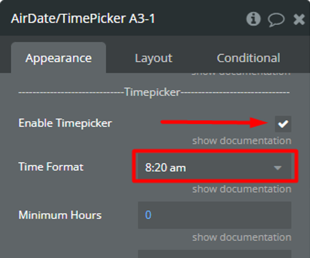
Enable Timepicker | Enables hour and minute selection. | Checkbox |
Time Format | The format in which the hours and minutes will be displayed. | Dropdown |
Minimum Hours | Minimum possible hours value.
☝️Min: 0,
☝️Max: 24. | number |
Maximum Hours | Maximum possible hours value.
☝️Min: 0,
☝️Max: 24. | number |
Hours Step | Step of the hour slider. | number |
Minimum Minutes | Minimum possible minutes value.
☝️Min: 0,
☝️Max: 59. | number |
Maximum Minutes | Maximum possible minutes value.
☝️Min: 0,
☝️Max: 59. | number |
Minutes Step | Step of the minute slider. | number |
Date Time Separator | Separator between date and time.
📝 Examples: '/', ',' '.' | text (optional) |
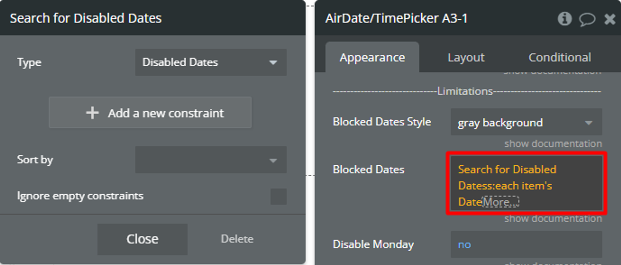
Blocked Dates Style | The style for the blocked dates. | Dropdown |
Blocked Dates | Blocked dates are unavailable for selection. | list of dates (optional) |
Disable Monday | Disables all Mondays for selection. | yes/no |
Disable Tuesday | Disables all Tuesdays for selection. | yes/no |
Disable Wednesday | Disables all Wednesdays for selection. | yes/no |
Disable Thursday | Disables all Thursdays for selection. | yes/no |
Disable Friday | Disables all Fridays for selection. | yes/no |
Disable Saturday | Disables all Saturdays for selection. | yes/no |
Disable Sunday | Disables all Sundays for selection. | yes/no |
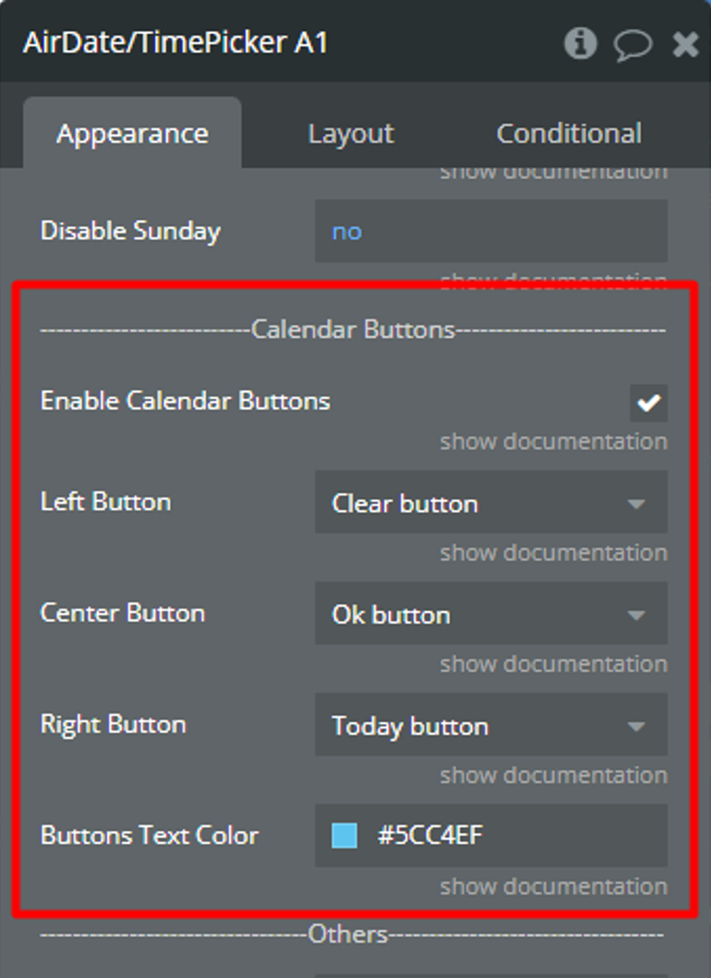
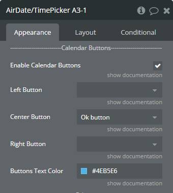
Enable Calendar Buttons | Enables action buttons to the body of the calendar. | Checkbox |
Left Button | Determines which button will be on the left side.
☝️Available buttons: Ok button, Clear button, Today button. | Dropdown (optional) |
Center Button | Determines which button will be on the center side.
☝️Available buttons: Clear button, Ok button, Today button. | Dropdown (optional) |
Right Button | Determines which button will be on the right side.
☝️Available buttons: Today button, Ok button, Clear button. | Dropdown (optional) |
Buttons Text Color | Color of buttons' text. | Color |
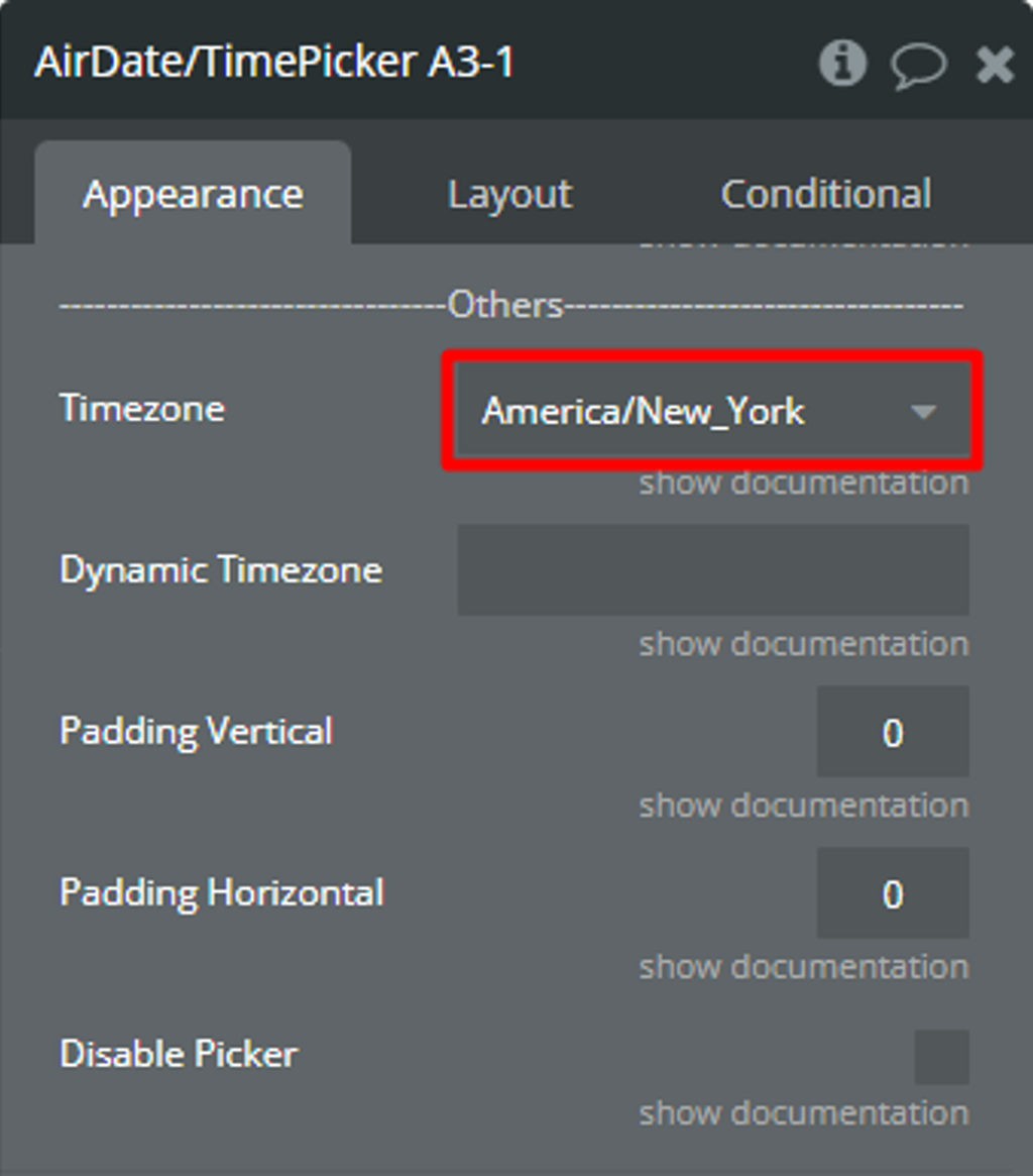
Timezone | Timezone of picker. | Dropdown |
Dynamic Timezone | Timezone of picker. | text (optional) |
Padding Vertical | The value for the top and bottom padding. | number |
Padding Horizontal | The value for the left and right padding. | number |
Disable Picker | Disables interaction with the element. | Checkbox |
Element actions
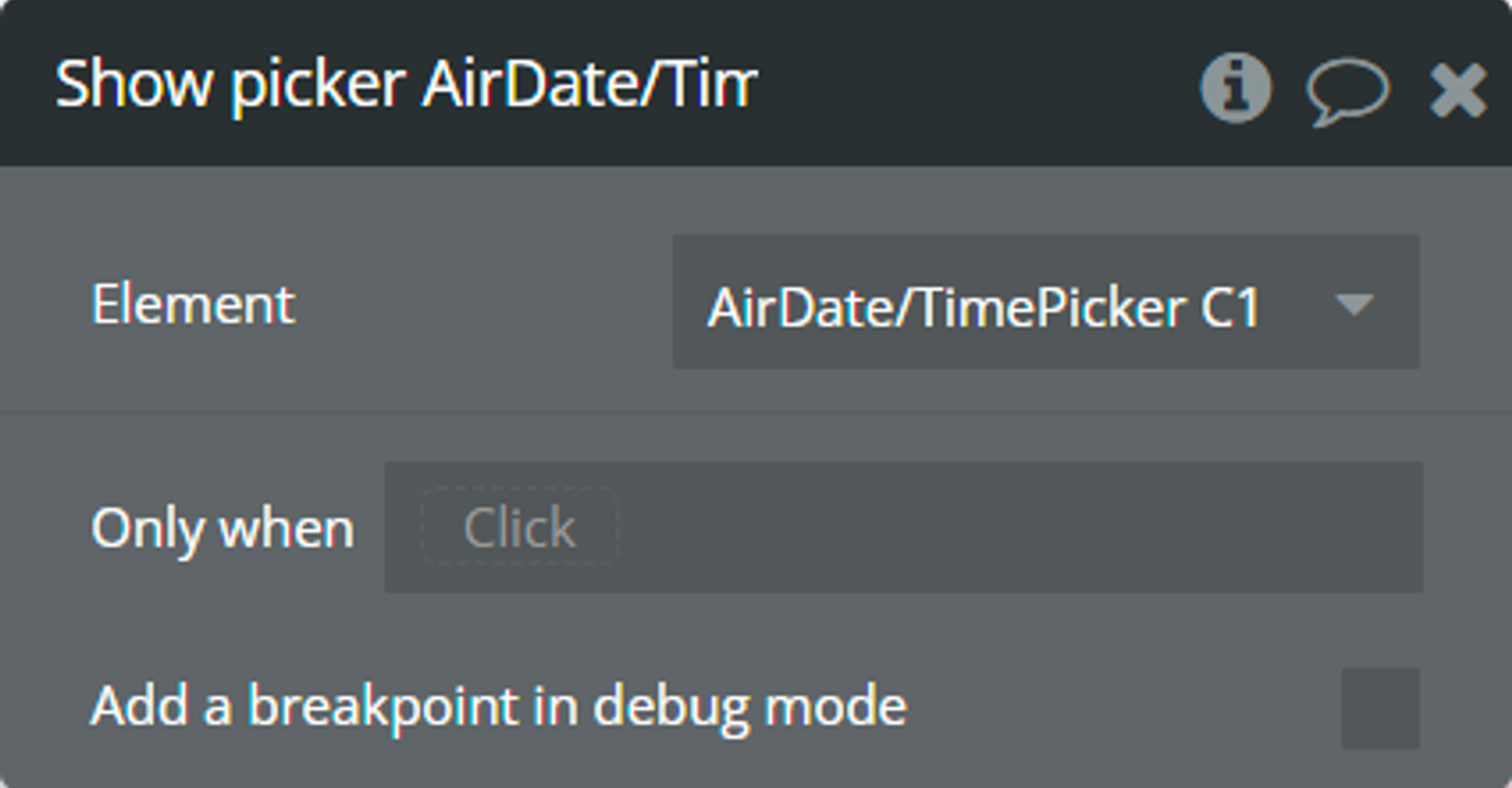
Show picker - This action is used to open the picker calendar.
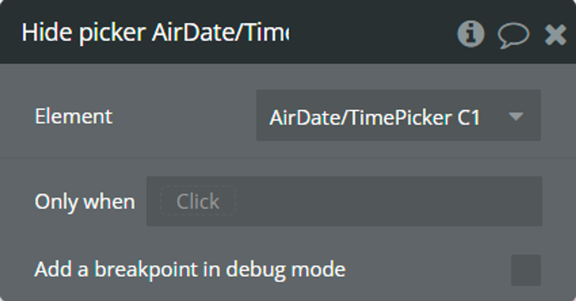
Hide picker - This action is used to close the picker calendar.
Change view - This action is used to change the representation of the picker calendar.
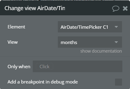
Fields:
Title | Description | Type |
View | New representation of the calendar. | Dropdown |
Clear selected dates - This action is used to clear selected dates and reset all states.
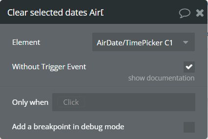
Fields:
Title | Description | Type |
Without Trigger Event | If checked, the "value is changed" event will not be triggered. | Checkbox |
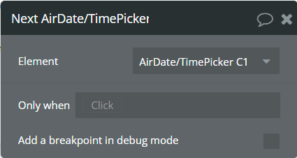
Next - This action is used to go to the next month/year/decade.
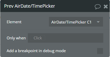
Prev - This action is used to go to the previous month/year/decade.
Set date - This action is used to set the date in the picker.
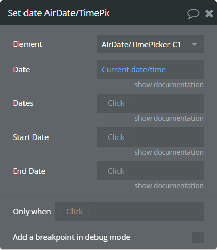
Fields:
Title | Description | Type |
Date | The date for the picker.
⚠️This date is used for the "Single Date" and "Only Timepicker" types. | date (optional) |
Dates | The list of dates for the picker.
⚠️These dates are used for the "Multiple Dates" type. | list of dates (optional) |
Start Date | The start date of the range.
⚠️This date is used for the "Range" type. | date (optional) |
End Date | The end date of the range.
⚠️This date is used for the "Range" type. | date (optional) |
Element events
Name | Description |
value is changed | This event is triggered when selecting a date in the calendar. Depending on the element type, this event indicates that one of the following states, "selected date", "selected range", "selected multiple dates" and "selected range as list" was changed. |
view is changed | This event is triggered when the calendar view is changed. This event indicates that the "current calendar view" state was changed. |
calendar is shown | This event is triggered when the calendar appears. |
calendar is hidden | This event is triggered when closing the calendar. |
Element states
Title | Description | Type |
selected date | Returns the last selected date from the picker. This state is available for the "Single Date" and "Only Timepicker" types of elements. | date |
selected range | Returns the last selected range of dates from the picker. This state is available for the "Range" type of element. | date range |
selected multiple dates | Returns the last selected list of dates from the picker. This state is available for the "Multiple Dates" type of element. | list of dates |
current calendar view | Returns the current view of the calendar. | text |
calendar is visible | Indicates if the picker calendar is visible. | yes/no |
selected range as list | Returns the last selected range of dates from the picker in the list of dates format. This state is available for the "Range" type of element. | list of dates |
picker ID | Returns the ID of the element. | text |
Helpful details
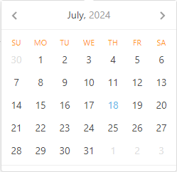
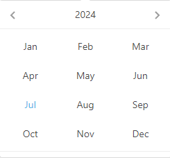
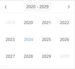
Calendar views
All available views of the calendar are presented.
- Days - In this view, all days of the month are displayed.
- Months - In this view, all months of the year are displayed.
- Years - In this view, the years of one decade are displayed.
Custom Language Definition example
There is an example of how to set up the "Custom Language Definition" field.
☝
For "Custom Language Definition" field needs to define its own values in the JSON format.
json{
  "days": ["Domenica", "Lunedi", "Martedi", "Mercoledi", "Giovedi", "Venerdi", "Sabato"],
  "daysShort": ["dom", "lun", "mar", "mer", "gio", "ven", "sab"],
  "daysMin": ["dom", "lun", "mar", "mer", "gio", "ven", "sab"],
  "months": ["Gennaio", "Febbraio", "Marzo", "Aprile", "Maggio", "Giugno", "Luglio", "Agosto", "Settembre", "Ottobre", "Novembre", "Dicembre"],
  "monthsShort": ["gen", "feb", "mar", "apr", "mag", "giu", "lug", "ago", "set", "ott", "nov", "dic"],
  "today": "oggi",
  "clear": "resetta",
  "dateFormat": "dd/MM/yyyy",
  "timeFormat": "hh:mm aa",
  "firstDay": 0
}
⚠️
Make sure that all text values are imbricated in double quotation marks (").
Key combinations for navigation
There are presented all available key combinations for navigation in the calendar when the "Keyboard Navigation" is enabled.
Ctrl + → | ↑ — change to next month.Ctrl + ← | ↓ — change to previous month.Shift + → | ↑ — change to next year.Shift + ← | ↓ — change to previous year.Alt + → | ↑ — change to 10 years forward.Alt + ← | ↓ — change to 10 years backward.Ctrl + Shift + ↑ — change calendar view, from dates to decades.Esc — closes calendar.Date Format
There are presented all available tokens for date formatting.
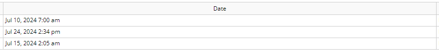
T — time in milliseconds.E — the short name of the day of the week, similar to daysShort field from the Custom Language Definition example.EEEE — the full name of the day of the week, similar to days field from the Custom Language Definition example.d — day of the month.dd — day of the month with leading zero.M — number of the month.MM — number of the month with leading zero.MMM — short name of the month, similar to monthsShort field from the Custom Language Definition example.yy — two-digit year number.yyyy — full year number.yyyy1 — the first year in the current decade.yyyy2 — the last year in the current decade.Example | Result |
T | 1720558800000 |
M/d/yy | 7/10/24 |
MM/d/yy | 07/10/24 |
dd.MM.yyyy | 10.07.2024 |
E MMM dd yyyy | Wed Jul 10 2024 |
dd MMMM yyyy, EEEE | 10 July 2024, Wednesday |
Calendar Buttons
The plugin element allows the addition of up to 3 action buttons in the calendar.
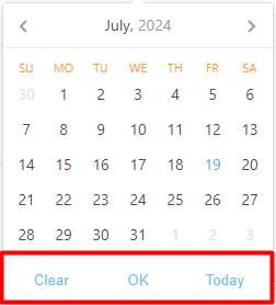
The order of buttons can be set up in the “Calendar Buttons” section.
What buttons do
Clear — removes the selected value from the element.Today — selects today's date in the element.OK — refreshes the element states and triggers the “value is changed” event."Clear" button dependencies
- If the "OK" button is also selected in the calendar, then clicking on the "Clear" button will clear the selected value ONLY from the element but will NOT clear the selected value from the element states. Click on the “OK” button to remove values from states!
- If the "OK" button is NOT selected in the calendar and the "Auto Close" field is checked, then clicking on the "Clear" button will close the calendar.
“Today” button dependencies
- If the “OK” button is also selected in the calendar, then clicking on the "Today" button will select today’s date ONLY in the element but will NOT change the element states. Click on the “OK” button to change values from states!
- If today's date is ALREADY selected in the element and the "Toggle Selected" field is checked, then clicking on the "Today" button will remove today's date from the element.
- If the "OK" button is NOT selected in the calendar and the "Auto Close" field is checked, then clicking on the "Today" button will close the calendar.
“OK” button dependencies
- If the “OK” button is selected in the calendar, then the checked “Auto Close” field will be ignored.
- When the “OK” button is clicked, then the element states are refreshed, the “value is changed” event is triggered and the calendar is hidden.
- While any date is selected in the calendar and the "OK" button is NOT clicked, then the element states are NOT refreshed, the "value is changed" event is NOT triggered and the calendar remains open.
Workflow examples
How to fix Recursion/Circular reference error
Problem
Sometimes you can get one of the following errors, Error: Recursion when evaluating property… or Error: Property contains circular reference…
Error: Recursion when evaluating property…
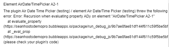
Error: Property contains circular reference…
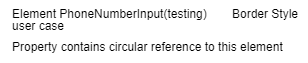
Reason of problem
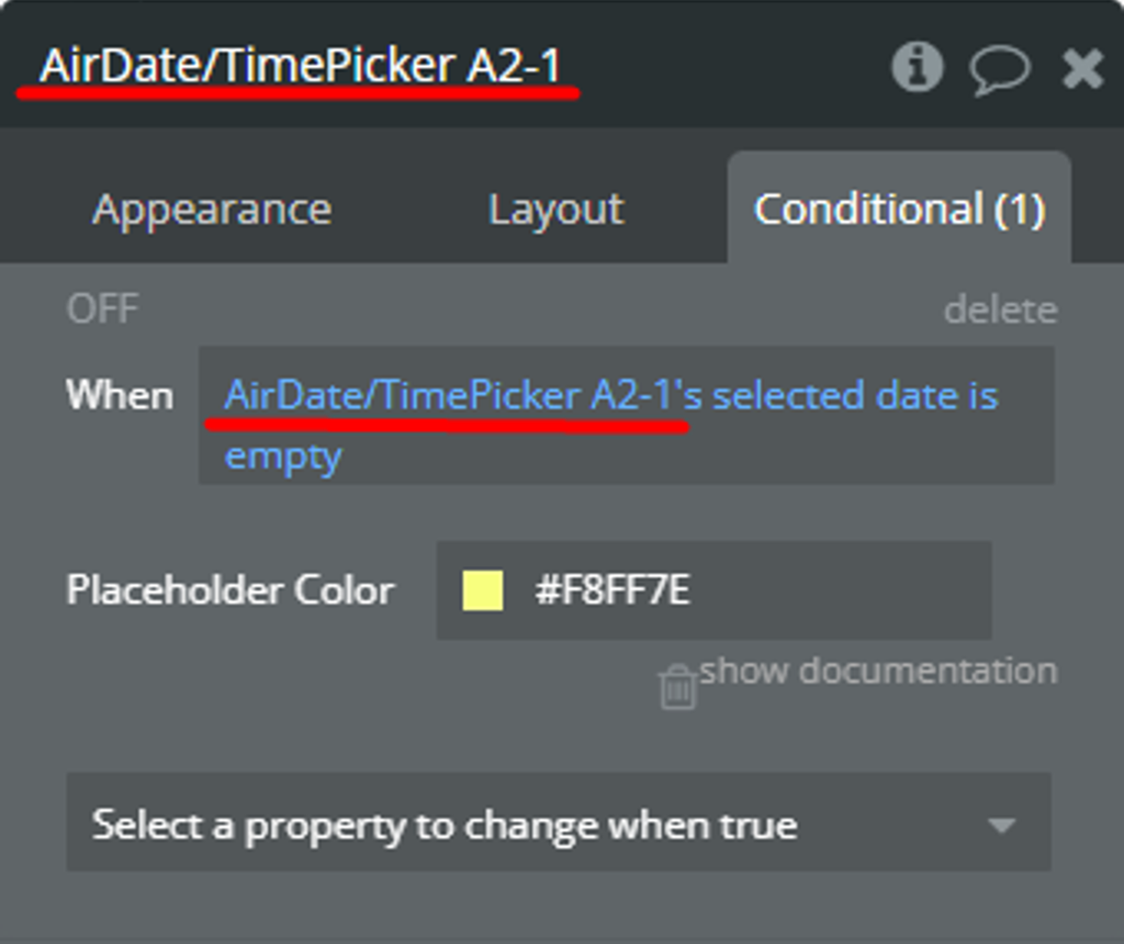
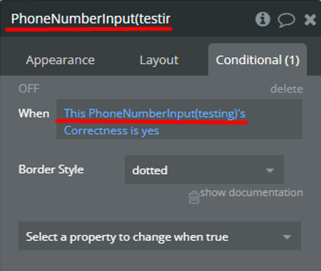
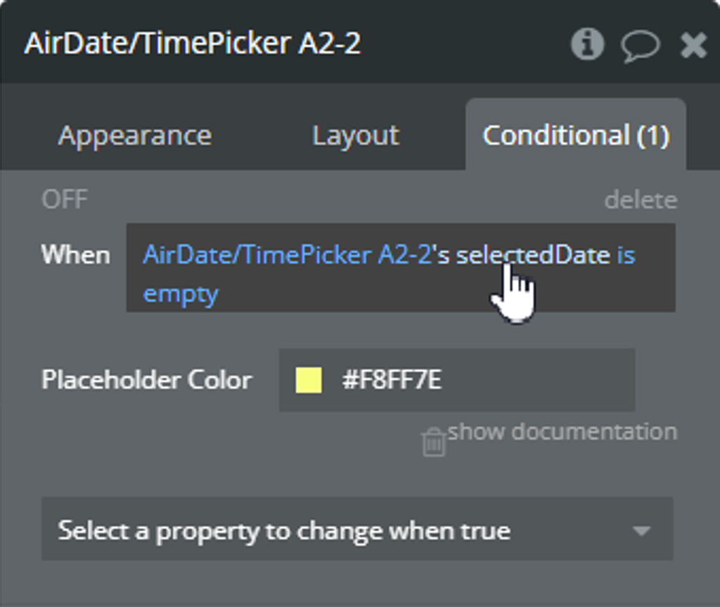
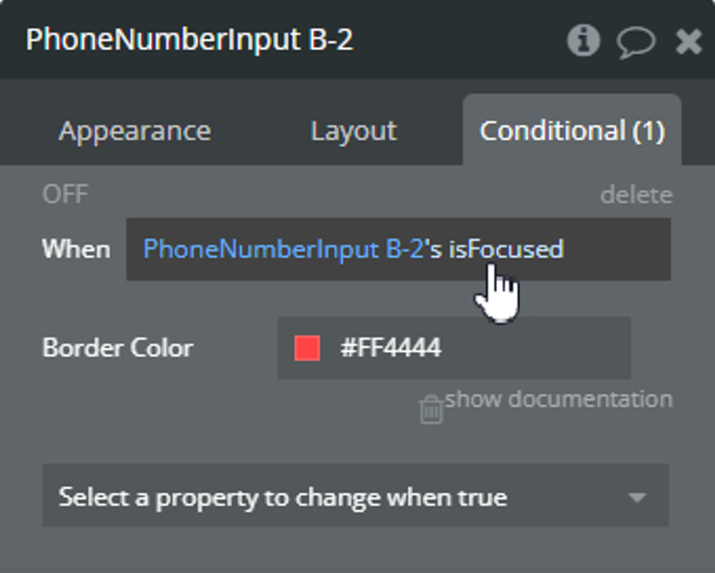
The reason for both errors is the same, using the own element state in its condition in the Conditional tab.
Solution
- Create a Custom state for any element.
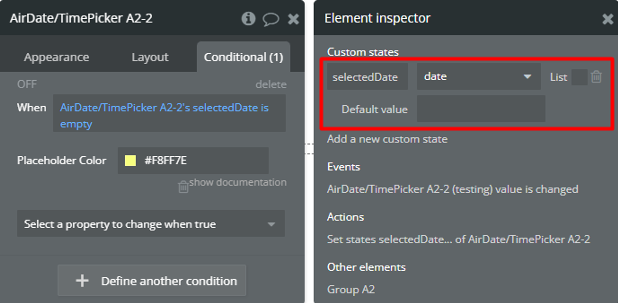
- Set up the value for the created Custom state. Set-up steps can differ depending on element state change behavior.
- For some states, it is possible to use the element events. And, call Set state action.
- For some states, you can't detect changes based on element events. Use default Bubble tools and call Set state action!
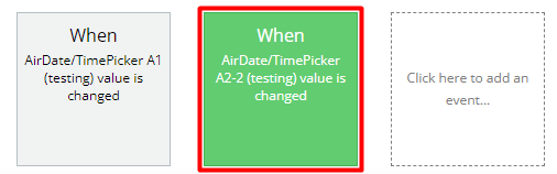
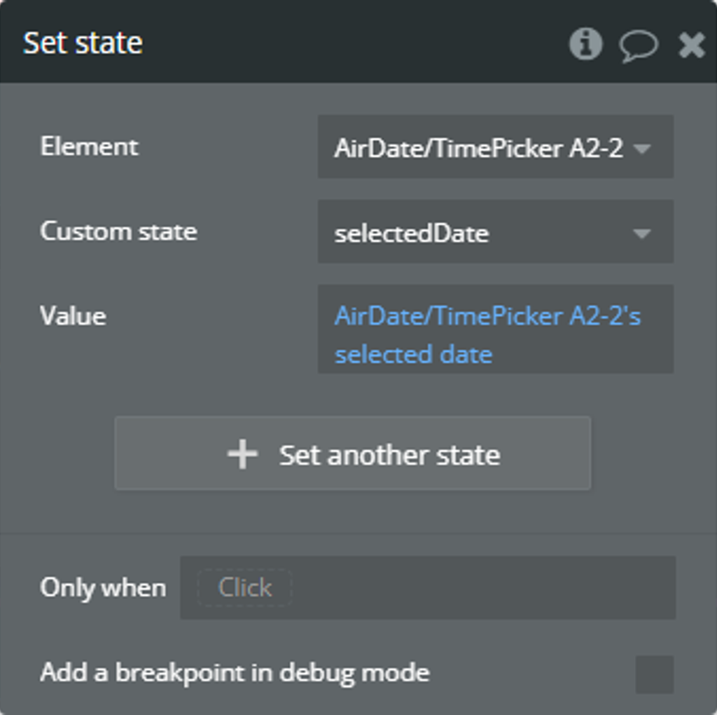
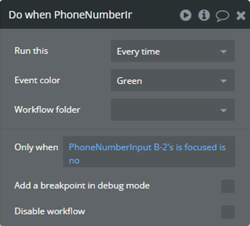
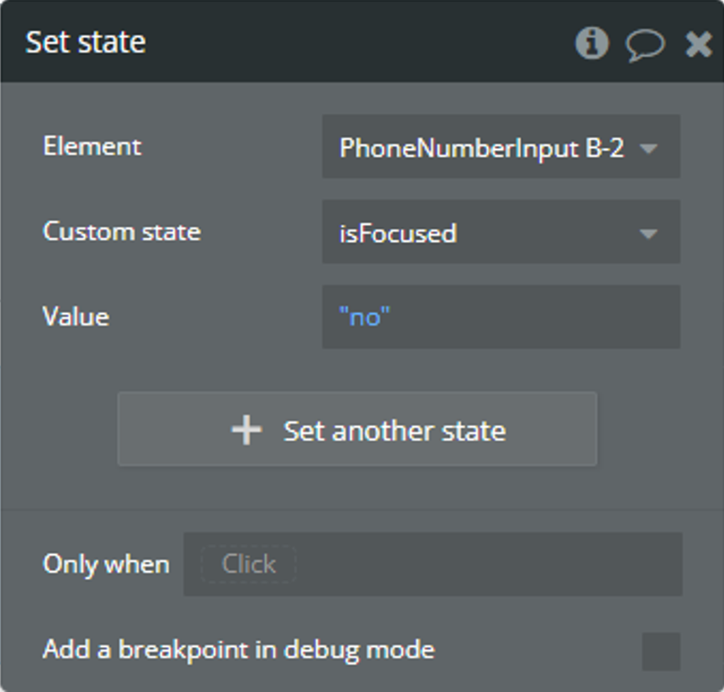
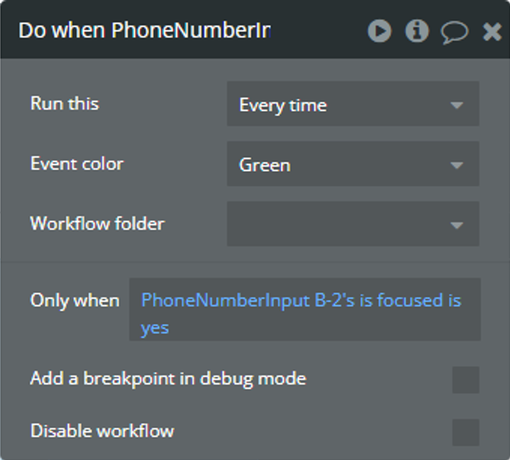
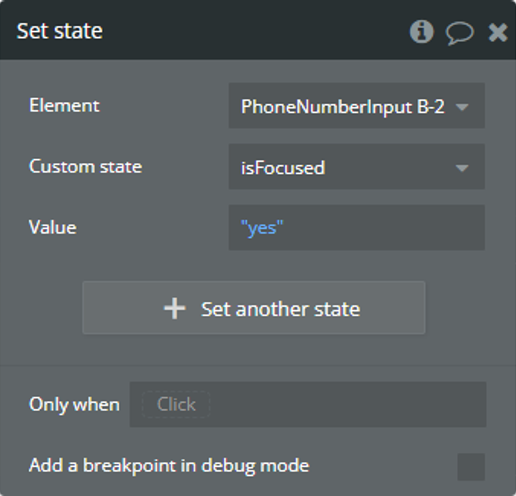
- Use created Custom state in condition instead of own element state.
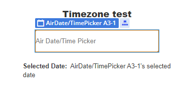
Using the Timezone feature
A simple example of using the timezone feature is presented.
Let's imagine we have an international app for booking something in New York. Our users will be able to book something from any country.
Setup
- On the page, it is placed a plugin element.
- The date format was customized through the "Custom Date Format" field. Check more details here.
- The “Timepicker” was enabled and the time format was customized through the “Time Format” field.
- The “Blocked Dates” field was used to disable some dates from selection.
In the database, we have prepared some examples for the “Blocked Dates” field.
- Additionally, the “OK” button from the “Calendar Buttons” section was enabled to prevent excessive database changes.
- Finally, for the “Timezone” field was selected “America/New_York” value.
☝
The “America/New_York” value was selected because we are looking to book something in New York.
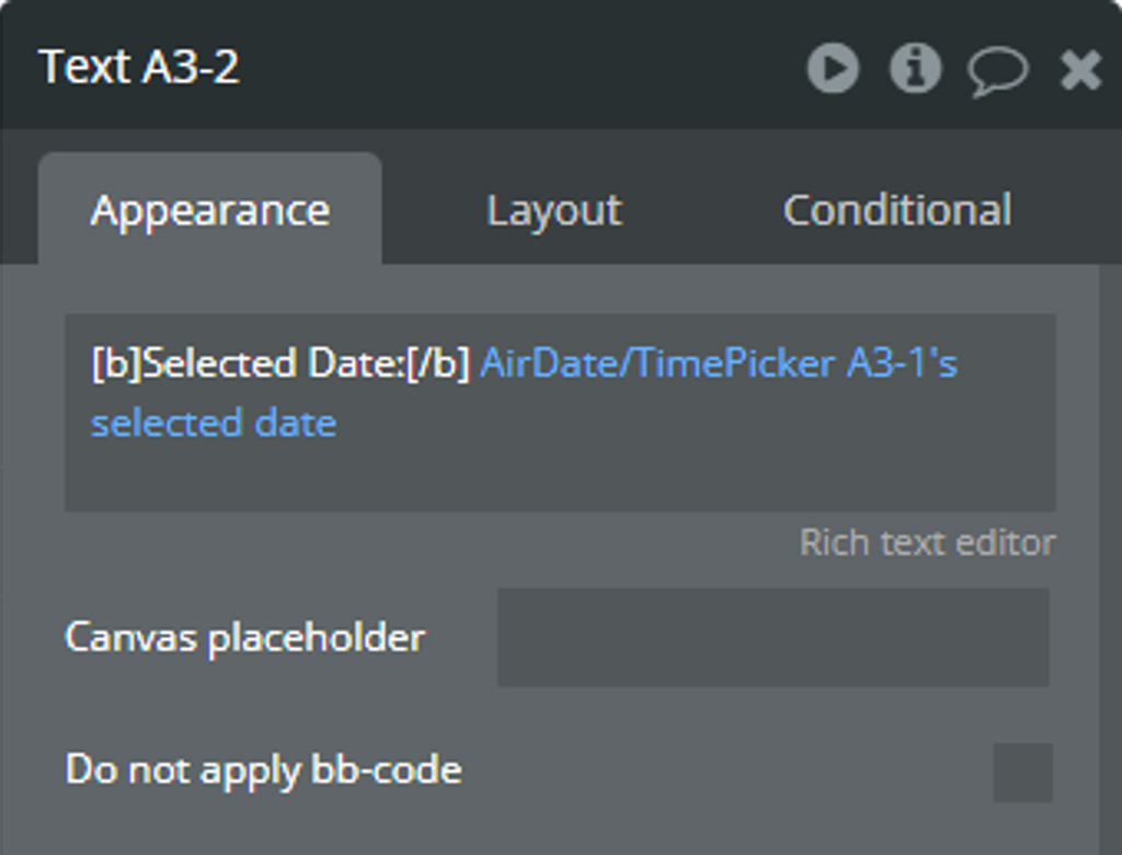
- For convenience, the selected value is displayed in a “Text” element.
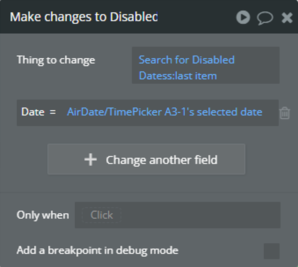
- When the “value is changed” event is triggered, the selected value from the “selected date” state will be registered in the database using the “Make changes to thing...” action.
How will it look for a user from the “Europe/Athens” time zone
Imagine a user from the "Europe/Athens" time zone will book something.
- Here is the initial date before selection.
- The user selects any date and time in the plugin element. Imagine that the user booked something on Jul 22, 2024, 6:00 pm, this is local time in New York.
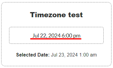
It is possible to notice that the “selected date” state has a different time.
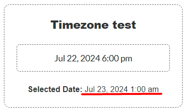
The value from the “selected date” state also is saved in the database.
🙏
Don’t worry that the value from the “selected date” state doesn’t match with the real-time in New York now.
💡
When another user from the “America/New York” time zone opens the app, Bubble automatically will adapt all dates from the database to the “America/New York” time zone.
☝
The plugin element calculates the time zone difference between the current time zone of the user and the selected time zone from the “Timezone” field. The calculation is done with the mention that Bubble automatically will adapt the saved date from the database.
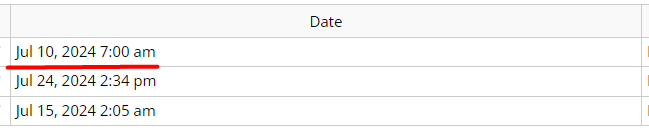
How will it look for a user from the “America/New York” time zone
Imagine a user from the "America/New York" time zone will book something.
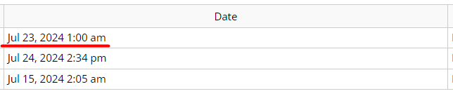
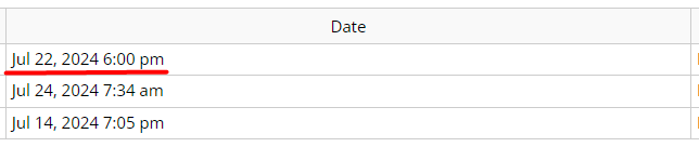
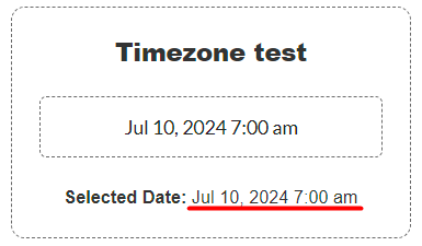
- From the previous section, we know a user from the “Europe/Athens” time zone selected Jul 22, 2024, 6:00 pm (local time in New York) but in the database was saved Jul 23, 2024, 1:00 am. Let’s check the value in the database for a user from the “America/New York” time zone now.
☝
Notice that Bubble automatically converted Jul 23, 2024, 1:00 am into Jul 22, 2024, 6:00 pm.
- Additionally, when users open the calendar, the Jul 22nd is blocked for selection.
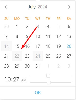
- The user selects any date and time in the plugin element. Imagine that the user booked something on Jul 10, 2024, 7:00 am, this is local time in New York.
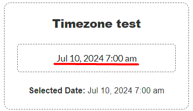
It is possible to notice that the “selected date” state has the same time.
⚠️
The saved value in the database for the “America/New York” time zone will automatically converted for other users from other time zones by Bubble.
💡
It is recommended to use the list of booked dates in the “Blocked Dates” field of the plugin element.
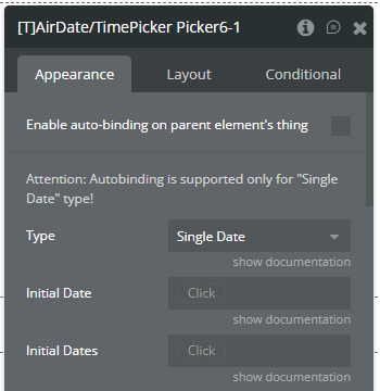
Using time range over midnight
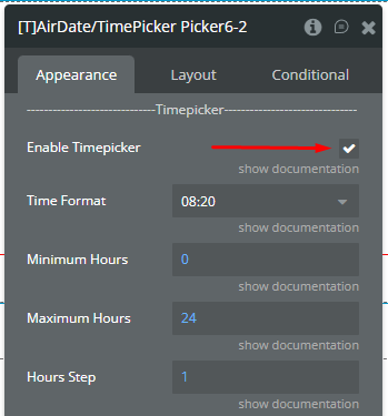
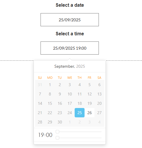
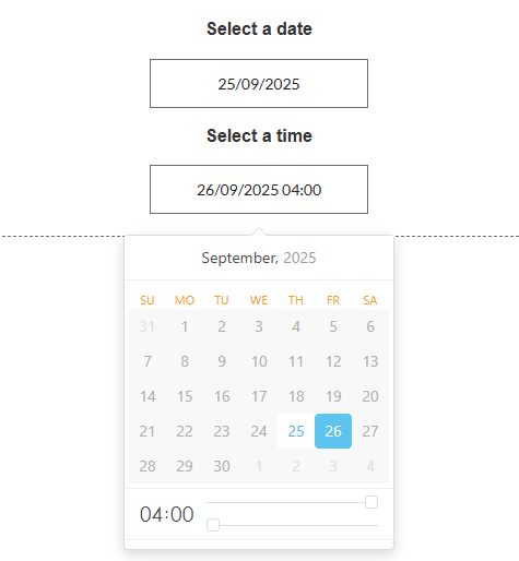
Here is presented an example when you need to select a time from range 7:00 pm - 4:00 am.
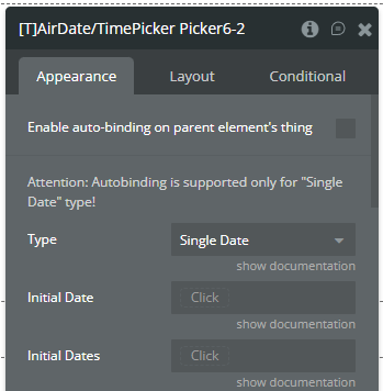
- A plugin element is placed on the page for date selection with the following setup.
- The 2nd plugin element is placed on the page for time selection with the following setup.
☝
Due to library limitation using of Only Timepicker type of element is not possible for this type of time range.
- The available range for the 2nd element is set with value from the 1st element.
- The Minimum Date field is set with selected date value from the 1st element but the time is changed to 19:00 (7:00 pm).
- The Maximum Date field is set with the selected date value from the 1st element but the time is changed to the next day at 4:00 (4:00 am).
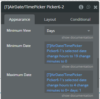
- Optionally, when the value is changed in the 1st element the minimal accepted date is set for the 2nd element.
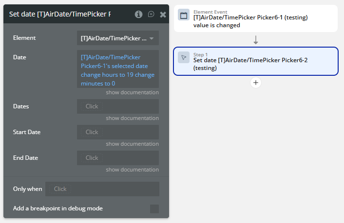
- Based on above setup the minimal available time is 7:00 pm.
- Also, the maximal available time is 4:00 am.

Changelogs
Update 07.01.26 - Version 3.110.0
- Fixed timezone synchronization between picker and states.
Update 16.12.25 - Version 3.109.0
- Bubble Plugin Page Update (Description).
Update 03.07.25 - Version 3.108.0
- Bubble Plugin Page Update (Logo).
Update 10.06.25 - Version 3.107.0
- Marketing update (minor change).
Update 26.05.25 - Version 3.106.0
- Fixed blocked weekdays & blocked dates.
Update 21.03.25 - Version 3.105.0
- Fixed blocked weekdays.
Update 26.02.25 - Version 3.104.0
- Fixed time refresh in "Set date" action and updated the library version.
Update 28.10.24 - Version 3.103.0
- Fixed event trigger from "Clear selected dates" action.
Update 21.10.24 - Version 3.102.0
- Minor update (Marketing update).
Update 19.09.24 - Version 3.101.0
- Fixed blocked dates style, "Mobile Device Mode" with enabled "Display Calendar Always".
Update 06.09.24 - Version 3.100.0
- Fixed "Mobile Device Mode" field.
Update 25.07.24 - Version 3.99.0
- Minor update .
Update 24.06.24 - Version 3.98.0
- Updated demo/service links.
Update 07.06.24 - Version 3.97.0
- Fixed state refresh on selection of one date for "Range" type.
Update 06.06.24 - Version 3.96.0
- Minor update.
Update 15.05.24 - Version 3.95.0
- Internal Changes.
Update 14.05.24 - Version 3.94.0
- Internal Updates.
Update 14.05.24 - Version 3.93.0
- Fixed Padding for Placeholder & Added Padding in Style.
Update 10.05.24 - Version 3.92.0
- Fixed autobinding and padding.
- Fixed autobinding.
- Fixed padding assignment.
- Removed default padding fields.
- Added new fields, "Padding vertical" & "Padding horizontal".
Update 26.04.24 - Version 3.91.0
- Fixed states refresh, days of week block, placeholder, initial values for Range type.
- Changed the import of libraries.
- Fixed refresh of states.
- Fixed blocking of days of week.
- Fixed placeholder value.
- Fixed initial values Range type.
Update 12.04.24 - Version 3.90.0
- Fixed Popper error.
Update 11.04.24 - Version 3.89.0
- Fixed initialization of states on the initial element load.
Update 03.04.24 - Version 3.88.0
- Fixed "Value change" event; "Reset", "Clear" actions; Blocked & Initial Dates fields; styles; console errors.
- Fixed interaction between "Auto Close" option and buttons.
- Fixed interaction between "Toggle Selected" option and buttons.
- Fixed "Value change" event trigger on interaction between "Auto Close" option and buttons.
- Fixed "Value change" event trigger on interaction between "Toggle Selected" option and buttons.
- Removed "Value change" event trigger on initial element loading on page.
- Removed "Value change" event trigger on "Reset" action.
- Fixed "Reset" action.
- Fixed "Clear" action for "Multiple Dates" and "Range" types.
- Fixed and improved "Blocked dates" feature.
- Fixed insertion of initial dates in the picker through the Initial Dates fields.
- Fixed the alignment of content.
- Fixed the color assignment for content.
- Fixed the font style assignment for content.
- Fixed the font size assignment for content.
- Fixed the size changes of element.
- Fixed errors from console and Debugger.
Update 19.03.24 - Version 3.87.0
- Fixed recursive trigger of value changing..
Update 12.03.24 - Version 3.86.0
- Fixed Timezone feature and the element interaction.
- Fixed "Keyboard Navidation" option.
- Fixed empty picker on initialization with values.
- Added states refresh on every update call.
- Fixed algorithm for Timezone time calculation.
- Fixed "Auto Close" option.
- Fixed interaction between "Auto Close" option and "OK" button.
- Added mention about dependention between "Auto Close" option and "OK button".
- Fixed selecting event.
- Fixed "Range" type Picker when start and end of range are the same date.
- Fixed interaction between "Range" type and "Today" button.
- Fixed dependention between "Blocked dates" and Timezone differences.
- Fixed "Disable picker" option for using in Conditional tab.
- Added cursor changing display depends on "Disable picker" option.
- Fixed reset of Picker to initial values.
Update 22.02.24 - Version 3.85.0
- updated description.
Update 22.02.24 - Version 3.84.0
- Code optimization.
Update 08.02.24 - Version 3.83.0
- minor updates.
Update 06.02.24 - Version 3.82.0
- Fixed Disabled (days) in week.
Update 06.02.24 - Version 3.81.0
- Fixed Disabled (days) in week .
Update 24.01.24 - Version 3.80.0
- Fixed "Set Date " action error.
Update 23.01.24 - Version 3.79.0
- Fixed Blocked Day in Range.
Update 03.01.24 - Version 3.78.0
- Fixed first selected date.
Update 14.11.23 - Version 3.77.0
- Fixed autobinding.
Update 10.11.23 - Version 3.76.0
- Fixed "value change" trigger event (back).
Update 30.10.23 - Version 3.75.0
- minor updates.
Update 19.10.23 - Version 3.74.0
- Updated description.
Update 13.10.23 - Version 3.73.0
- internal update.
Update 27.09.23 - Version 3.72.0
- Fixed "Value change" trigger event.
Update 19.09.23 - Version 3.71.0
- Fixed "disabled picker".
Update 18.09.23 - Version 3.70.0
- updated description.
Update 15.09.23 - Version 3.69.0
- Fixed placeholder in RG.
Update 13.09.23 - Version 3.68.0
- minor updates.
Update 23.08.23 - Version 3.67.0
- fixed Auto-binding and "OK button" (empty state).
Update 08.08.23 - Version 3.66.0
- updated name.
Update 03.08.23 - Version 3.65.0
- internal updates.
Update 31.07.23 - Version 3.64.0
- Fixed "Clears all selected dates" action.
Update 27.07.23 - Version 3.63.0
- Added "Picker ID" state.
Update 18.07.23 - Version 3.62.0
- Fixed "Value change" trigger.
Update 11.07.23 - Version 3.61.0
- updated description.
Update 19.06.23 - Version 3.60.0
- Updated the description .
Update 19.06.23 - Version 3.59.0
- Added list of dates option in the multiple dates.
Update 13.06.23 - Version 3.58.0
- Change min/max hour/min to dynamic value.
Update 01.06.23 - Version 3.57.0
- Fixed inline mode colors.
Update 10.05.23 - Version 3.56.0
- Fixed "Today" button..
Update 02.05.23 - Version 3.55.0
- Added "TimeZone Dynamic" field.
Update 21.04.23 - Version 3.54.0
- Fixed "Custom language" field.
Update 19.04.23 - Version 3.53.0
- Added "Disable Picker" checkbox.
Update 20.03.23 - Version 3.52.0
- Added fields "Start range" and "End range" to action "Set date".
Update 15.03.23 - Version 3.51.0
- Fixed custom language..
Update 23.02.23 - Version 3.50.0
- deleted the icons.
Update 22.02.23 - Version 3.49.0
- updated the description.
Update 09.02.23 - Version 3.48.0
- Added a field "Minimum view".
Update 30.01.23 - Version 3.47.0
- Fixed Set date action.
Update 10.01.23 - Version 3.46.0
- Fixed time in action "Set Date".
Update 03.01.23 - Version 3.45.0
- Fixed Inline.
Update 02.01.23 - Version 3.44.0
- Fixed the ranges for March and October.
Update 27.12.22 - Version 3.43.0
- Minor Fixes.
Update 22.12.22 - Version 3.42.0
- Added "Timezone" dropdown .
Update 22.12.22 - Version 3.41.0
- Added "Timezone" dropdown.
Update 14.11.22 - Version 3.40.0
- Fixed initial date.
Update 27.10.22 - Version 3.39.0
- Fixed: button "Clear" translation, autoclose when selecting a date, AM/PM parameters, plugin element conditions..
Update 20.10.22 - Version 3.38.0
- Display calendar on mobile Fixed.
Update 15.09.22 - Version 3.37.0
- Adapted to the new responsive engine..
Update 02.09.22 - Version 3.36.0
- Minor fixes.
Update 25.08.22 - Version 3.35.0
- Fixed range when blocking the day.
Update 14.08.22 - Version 3.34.0
- Fixed range type.
Update 09.08.22 - Version 3.33.0
- Added fields "Initial range start date" & "Initial range end date".
Update 02.08.22 - Version 3.32.0
- Minor fixes.
Update 27.07.22 - Version 3.31.0
- Fixed placeholder language.
Update 22.07.22 - Version 3.30.0
- added action “set date” and option “disabled dates styles”.
Update 07.07.22 - Version 3.29.0
- fixed picker layers on mobile view.
Update 27.06.22 - Version 3.28.0
- fixed: you cannot select a range if it contains blocked dates.
Update 22.06.22 - Version 3.27.0
- added - Ability to use a custom language
- added - Ability to limit picked dates in the "Multiple dates" type ("Multiple dates limit" field)
Update 06.06.22 - Version 3.26.0
- added - Added the Korean language
- added - Added custom date field
- added - Added ability to set custom colours to almost all plugin properties
Update 07.05.22 - Version 3.25.0
- Updated icon.
Update 25.04.22 - Version 3.24.0
- added - Added Pudding support
- fixed - Fixed issue with conditions
Update 19.04.22 - Version 3.23.0
- fixed zIndex and multiple dates error.
Update 15.04.22 - Version 3.22.0
- Added new element with latest library version and new features.
Update 12.04.22 - Version 3.21.0
- Changed the icon.
Update 18.03.22 - Version 3.20.0
- New time formats added. Header bug workaround added..
Update 25.01.22 - Version 3.19.0
- fixed minor styling bugs.
Update 14.12.21 - Version 3.18.0
- Fixed: value, returned by the element.
Update 28.11.21 - Version 3.17.0
- Added possibility to customise thumb of time in popup.
Update 22.11.21 - Version 3.16.0
- Fixed return values for non-inline element.
Update 04.11.21 - Version 3.15.0
- Fixed error in reset action.
Update 22.09.21 - Version 3.14.0
- blur no longer blocks the appearance of the navigation menu.
Update 13.09.21 - Version 3.13.0
- Added a more detailed description of some fields.
Update 15.08.21 - Version 3.12.0
- Fixed custum state "change day".
Update 09.08.21 - Version 3.11.0
- Fixed custom state "blocked day".
Update 05.08.21 - Version 3.10.0
- Added dynamic value with placeholder text.
Update 20.07.21 - Version 3.9.0
- fixed hovered and pressed states issue.
Update 20.07.21 - Version 3.8.0
- added - Updated icon
- fixed - Fixed "Hovered" and "Pressed" states issue
Update 09.06.21 - Version 3.7.0
- font-weight displaying fix.
Update 26.05.21 - Version 3.6.0
- fixed - Fixed error that appears when the "Automatically position Date/Time Picker" option was selected
Update 14.05.21 - Version 3.5.0
- for hours added possibility to set data dynamic.
Update 21.04.21 - Version 3.4.0
- Fixed fatal error.
Update 12.04.21 - Version 3.3.0
- Updated description.
Update 28.08.19 - Version 3.2.0
- Added Ok button | Fixed value list bug | Added moment-timezone library to address interference with air calendar bug..
Update 18.04.19 - Version 3.1.1
- Fixed "clear picker" bug.
Update 13.04.19 - Version 3.1.0
- Added Min View. Fixed time and color issues. Minor bug fixes and improvement..
Update 12.04.19 - Version 3.0.0
- Added navigation actions, new events and improvement in Inline mode..
Update 12.04.19 - Version 2.10.0
- Added inline support, bug fixes.
Update 22.09.18 - Version 2.9.0
- Added clear action. Added ability to set date to empty. Added ability to select blocked dates style. Changed date selected event to a date is changed. Updated the date change event to behave like default datetime picker. Fixed reset action bug..
Update 05.03.18 - Version 2.8.0
- Added events calendar showing, and calendar hiding.
Update 05.03.18 - Version 2.7.0
- Added Italian and Catalan languages, Added calendar show and calendar hide events. Added ability to hide cursor. .
Update 23.01.18 - Version 2.6.2
- fixed issue with broken plugin.
Update 23.01.18 - Version 2.6.1
- moved css and js files to shared asset.
Update 22.01.18 - Version 2.6.0
- added placeholder color, fixed reset action bug, added ability to prevent range with blocked dates. fixed d-M-yyyy date format.
Update 06.12.17 - Version 2.5.0
- Moved Use auto binding to top of property editor. Updated plugin instructions.
Update 06.12.17 - Version 2.4.0
- Added autobiding. Fixed enabled bug.
Update 04.12.17 - Version 2.3.0
- Added placeholder, reset action and initial multiple dates.
Update 24.07.17 - Version 2.2.0
- Added workflow actions (show picker, set date). Added event, date selected. Added ability to specify any date format. Added ability to disable date. Added ability to choose colors. Fixed IE and Edge bugs. Disabled full date showing when use try to edit input..
Update 19.06.17 - Version 2.1.0
- Fixed initialization issues. Added action show datepicker.
Update 19.06.17 - Version 2.0.0
- Added ability to dynamically block days and dates. Added ability to choose any day as start or week..
Update 14.06.17 - Version 1.7.1
- Fixed bug with stacking order when picker is inside a popup. .
Update 13.06.17 - Version 1.7.0
- Added support to set the initial view of the date picker..
Update 13.06.17 - Version 1.6.0
- Added options for time. Added ability to choose time format.
Update 13.06.17 - Version 1.5.0
- Added support for russian language. Fixed bug in one of the date formats.
Update 13.06.17 - Version 1.4.0
- Added support for multiple dates. .
Update 12.06.17 - Version 1.3.0
- Added ability to choose to navigate the datepicker with the keyboard. .
Update 12.06.17 - Version 1.2.0
- Added ability to block some days of the week. Example you can block the weekends so your users will not be able to select weekend dates.
Update 12.06.17 - Version 1.1.0
- Added ability to set Monday as start of the week. Default is the locale of the user..
Update 12.06.17 - Version 1.0.1
- Fixed an issue with having multiple instances of the datepicker on a page. Each instance now has a unique div id..
Update 11.06.17 - Version 1.0.0
- Alpha release (version 1.0).