
✅
Demo to preview the settings
✅
Introduction
The Air Calendar Plugin is a powerful Bubble plugin built on FullCalendar, the industry-leading calendar and scheduling library used by companies and SaaS products worldwide. It was created to overcome the limitations of Bubble’s native calendar, with a strong focus on performance, customization, and features. Fast, flexible, and production-ready, Air Calendar is robust enough to power complete scheduling-based SaaS applications.
Air Calendar offers multiple built-in and custom views, full control over layout and styling, internationalization with locales and timezones, on-demand event loading, drag-and-drop interactions, blocked time periods, and flexible database integration. Built on modern, lightweight JavaScript, it loads quickly and gives you total freedom to design both the user experience and the data flow exactly the way your app needs.

Tutorial
How to setup
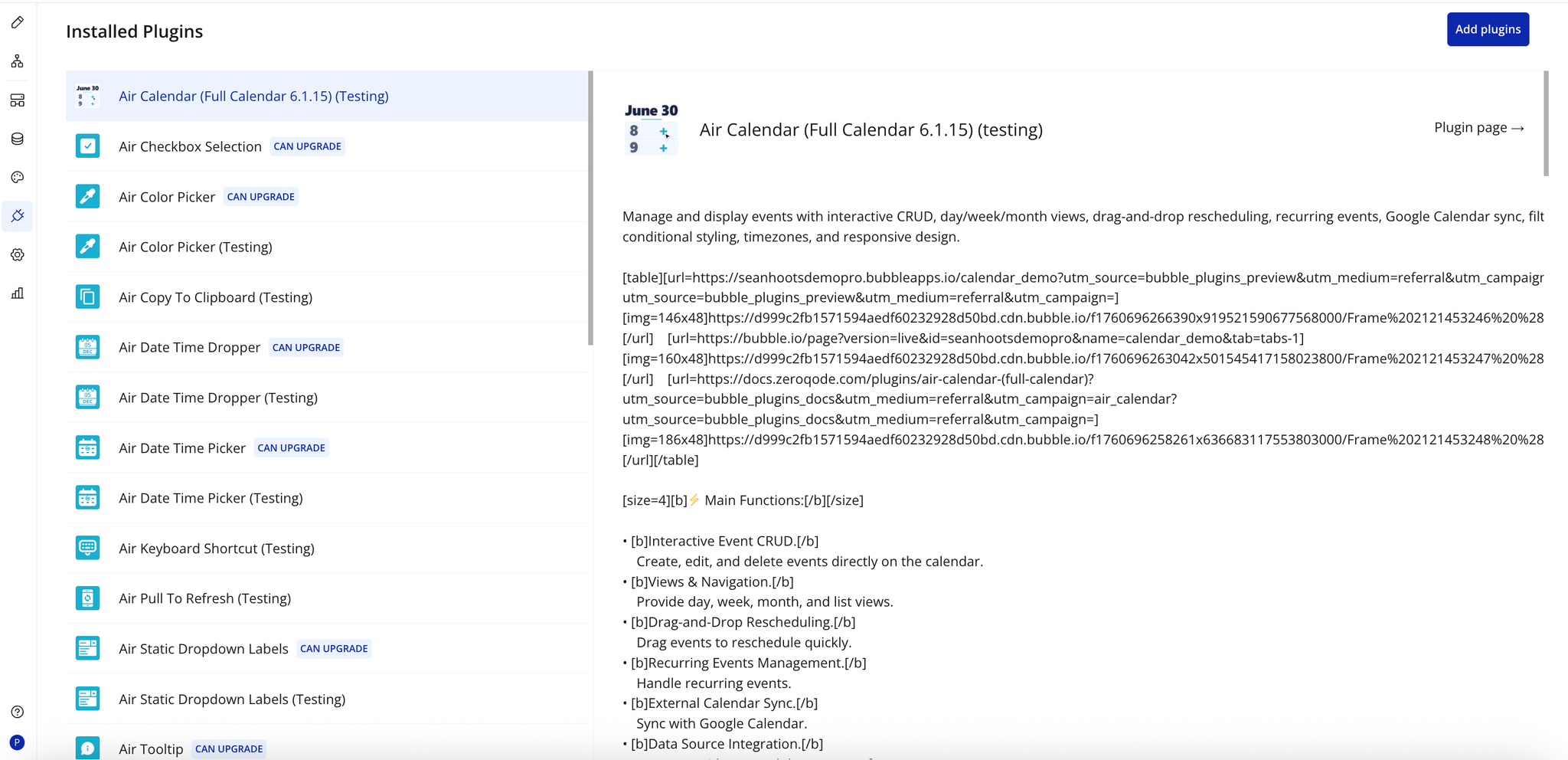
Step 1 – Install the Plugin
- Go to the Plugin Tab
- Open your Bubble Editor.
- Navigate to the Plugins tab on the left panel.
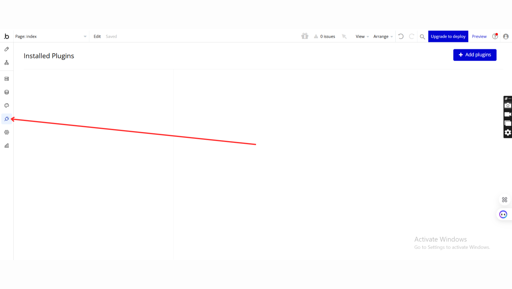
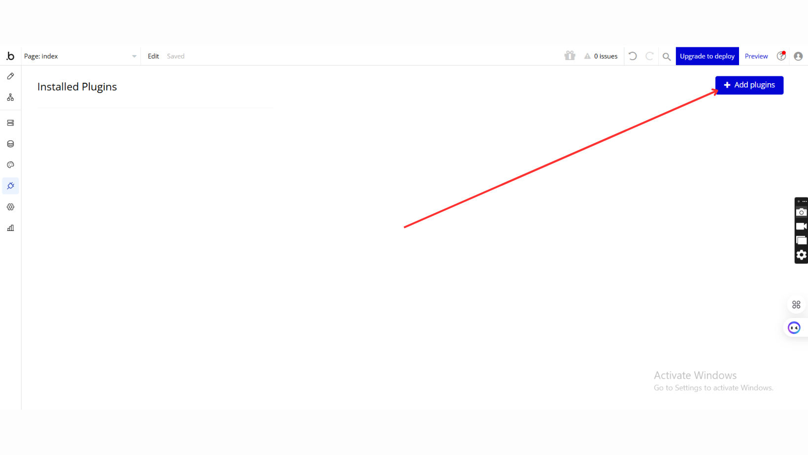
- Add Plugins
- Once in the Plugins tab, click the Add Plugins button.
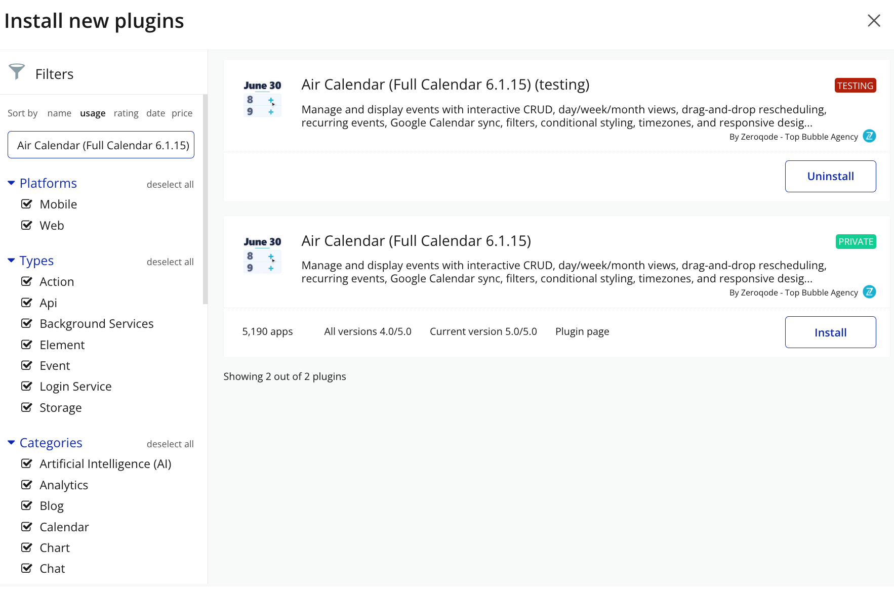
- Search for the Plugin
- Use the search bar to type Air Calendar (Full Calendar 6.1.15).
- Locate the plugin in the search results.
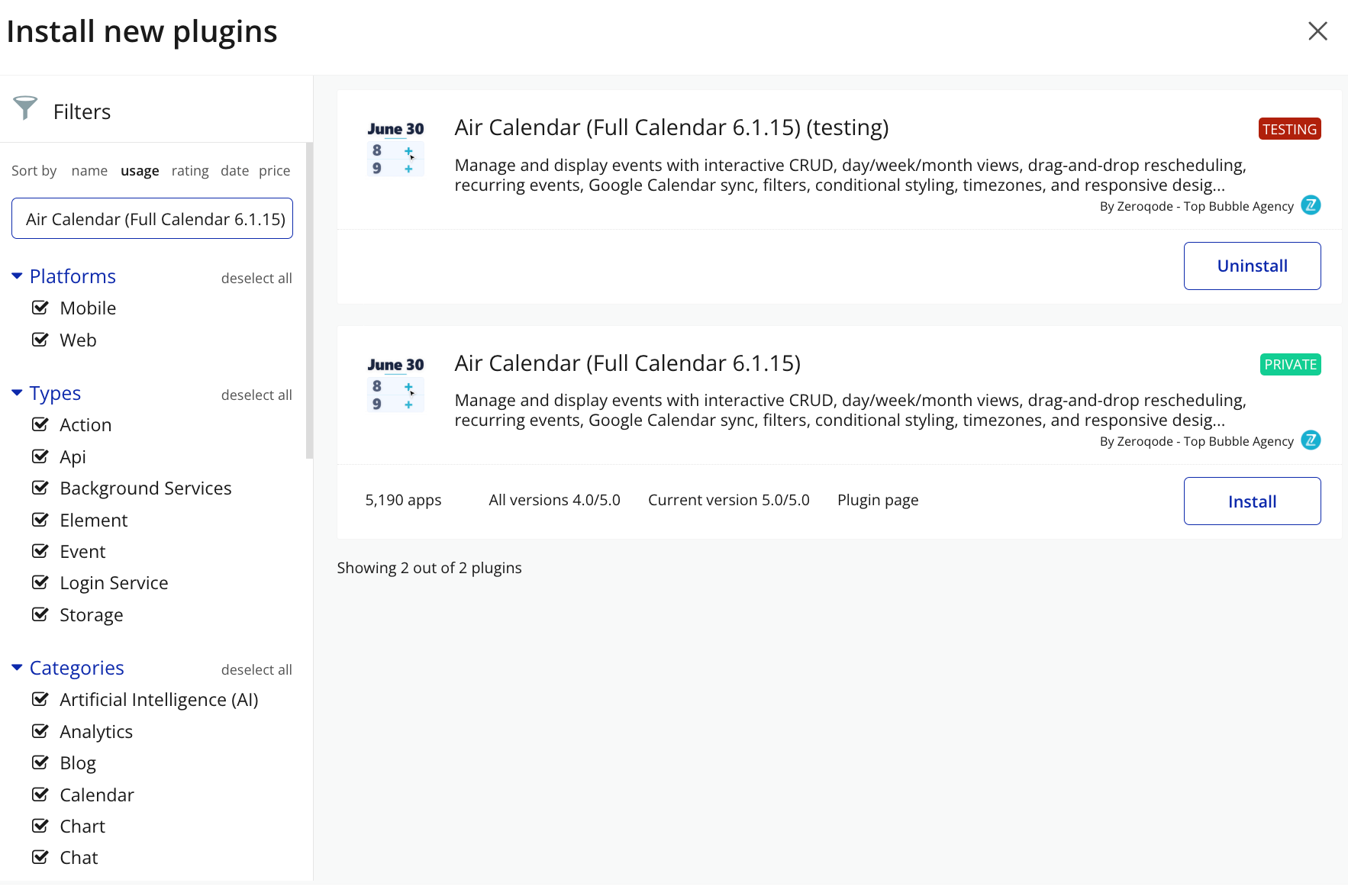
- Install/Buy
- Click Buy and follow the purchase instructions.
- Charges will be added to your Bubble billing account.
- Remember, if you unsubscribe from the plugin shortly after installation, charges will be prorated based on the days used.
- Plugin Installed
- Once installed, the plugin will appear under the Installed Plugins list in your Bubble Editor.
Step 2 – Add the Plugin Element to Your Page
- Open the Design tab in your Bubble editor.
- Search for the AirCalendar element in the Elements panel.
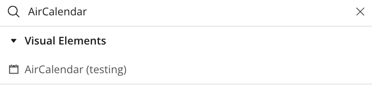
- Drag and drop the element onto your page.
Step 3 – Configure Properties
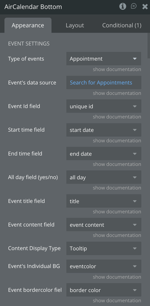
Select the element and configure its settings in the Property Editor, such as the Data Source, Event Types, and Event Fields.
To set the Data Source, you must have a data type Appointment that includes the required fields listed below:
Appointment – Fields & Types
- all day — yes / no
- blocked event — yes / no
- border color — text
- days of week — list of texts
- draggable — yes / no
- end date — date
- event content — text
- eventcolor — text
- img — file
- overlap — yes / no
- recurring — yes / no
- resizable — yes / no
- room — Room
- roomid — text
- start date — date
- text color — text
- title — text
- type — text
Next, perform a Search on this data type in the database, set it into Data Source and map each field in the plugin element to its corresponding field from the database.
Google API Key Security Setup
Since the plugin uses the API key on the client side, you must strictly restrict its usage in the Google Cloud Console to prevent unauthorized quota consumption on other websites.
Domain Restrictions (HTTP referrers)
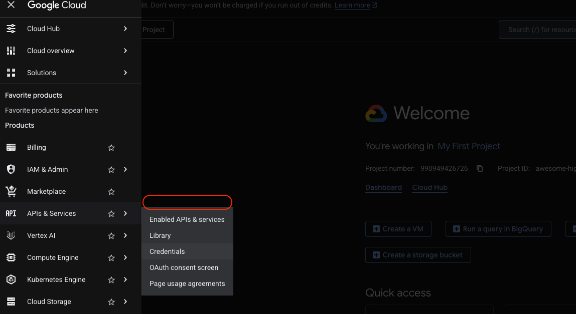
- Open the Google Cloud Console and go to APIs & Services -> Credentials.
- Click on your API key.
- Under the Application restrictions section, select Websites.
- In the Website restrictions section that appears, click ADD AN ITEM.
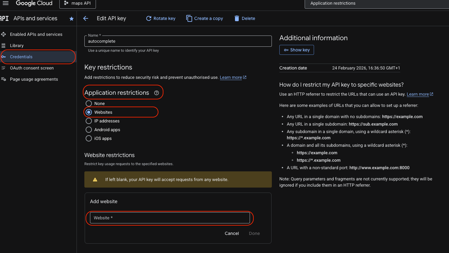
- Add the URLs of your Bubble application. Be sure to use asterisks to cover all pages and subdomains:
- For the test environment:
yourappname.bubbleapps.io/* - For your live domain:
yourdomain.com/*
- Click Done after adding each address.
API Restrictions
- On the same page, scroll down to the API restrictions section.
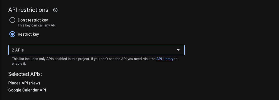
- Select the Restrict key option.
- In the dropdown list that opens, find and check the Google Calendar API box.
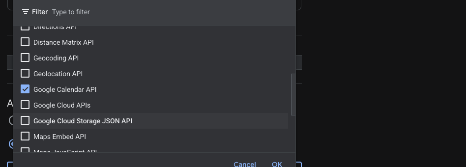
- Click OK.
Save and Verify
- Click the SAVE button at the very bottom of the page.
- The new security rules will take effect within 5 minutes.
- Open your application in Preview mode and make sure the calendar events are displayed correctly.
Plugin Element - AirCalendar
Air Calendar offers multiple built-in and custom views, full control over layout and styling, internationalization with locales and timezones, on-demand event loading, drag-and-drop interactions, blocked time periods, and flexible database integration
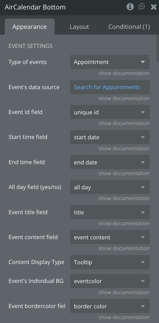
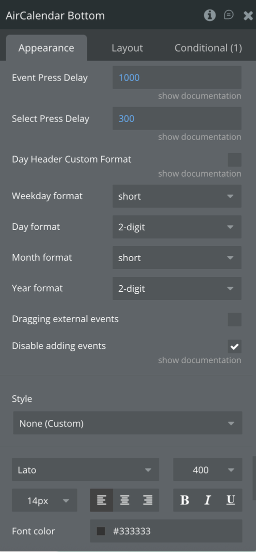
Fields
ℹ️
Required fields are marked with an asterisk (*). The element will not display events correctly without them.
Event Data Settings
Title | Description | Type |
Type of events * | The data type used to represent calendar events (e.g. Booking, Appointment). | Custom type |
Event's data source * | List of things to display on the calendar. Typically a Do a Search result.
Supports date-range constraints for performance. | List of custom type |
Event Id field * | A field with a unique value per event. Use the built-in unique id field for Bubble things. | Text field of event type |
Start time field * | Field containing the event start date/time. Must be of type Date. | Date field of event type |
End time field | Field containing the event end date/time. If left blank, the default duration is used (see Calendar Settings). | Date field of event type |
All day field | Yes/No field indicating whether an event is all-day. | Boolean field of event type |
Event title field | Field used as the event label on the calendar. | Text field of event type |
Event content field | Additional content to display inside or as a tooltip for the event.
Supports HTML if "Title has HTML content" is enabled. | Text field of event type |
Content Display Type | Controls where event content appears: inside the event block ( Event) or as a hover tooltip (Tooltip). | Dropdown |
Event's Individual BG | Field containing a HEX color code for the event background.
Overrides the default event color. | Text field of event type |
Event border color field | Field containing a HEX color code for the event border.
If left blank, the background color is used as border. | Text field of event type |
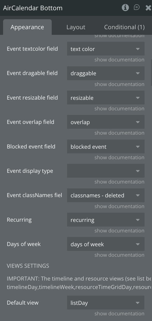
Event text color field | Field containing a HEX color code for the event text. | Text field of event type |
Event draggable field | Per-event override for drag behavior.
Overrides the global "Event draggable?" setting. | Boolean field of event type |
Event resizable field | Per-event override for resize behavior.
Overrides the global "Event resizable?" setting. | Boolean field of event type |
Event overlap field | Per-event control over whether this event allows overlap during drag/resize. | Boolean field of event type |
Blocked event field | Marks an event as a background/blocked period.
Blocked events are rendered as background by default and are non-interactive unless "Allow editing blocked events" is enabled. | Boolean field of event type |
Event display type | Field containing the FullCalendar display type: block, list-item, background, inverse-background.
Defaults to block. | Text field of event type |
Event classNames field | A list of CSS class names to attach to rendered events.
Useful for custom styling. | List of text fields |
Recurring | Field indicating whether an event is recurring. When true, the calendar uses daysOfWeek, startRecur, and endRecur instead of fixed start/end dates. | Boolean field of event type |
Days of week | List field with the days this event repeats on.
Accepted values: sunday, monday, tuesday, wednesday, thursday, friday, saturday. | List of text fields |
View Settings
Title | Description | Type |
Default view * | The view shown when the calendar first loads.
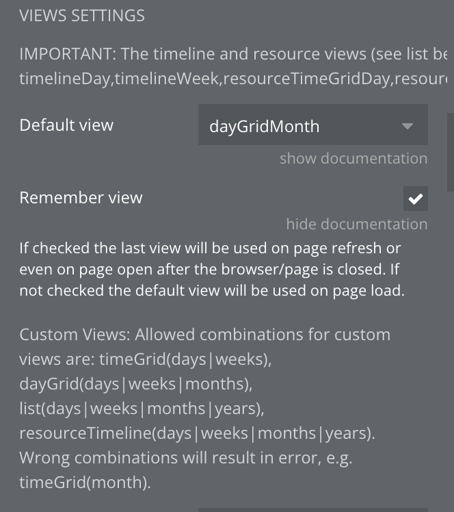
Options include: timeGridDay, timeGridWeek, dayGridMonth, listWeek, multiMonthYear, timeline views, resource views, and custom views. | Dropdown |
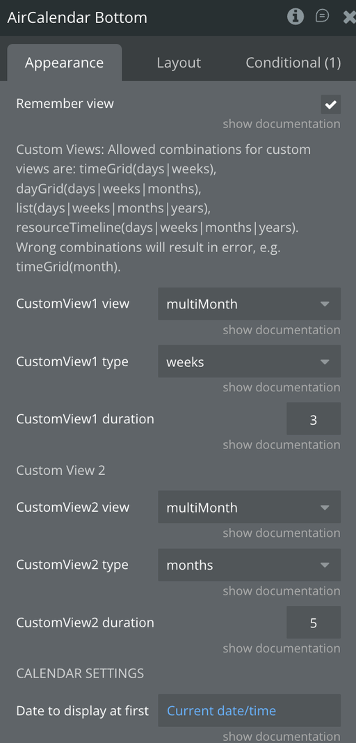
Remember view | If checked, the last active view and date are saved in localStorage and restored on page reload. | Checkbox |
CustomView1 view | Base view type for custom view 1 (e.g. timeGrid, dayGrid, timeline).
See note below for valid combinations. | Dropdown |
CustomView1 type | Duration unit for custom view 1: days, weeks, months, or years. | Dropdown |
CustomView1 duration | Number of units for custom view 1 (e.g. 3 days). | Number |
CustomView2 view | Base view type for custom view 2. | Dropdown |
CustomView2 type | Duration unit for custom view 2. | Dropdown |
CustomView2 duration | Number of units for custom view 2. | Number |
⚠️ Valid custom view combinations: ·timeGrid(days, weeks) ·dayGrid(days, weeks, months) ·list(days, weeks, months, years) ·timeline/resourceTimeline(days, weeks, months, years). Invalid combinations (e.g.timeGrid+months) will cause an error.
⚠️ Scheduler-only views require "Enable Resource/Scheduler view" to be checked:timelineDay,timelineWeek,resourceTimeGridDay,resourceTimeGridWeek,resourceDayGridMonth,resourceDayGridDay,resourceDayGridWeek,resourceTimelineDay,resourceTimelineWeek.
Calendar Behavior Settings
Title | Description | Type |
Date to display at first | The date shown when the calendar loads. If not set, defaults to today. | Date |
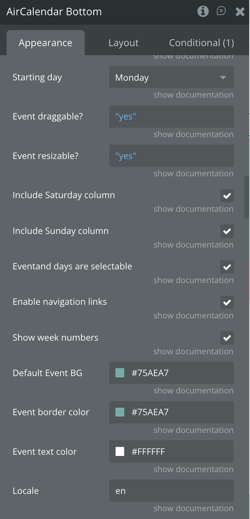
Starting day * | Day the week starts on.
Default: Sunday. | Dropdown |
Event draggable? | Enable users to modify events by dragging.
Per-event field overrides this when set. | Boolean |
Event resizable? | Enable users to modify event lengths by resizing.
Per-event field overrides this when set. | Boolean |
Include Saturday column | When unchecked, Saturdays are hidden from the calendar grid. | Checkbox |
Include Sunday column | When unchecked, Sundays are hidden from the calendar grid. | Checkbox |
Events and days are selectable | Allows users to click or drag to select time ranges, triggering the selection is made event. | Checkbox |
Enable navigation links | Makes day and week header labels clickable, navigating to the corresponding day/week view. | Checkbox |
Show week numbers | Displays ISO week numbers on the left side of the calendar. | Checkbox |
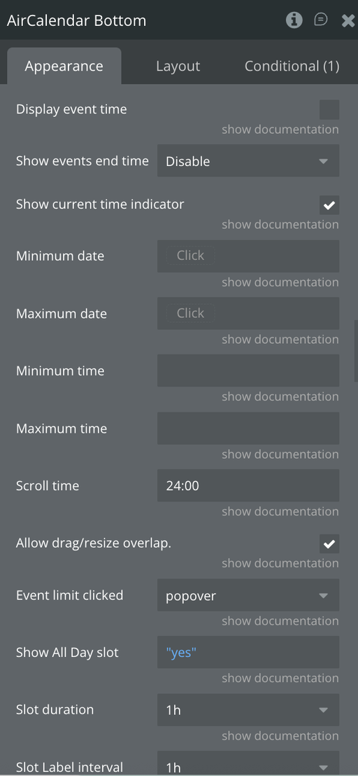
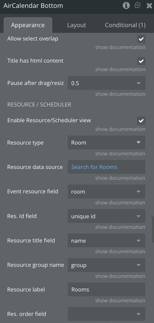
Allow drag/resize overlap | Whether events being dragged or resized may overlap other events. | Checkbox |
Allow select overlap | Whether users can select time ranges occupied by existing events.
Background events always block selection regardless of this setting. | Checkbox |
Disable adding events | When checked, selecting a time range already containing an event is blocked.
Triggers the Event already added event instead. | Checkbox |
Pause after drag/resize | Seconds to disable the calendar after a drag or resize, preventing double-edits before the database saves.
Recommended minimum: 1. | Dropdown |
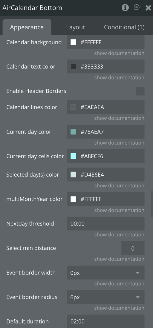
Select min distance | Minimum mouse travel distance (px) before a date selection is registered.
Set above 0 to differentiate a selection from a click. | Number |
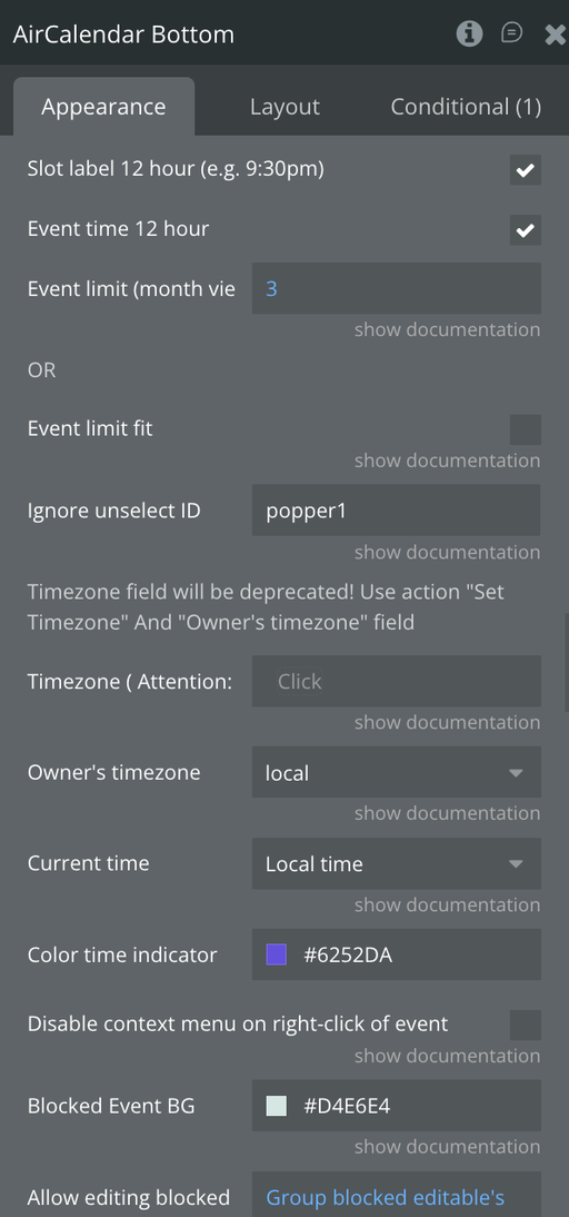
Ignore unselect ID | Element ID to exclude from triggering deselection when clicked outside the calendar. | Text |
Default duration | Fallback visual duration for timed events with no end date.
Format: HH:MM (e.g. 01:30).
Note: this is display-only — the event end date in the database remains empty. | Text |
Disable context menu on right-click | Prevents the browser's default right-click context menu on events. | Checkbox |
Nextday threshold | Minimum time an event must extend into the next day to render as a multi-day event in month/all-day views.
Format: HH:MM.
Example: 09:00 means events ending before 9am the next day appear as single-day. | Text |
Title has HTML content | Check if event title or content fields contain raw HTML markup. | Checkbox |
Event Press Delay | Milliseconds a user must hold down on an event (touch devices) before it becomes draggable.
Default: 1000. | Number |
Select Press Delay | Milliseconds a user must hold down on an empty cell (touch devices) before a date selection starts.
Default: 1000. | Number |
Time & Slot Settings
Title | Description | Type |
Minimum date | Minimum date limit for the calendar | Date |
Maximum date | Maximum date limit for the calendar | Date |
Minimum time | Earliest visible time slot per day (e.g. 08:00). | Text |
Maximum time | Latest visible time slot per day (e.g. 20:00). | Text |
Scroll time | Position the time grid is initially scrolled to on load. Users can scroll back further if needed. Use "Minimum time" to hard-restrict visible hours. | Text |
Slot duration | Frequency of time slots in the grid. Options: 5, 10, 15, 20, 30 minutes or 1h–24h. | Dropdown |
Slot label interval | How often time labels appear in the slot column. Can differ from slot duration (e.g. slots every 15 min, labels every 1h). | Dropdown |
Slot label 12 hour | Use 12-hour format (e.g. 9:30pm) for slot labels. | Checkbox |
Event time 12 hour | Use 12-hour format for time displayed inside events. | Checkbox |
Display event time | Show the event start time before the title inside the event block. | Checkbox |
Show events end time | Controls end time display: Default (view-dependent), In all views, or Disable. | Dropdown |
Show All Day slot | Show or hide the all-day row at the top of time-grid views. | Boolean |
Show current time indicator | Display a horizontal line marking the current time in time-grid views. | Checkbox |
Color time indicator | Color of the current time indicator line. | Color |
Current time | Determines which time the current time indicator tracks: Timezone (follows the selected calendar timezone) or Local time (browser time). | Dropdown |
Event limit (month view) | Maximum number of events shown per day cell in month view before a "+X more" link appears. | Number |
Event limit fit | When checked, shows only as many events as fit the day cell height, ignoring the numeric limit above. | Checkbox |
Event limit clicked | Action when the "+X more" link is clicked: open a popover, or navigate to a specific view. Leave blank to fire only the more events clicked event. | Dropdown |
Timezone & Locale Settings
Locale | Language and localization options | Text |
Owner's timezone | The timezone of the calendar owner, used for converting event times before saving to the database. Use local for browser timezone. | Dropdown |
Timezone (Deprecated) | ⚠️ Deprecated. Use the Set timezone action instead. | Text |
Appearance Settings
Title | Description | Type |
Default Event BG | Default background color for events without an individual color set. | Color |
Event border color | Default border color for events. | Color |
Event text color | Default text color for all event titles and times. | Color |
Event border width | Border thickness for events in pixels. Options: 0px–6px. | Dropdown |
Event border radius | Corner rounding for events in pixels. Options: 0px–12px. | Dropdown |
Blocked Event BG | Background color used for blocked/background events. | Color |
Allow editing blocked events | When enabled, blocked events become clickable and draggable like regular events. | Boolean |
Calendar background color | Background color of the entire calendar area. | Color |
Calendar text color | Text color for day numbers, day names, "all day" label, etc. | Color |
Calendar lines color | Color of grid lines and borders inside the calendar. | Color |
Current day color | Color of the circular highlight on today's date number. | Color |
Current day cells color | Background color of the entire column/cell for today in time-grid views. | Color |
Selected day(s) color | Highlight color for selected time ranges. | Color |
Multi-Month Year Background сolor | Background color for each month's day cells in multiMonthYear view. | Color |
Enable Header Borders | Show borders around column header cells. | Checkbox |
Day Header Custom Format
Title | Description | Type |
Day Header Custom Format | Enable custom date format in column headers. When off, FullCalendar uses its locale-based default. | Checkbox |
Weekday format | Format for the weekday name: long (Monday), short (Mon), narrow (M), or blank to omit. | Dropdown |
Day format | Format for the day number: numeric (1), 2-digit (01), or blank to omit. | Dropdown |
Month format | Format for the month: long, short, narrow, numeric, 2-digit, or blank to omit. | Dropdown |
Year format | Format for the year: numeric (2025), 2-digit (25), or blank to omit. | Dropdown |
Note: In month-based views, only the Weekday format applies to column headers. The other format fields are used in day/week/timeline views.Google Calendar Settings
Title | Description | Type |
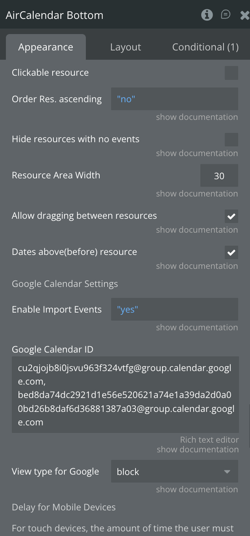
Enable Import Events From Google Calendar | Toggle to enable pulling events from one or more Google Calendars.
Requires a Google Calendar API key set in plugin settings. | Boolean |
Google Calendar ID | Google Calendar ID(s) to import. Separate multiple IDs with a comma.
Example: abc123@group.calendar.google.com. | Text |
View type for Google Events | Display style for imported Google events: auto, block, list-item, background, or inverse-background. | Dropdown |
Prerequisite: A Google Calendar API key must be entered in the plugin's shared settings (Plugin Settings → Shared Keys → Google Calendar API).
Resource / Scheduler Settings
Title | Description | Type |
Enable Resource/Scheduler view | Activates the FullCalendar Scheduler extension, required for all resource and timeline views. | Checkbox |
Resource type | The Bubble data type representing resources (e.g. Room, Staff Member). | Custom type |
Resource data source | List of resource things to display. | List of custom type |
Res. Id field | Unique identifier field for resources.
Use unique id for Bubble things. | Field (text/file) |
Event resource field | Field on the event type that references the resource. Can be a single resource or a list. | Field |
Resource title field | Field containing the display name shown in the resource column header. | Field (text/file) |
Resource label | Label displayed above the resource list column.
Default: Resource. | Text |
Resource group name | Field containing a group name to visually group resources under a shared heading. | Field (text/file) |
Res. order field | Field used to sort the resource list. Must be a text field. | Field (text/file) |
Order Res. ascending | Sort resources ascending ( true) or descending (false) using the order field. | Boolean |
Resource Area Width | Width of the resource column as a percentage of the total calendar width.
Default: 30. | Number |
Clickable resource | Makes resource labels clickable, triggering the Resource click event. | Checkbox |
Allow dragging between resources | Allows users to drag events from one resource row to another. | Checkbox |
Dates above(before) resource | In resourceTimeGrid/resourceDayGrid views, renders date headings above resource headings. | Checkbox |
Hide resources with no events | When checked, only resources with at least one event are shown. | Checkbox |
Touch / Mobile Settings
For touch devices, the amount of time the user must hold down before an event becomes draggable or a date becomes selectable.
Title | Description | Type |
Event Press Delay | Milliseconds a user must hold down on an event (touch devices) before it becomes draggable. Default: 1000. | Number |
Select Press Delay | Milliseconds a user must hold down on an empty cell (touch devices) before a date selection starts. Default: 1000. | Number |
Element States
Title | Description | Type |
current event | Returns current event. Should be of the event type | Event Type |
clicked date | Retrieves the current date that was just clicked. This is a date field | date |
current view's name | The current view's name as text. Possible values are any one of the available views listed above. e.g. timeGridWeek. Note that this is case-sensitive (meaning the small letters and capital letters should be exactly as listed above) | text |
current view's title | Title text that is displayed at the top of the header (such as “September 2009” or “Sep 7 - 13 2009”). | text |
modified event | Returns the event which has just been dragged. You must do a change to a thing with this event. | Event Type |
modified event start | Returns the start date of the event that has just been dragged. | date |
modified event end | Returns the end date of the event that has just been dragged. | date |
modified event allday | Returns the allday of the event that has just been dragged. | yes/no |
current view's date | For month view, it will always be sometime between the first and last day of the month. For week views, it will always be sometime between the first and last day of the week. | date |
view's activeStart date | A Date that is the first visible day. In month-view, this value is often before the 1st day of the month, because most months do not begin on the first day-of-week. | date |
view's activeEnd date | A Date that is the exclusive last visible day. | date |
selected start date | Start date/time of selection. | date |
selected end date | End date/time of selection. | date |
locales | List of timezones | text |
more link clicked date | The date for the day of the more link clicked. | date |
current event's rightclick pageX | right-click position on the x-axis | number |
current event's rightclick pageY | right-click position on the y-axis | number |
timezones | Available timezones | text |
browser timezone | Returns the browser's timezone | text |
browser locale | Returns the browser's locale | text |
hovered_event | Returns the currently hovered event. | Event Type |
current event's id attribute | ID attribute of the currently clicked, hovered or right-clicked event. | text |
timezone offset display seconds | The difference between browsers time and calendar time in seconds. Add this to date picker input when displaying. | number |
timezone offset save seconds | The difference between browsers time and calendar time in seconds. Add this to date picker input when saving date from a picker. | number |
selection all day? | Whether the selection happened on all-day cells. | yes/no |
calendar timezone | The current timezone the calendar is displaying in not the browswer's timezone | text |
calendar locale | The current locale of the calendar, not the browser locale. | text |
view's currentStart date | A Date is the start of the interval the view is trying to represent. For example, in month view, this will be the first of the month. This value disregards hidden days. You can use this to restrict the number of events the calendar fetches. | date |
view's currentEnd date | A Date is the exclusive end of the interval the view is trying to represent. For example, in month view, this will be the day after the last day of the month (because it is exclusive). This value disregards hidden days. You can use this to restrict the number of events the calendar fetches. | date |
modified event's new resource | The new Resource of the modified event. If the resource hasn't changed then this will return the same old resource. | Resource type |
selected_resource | Resource of the current selection. | Resource type |
modified event's old resource | The old Resource of the modified event. | Resource |
clicked resource name | The name of the event when clicking on the resource | Text |
external event start date | External event start date. Received after dragging an external event to the calendar. | Date |
external event all day | External event all day. Received after dragging an external event to the calendar. | Yes/no |
date recurring event | date of recurring event | Date |
clicked resource id | The id of the resource when you click on it | Teext |
Element Events
Title | Description |
event is clicked | This event is triggered when the user clicks on an event in the calendar. Refer to the current event that was just clicked using the expression 'This calendar's current event’. |
date is clicked | This event is triggered when the user clicks on a day in the calendar. You can refer to the current day that was just clicked using the expression 'This calendar's current day.' You can also retrieve the events for this day with the expression 'This calendar's current day's events’. |
event is modified | True when an event has been dragged to a new date or time. |
view changes | Triggered when a view is being rendered. |
all events rendered | Triggered when a new date-range is rendered, or when the view type switches. This callback will get triggered when the user changes the view, or when any of the date navigation methods are called. |
selection is made | Triggered when a date/time selection is made. |
more events clicked | Triggered when 'more' link is clicked. |
calendars's event is right clicked | Triggered when right clicked on the event |
mouse entered event | Triggered when the user mouses over an event. |
mouse left event | Triggered when the user mouses out of an event. |
Events are loaded | Triggered when events are loaded |
Blocked Event Clicked | Triggered when a blocked event is editable and is clicked. |
Event is dropped | Triggered when an event is dropped |
Recurring event is clicked | An event triggered when a recurring event is clicked on. |
Event already added | It is triggered when we add an event to a time interval that contains another event. Triggered when checkbox 1 is enabled. |
Resource click | An event triggered when a resource is clicked on. |
External event is dropped | Triggered when an external event is dropped |
Calendar is loaded | This event is triggered when calendar has finished setting its events and is ready to be used. |
Event overlap blocked | It is triggered when a new event overlaps a blocked one. |
Element Actions
Go to date
Go the provided date on the calendar
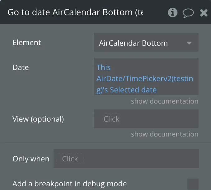
Fields:
Title | Description | Type |
Date | The date to go to on the calendar | date |
View (optional) | The view to show. If left blank will be set the the current view type. | text |
Change view
Immediately switches the calendar to a different view.
❕
This action can be supplied some properties depending on whether you're picking the view name statically from the available views or getting it dynamically from another element (e.g. a dropdown value).
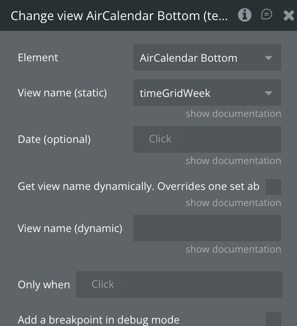
Fields:
Title | Description | Type |
View name (static) | The view to display. If you defined custom views you can use any of them. | dropdown |
Date (optional) | If you'd like to navigate to a new date while simultaneously switching to a new view, you can specify a date parameter. | date |
Get view name dynamically. Overrides one set above. | If true the view will be valued will be taking from the dynamic text | checkbox |
View name (dynamic) | Name of the view to change to. | text |
Go to Next view
Moves the calendar one step forward (either by a month, week, or day).
If the calendar is in
dayGridMonth view, will move the calendar forward one month.If the calendar is in
dayGridWeek or timeGridWeek, will move the calendar forward one week.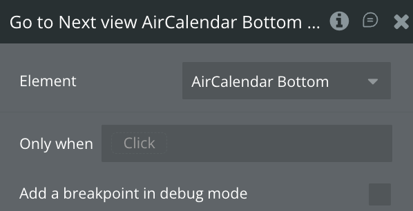
Go to Previous view
Moves the calendar one step back (either by a month, week, or day).
If the calendar is in
dayGridMonth view, will move the calendar back one month.If the calendar is in
dayGridWeek or timeGridWeek, will move the calendar back one week.If the calendar is in
dayGridDay or timeGridDay, will move the calendar back one day.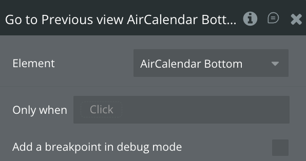
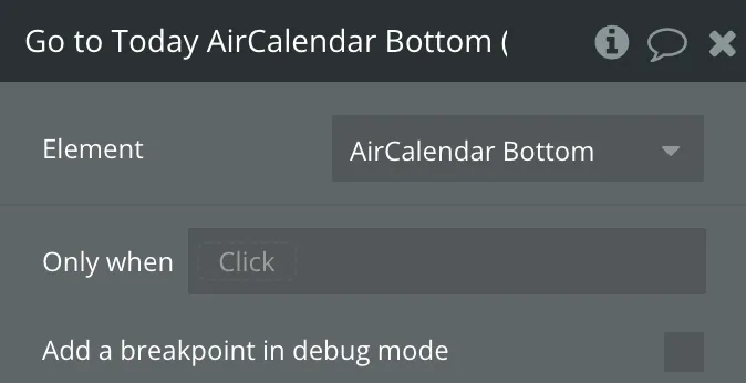
Go to Today
Moves the calendar to the current date.
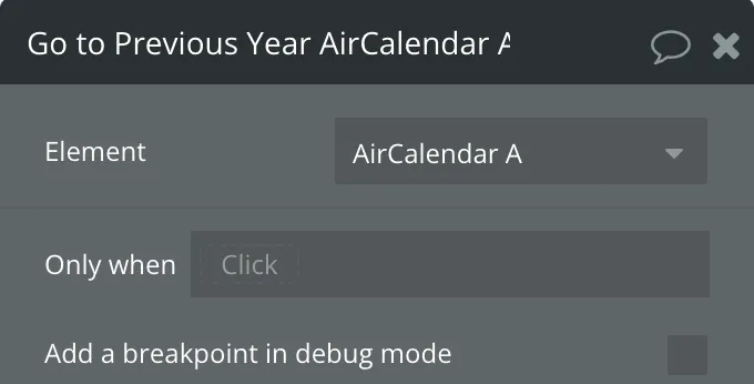
Go to the Previous Year
Moves the calendar backward one year.
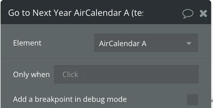
Go to Next Year
Moves the calendar forward one year.
Set locale
Customize the language and localization options for the calendar. This option affects many things such as: the text in buttons, as defined by header text that contains month or day-of-week strings date formatting strings, such as timeFormat weekNumberCalculation firstDay
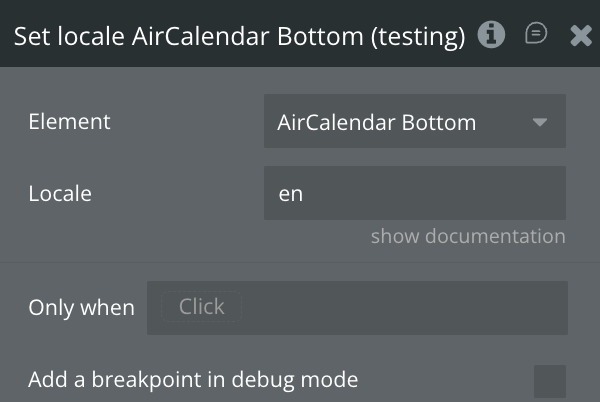
Fields:
Title | Description | Type |
Locale | The locale to set the calendar to. e.g. es, fr, fr-ca | text |
Select
A method for programmatically selecting a period of time. It accepts two different signatures
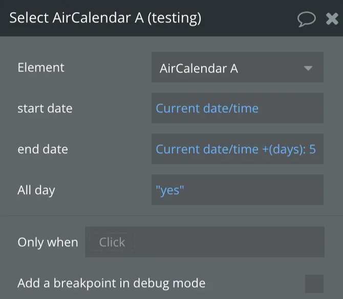
Fields:
Title | Description | Type |
start date | Selected date start | date |
end date | Selected date end | date |
All day | Selected date all day | yes/no |
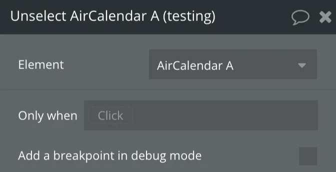
Unselect
A method for programmatically clearing the current selection.
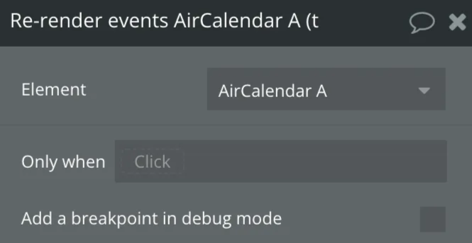
Re-render events
Refetches events from all sources and rerenders them on the screen.
Set timezone
A time zone is a region of the world that serves as a context for displaying dates. It affects a Calendar instance in the following ways:
- How the datetime text renders on events
- The positioning of events. Which day or which part of the time axis an event is on top of.
- The way in which you should interpret the exposed native Date objects throughout the API, such as an Event Object’s
start/end, a View object’sactiveStart/activeEnd, or the dates exposed by thedateClickorselectcallbacks. Read more about Date Objects.
- When event data is requested, the dates given to an events function or json feed
- When event data is received, the way in which dates are parsed. This only affects dates that were supplied with no time zone information, aka ISO8601 date strings that do not supply a UTC offset. Read more about Date Parsing.
Here are the values you can enter for the
timeZone setting and how they behave:'local'(the default) Every browser has a default time zone, which is usually determined by the settings of the user’s operating system. This is considered the “local” time zone. It will vary for different users of you calendar, depending on where they live or how they have their computer configured.
'UTC'Whereas the local timezone will vary from browser to browser, the UTC time zone is guaranteed to be the same in every browser. It will also not experience daylight savings times. The UTC time zone was designed this way and it serves as a time zone that other time zones define themselves relative to.
- Named Time Zones
A named time zone is a specific region of the world specified by a string like
'America/New_York'or'Europe/Moscow'. Just like the UTC time zone, it will display consistently across browsers because there is no ambiguity.
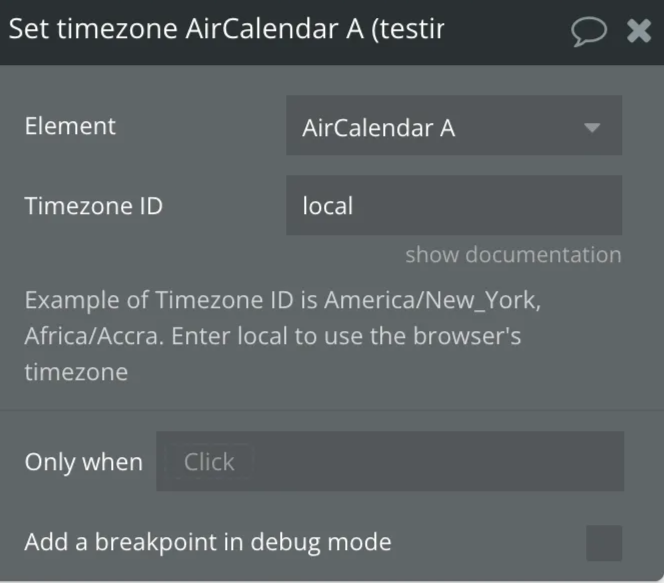
Fields:
Title | Description | Type |
Timezone ID | local,UTC or Named Time Zones | text |
Render
Will initially render a calendar, or if it is already rendered, will rerender it.
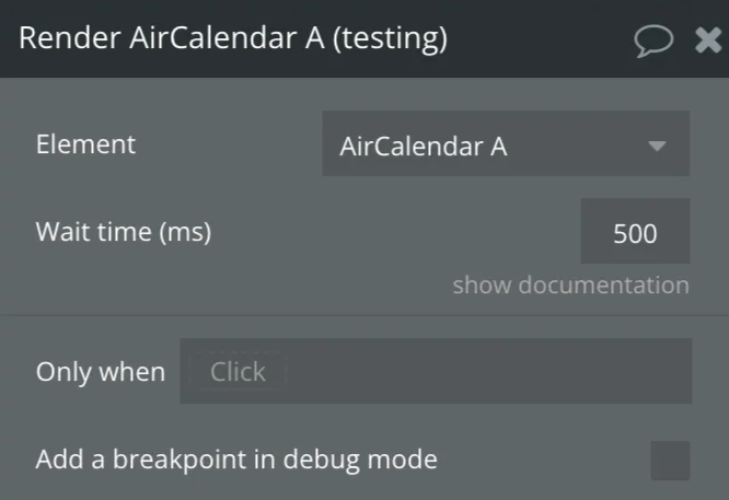
Fields:
Title | Description | Type |
Wait time (ms) | Time in milliseconds to wait before rendering. If there is an animation or a delay before making the calendar container visible, set enough time for to wait for the animation or delay to finish before re-rendering calendar. | number |
Reload Events
Hides all events, and then displays again, updating all data (including calculating the time of the event in a new time zone).
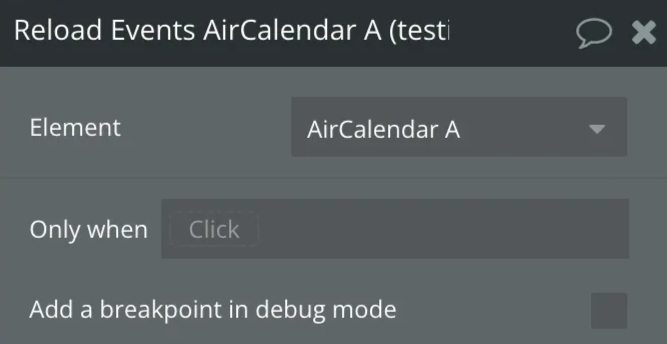
Set Max Number of displayed events
In dayGrid view, the max number of stacked event levels within a given day. This includes the +more link if present. The rest will show up in a popover.
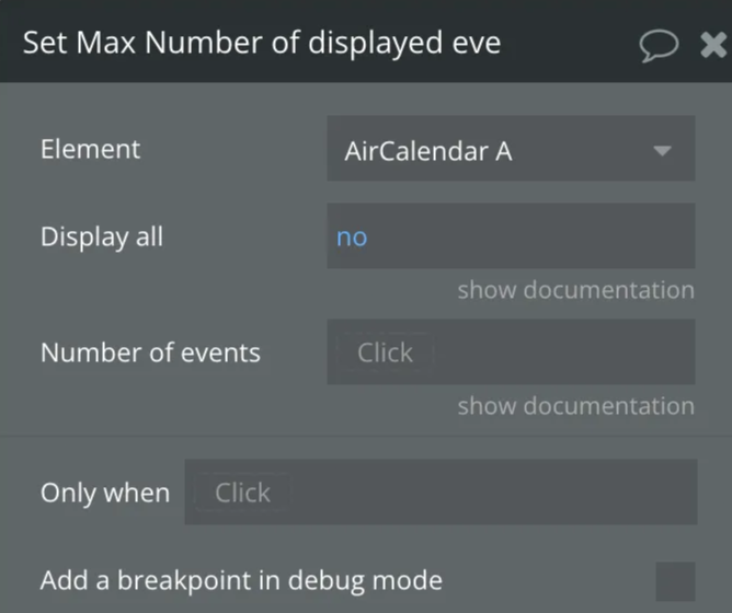
Fields:
Title | Description | Type |
Display all | Display all events as-is. True will limit the number of events to the height of the day cell. | yes/no |
Number of events | Limit the events to a specific number of rows | number |
Set the first day
The day that each week begins.
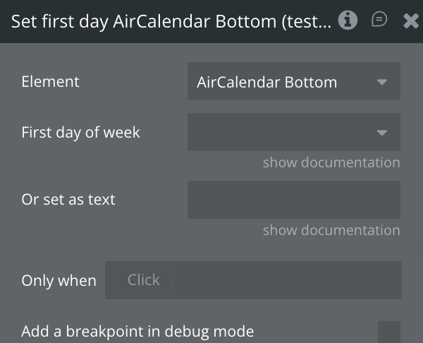
Fields:
Title | Description | Type |
First day of week | Select first day of week (Sunday,Monday,Tuesday,Wednesday,Thursday,Friday,Saturday) | Dropdown |
Or set as text | This value will be used if "First day of week" is empty. Allowed values: Sunday,Monday,Tuesday,Wednesday,Thursday,Friday,Saturday. | text |
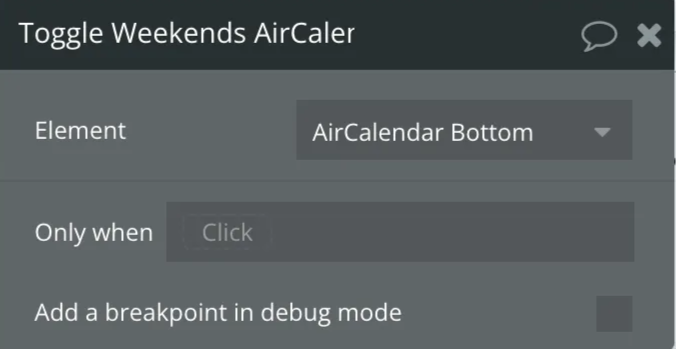
Toggle Weekends
Toggles the display of weekends in a FullCalendar instance.
Use external events
Creates draggable elements from the items of the RG.
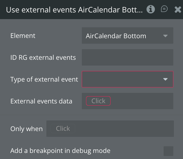
Fields:
Title | Description | Type |
ID RG external events | ID of a repeating group with draggable elements | text |
Type of external events | Data type of external events | app type |
External events data | External event data source | as type of external events |
External event ID | External event ID | text |
External event title | External event title | text |
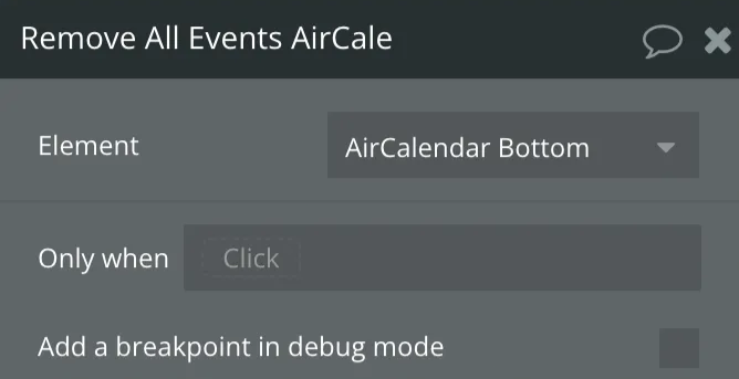
Remove All Events
Resets the calendar by removing all event sources and events currently displayed in the calendar.
Workflow example
Creating an events table in the database
- Go to the Data tab in Bubble.
- Create a new Thing. You can give it any name you like, e.g. Appointment.
- At minimum AirCalendar requires and an Event start and end date field which is of type date. You can have other optional fields and any other fields you require for your application. Ideally, you should have the three fields in bold.
- Event start date - date (required)
- Event end date - date (required)
- All day - yes/no (optional)
- Event title - text (optional)
- Event background color - text (optional)
- Event border color - text (optional)
- Event text color - text (optional)
- Blocked - yes/no (optional)
- Type - text (optional)

How to add events to the calendar
To improve the speed of loading events into the calendar, Air Calendar fetches events on demand. This means instead of loading all the calendar events when the page loads, Air Calendar allows you to load just the events needed for a view.
To achieve this, store the
current view start date and current view end date state values into custom states and then use these custom states in the element event’s data source. When the “view changes” event is triggered, you can write the values to custom states and then utilize these custom states within the “AirCalendar” field.❕
For better performance (faster event load), use the calendar's
view start date and view end date states to restrict events to only those needed for the current view. 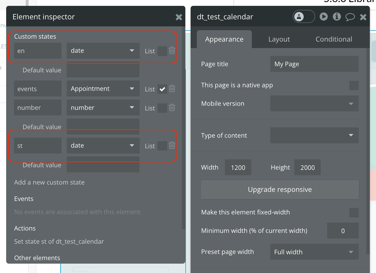
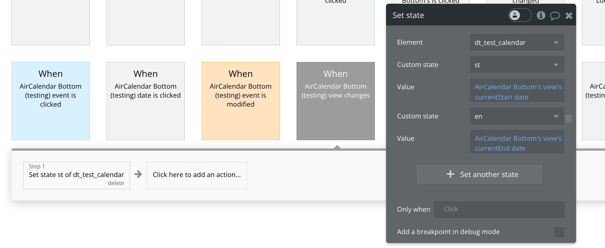
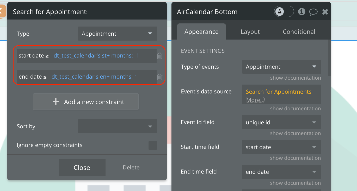

☝
Note:
Ignore unselect ID field will prevent the current selection from being cleared (due to the unselectAuto option).This option is useful if you have a “Create an event” form that shows up in response to the user making a selection. When the user clicks on this form, you probably don’t want to the current selection to go away. Thus, you should add a class to your form such as
my-form, and set the Ignore unselect ID field to .my-form.See the related link here: unselectCancel - Docs | FullCalendar
Changing view statically
Static view name: The name of the new view to switch to.
Date: If you’d like to navigate to a new date while simultaneously switching to a new view, you can specify a date parameter.

Changing view name dynamically
Get view name dynamically: Check this box if you want to get the name of the view to switch to dynamically. This can be used if you're getting the view name from say a dropdown. In this case you will call this action in the dropdown value's change event.
Then you can get the dropdown value as
Dynamic view name: The view name to switch two.
Can be any one of the supported view names: timeGridDay, timeGridWeek, dayGridDay, dayGridWeek, dayGridMonth,listDay, listWeek, listMonth, listYear , customView1, customView2

❗
Important: view names are case-sensitive. They must be specified exactly as specified above taking note of the lower and upper case.
Create a new event by selecting a time range
This workflow lets users click and drag on the calendar to select a time slot, then save a new event to the database.
Step 1 — Prepare the page
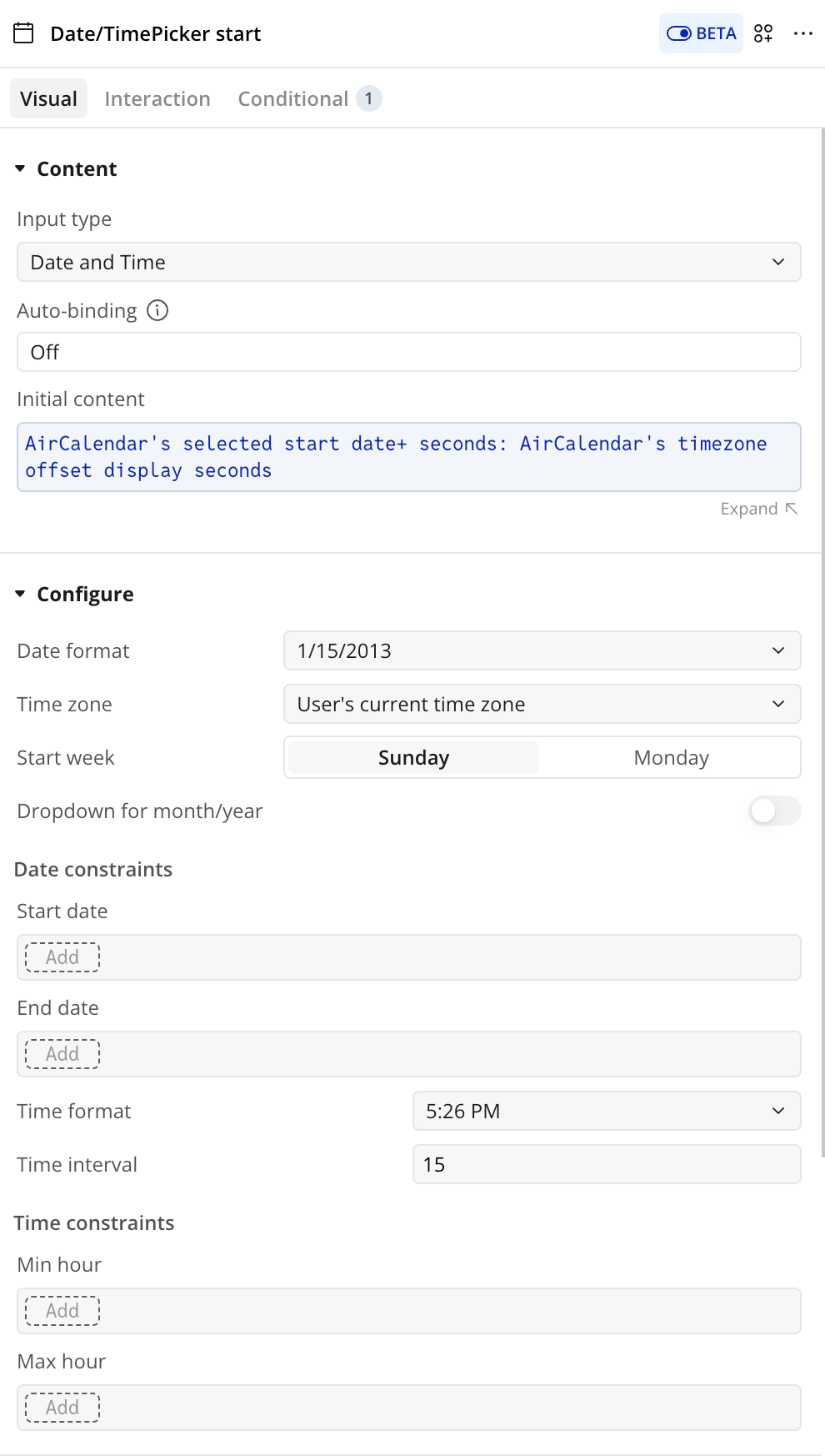
Add a Popup to the page with:
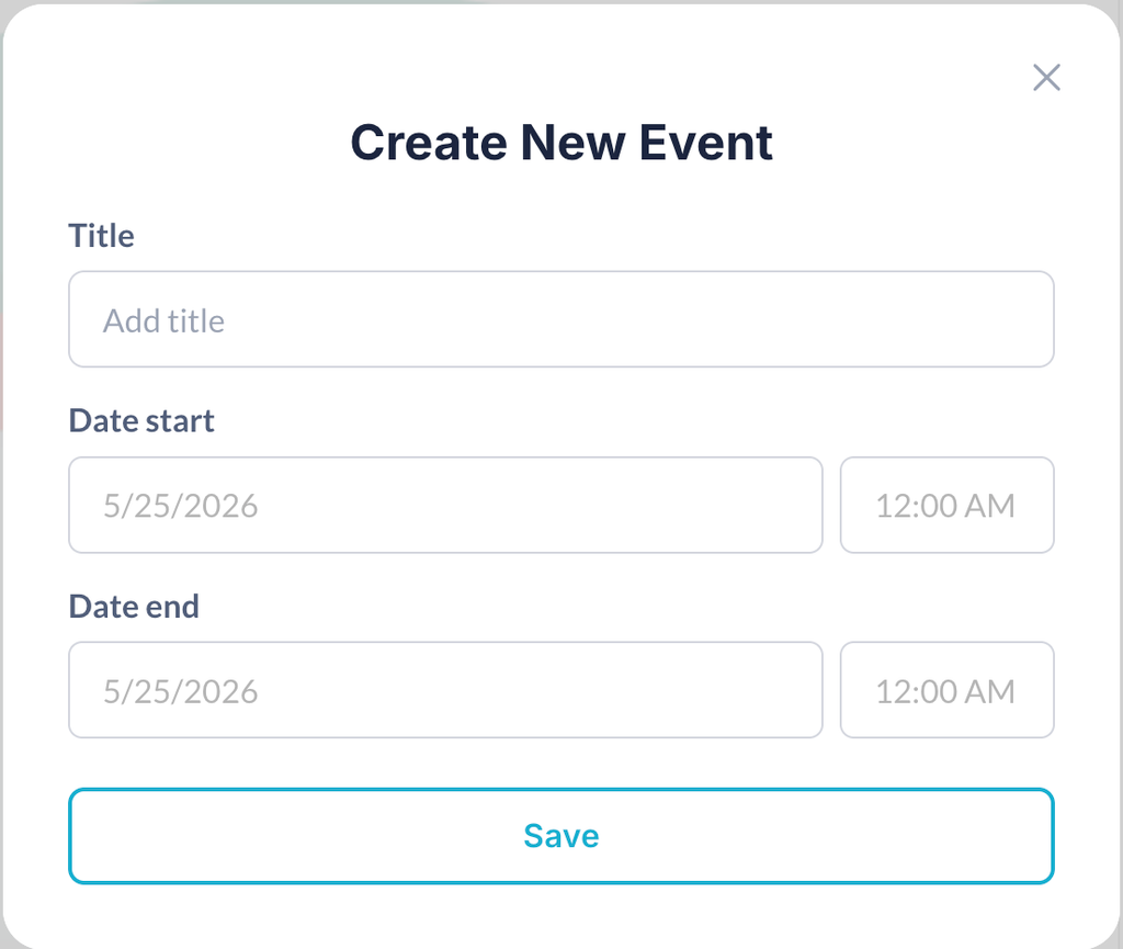
- Two date/time pickers:
Start date inputandEnd date input - Initial content: AirCalendar's selected start date + seconds: AirCalendar's timezone offset display seconds
- A text input for the event title
- A Save button and a Close button
Step 2 — Capture the selection
Add a workflow trigger: AirCalendar → selection is made
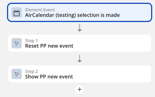
- Action: Reset the Popup
This action needs to reset date/time pickers
- Action: Show the Popup
Step 3 — Save the event
On the Save button inside the Popup, add a workflow:
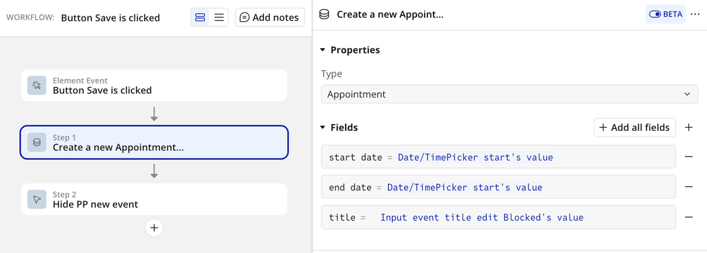
- Action: Create a new Thing (your event type)
start time=Start date input's valueend time=End date input's valuetitle=Title input's value
- Action: Hide the Popup
ℹ️
Timezone tip: If the calendar displays a timezone different from the owner's, add
AirCalendar's timezone offset save seconds to the picker values before saving so dates are stored correctly in the database.ℹ️
All-day events tip: Use
AirCalendar's selection all day? to detect whether the user selected an all-day cell and set the all day field on the new event accordingly.Troubleshooting & Tips
Fix Error: TypeError: moment.tz is not a function
What it means
Air Calendar expects Moment Timezone support (
moment.tz). This error usually happens when another plugin overrides, bundles, or loads an incompatible Moment build (e.g., plain Moment without timezone), so tz never gets attached.Most common cause (seen in the wild)
A plugin conflict—especially with “# Date & Time Toolkit” or any other plugin that also touches Moment/time formatting (e.g., “Relative Time with Moment.js”). If two plugins manipulate or ship their own Moment-related code, the timezone method can disappear or get replaced.
Prevention guideline
- Do not use Air Calendar alongside other plugins that also bundle/patch Moment or timezone features. If you need timezone support, keep it centralized in Air Calendar.
How to resolve
- Confirm it’s a plugin conflict
- Temporarily disable other Date/Time-related plugins (start with # Date & Time Toolkit and Relative Time with Moment.js).
- Reload the page/app.
- If the error disappears, you’ve confirmed the conflict.
- Pick one source of timezone handling
- Recommended: use Air Calendar alone for timezone functionality.
- Leave timezone / “moment + timezone” behavior to Air Calendar, and avoid parallel plugins that patch the same library.
- Re-enable plugins one-by-one
- Turn plugins back on individually, reloading each time, until the error returns.
- The plugin enabled right before the error returns is the conflict source.
- Permanent fix options
- Best: Keep the conflicting plugin disabled or remove its date/time features.
- Alternative: If the other plugin has a setting to not load Moment / not modify global Moment, turn that on.
- Avoid: Running multiple plugins that provide Moment-based relative-time/timezone logic at the same time.
Fix Error: TypeError: Cannot read properties of null (reading 'match')
What it means
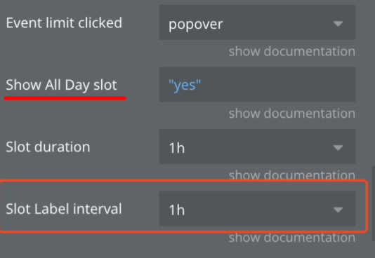
This is almost always caused by an incomplete “all day slot” configuration. Air Calendar expects a valid time/interval string to parse, but it receives
null/empty, and then attempts to call .match(...) on it.Most common configuration trigger
- “Show all day slot” = YES
- “Slot duration” (or slot label interval) is empty
- This combination commonly causes the
matcherror.
How to resolve
- Open Air Calendar configuration
- Locate these fields:
- Show all day slot
- Slot duration (and/or Slot label interval, depending on your UI naming)
- Fix using one of these:
- Option A (recommended): Keep Show all day slot = YES and set Slot duration to a valid value.
- Option B: If you don’t need all-day rows, set Show all day slot = NO.
- Save and reload
- Reload the page/app after saving to ensure the calendar re-initializes cleanly.
“Known-good” guideline
- If Show all day slot is enabled, Slot duration must not be empty.
- Treat Slot duration / slot interval fields as required when all-day slots are on.
Exclusive End date - AllDay events
Air Calendar is based on FullCalendar which uses exclusive end dates. Below is an explanation of what this means and how to set things up to work properly.
All end dates are exclusive. For example, if an all-day event ends on a Thursday, the end date will be 00:00:00 on Friday.
An event with the end date of 2018-09-03 will appear to span through the 2nd of the month, but will end before the start of the 3rd of the month.
These threads (#1,#2) have a lot of discussion and useful information on why exclusive dates are used for end dates of All day events.
Yes, it might be confusing for users. But remember computers understand things differently from humans.
For example, array indexes start from 0 but humans count from 1. This means when dealing with arrays the indexes you display to your users will be different from what you use to perform your calculation.
Bubble.io as a no-code platform makes life easy for its developer by counting from one but behind the scene, counting starts from 0.
So how do we make sure the users don't get confused?
❕
Store end dates with exclusive times (most apps do this). Whenever you are about to display an all-day end date to the user, always subtract 1 day. Immediately after you accept an all-day end date input from the user, always add 1 before you store it.
You can for example use Bubble's conditional to check if the event is an all day event and if yes subtract 1 day using the bubble function +(days): -1

When saving an All Day event, do the opposite by adding 1 day to the end date.
What is a Current event?
The current event is a very important state returned by the plugin. Below are details of the value.
- current event: This is the current bubble event that has been left-clicked, right-clicked or hovered. Its type is your calendar's event type. For example, if your calendar things are called Appointment, this value will be an Appointment.
❗
Important: The following states/values are for the advanced user, for example, to help create a context menu popup when an event is clicked or disable the default right-click context menu like google calendar. Don't use them if you're not familiar with the concepts. For most users, you shouldn't care about these.
- current event id attribute: The HTML ID attribute of the current clicked event. You can use this for showing a context menu popup using some javascript or some plugin.
- current event's rightclick pageX: The right-clicked horizontal coordinate (pageX) on an event.
- current event's rightclick pageY: The right-clicked vertical coordinate (pageY) on an event.
Event dragging and resizing
Here are described the triggers and actions for reacting to event drags and resizing on the calendar.
❗
Air Calendar doesn't automatically save dragged or resized events to the database.
If your application allows dragging and resizing an event, you must add a workflow to update the event as explained below.
A unique feature of Air Calendar is that it doesn't automatically write changes in the calendar to the database. This allows you complete control on when and how to update your database.
The calendar provides the following states and events for updating an event in the database when it is modified on the calendar.
Example workflow for updating an event when modified
- In the workflow tab add a new event and select AirCalendar event is modified.

2. Add a make a change to a thing action and in the Thing to change field select AirCalendar's modified event. Then for your event's start and end dates select AirCalendar's modified event start and AirCalendar's modified event end states respectively.

Event selecting
Air Calendar supports dynamic selection. Users can click and drag to select a period of time to create an event. Below are the actions, triggers and states associated with selection.

To enable selection check the element property
Event and days are selectable . Once enabled the following states, triggers and actions can be used.
❗
When selection is enabled, clicking on a cell triggers the
selection is made event as well as the date clicked event. If you don't want your users to click to select but instead click and drag to select, you have to change the element property, Select min distance to a value greater than 0.
Used States
- selected start date: The start date/time of the current selection. The value is a date.
- selected end date: The end date/time of the current selection. The value is a date.
- selection all day?: This is a boolean (yes/no) that tells you if the selection occurred in an All Day (yes) cell or a timed cell (no).
Used Events
- selection is made: Triggered when a selection has been made. Once this event occurs the states defined above are available and can be used in a workflow. For example, you may want to show a popup with the selected dates to create an event in your database.
Used Actions
Air Calendar allows you to programmatically select or cancel a selection. This is useful if after the user has selected an area decides to change the start or end time (see a demo at the start of this page). The following actions are provided.
1. Select: Selects a period of time on the calendar. It has the following fields
- start date - Start date of the selection. The value should be a date.
- end date - End of the selection. Optional. Default slot value will be used. The value should be a date. This value is exclusive, meaning if you want your last full-day selection to be Thursday, then specify Friday
- All day - Specify if selection should happen in the All Day slot. Optional. The default is false.
2. Unselect: Cancels the current selection. It doesn't have any fields.
Timezone feature
Required fields, actions and states
Fields
Owner's Timezone - this dropdown contains a list of timezones. The page owner must choose his own time zone so that the time difference between different time zones can be calculated.

Actions
Set Timezone - The incoming parameter is the ID (text) of the new time zone. Switches the timezone of the calendar to the selected one.
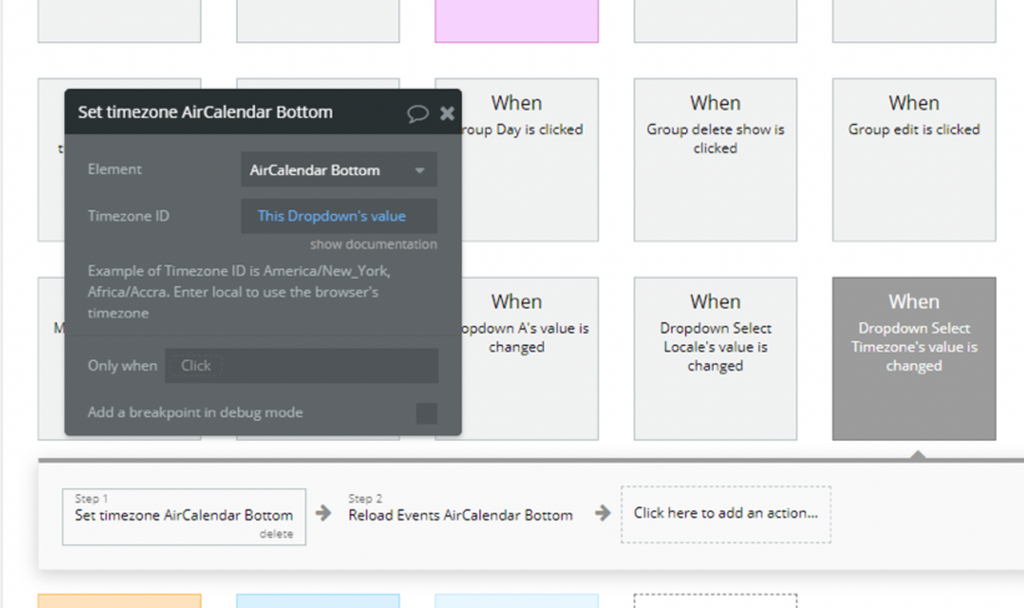
Reload Events - New action. Hides all events, and then displays again, updating all data (including calculating the time of the event in a new time zone).
States
timezone offset display seconds - This state stores information about the difference between the time zone of the owner of the calendar and the current time zone of the calendar. It is used to correctly display the event time when editing it, since by default the event is stored in the database in the owner's time zone.
timezone offset save seconds - This state stores information about the difference between the time zone of the owner of the calendar and the current time zone of the calendar. unlike the previous state in the sign, that is, it is the opposite (example: offset display = 120 => offset save = -120). Used for correct saving to the database. Changes the time of the added event from the user's time zone to the owner's time zone
How to use


Resources / Scheduler
How to get resources onto your calendar and how to manipulate resource data thereafter.


Fields
Resource type - this field represents an App Type from your Data.

❕
Required is 1 field for the title of the resource
Resource data source - This is your resources from Data Base (things, events, etc)
❗
Note: Resource data source should not be a type of list, otherwise the plugin will not process it.
Event resource field - This field is needed for communication resources and events. In this field is the saved ID of the resource.
Res. id field - field from Data representing resource identifier
Resource title field - field from Data representing resource title. This title will be displayed in the calendar
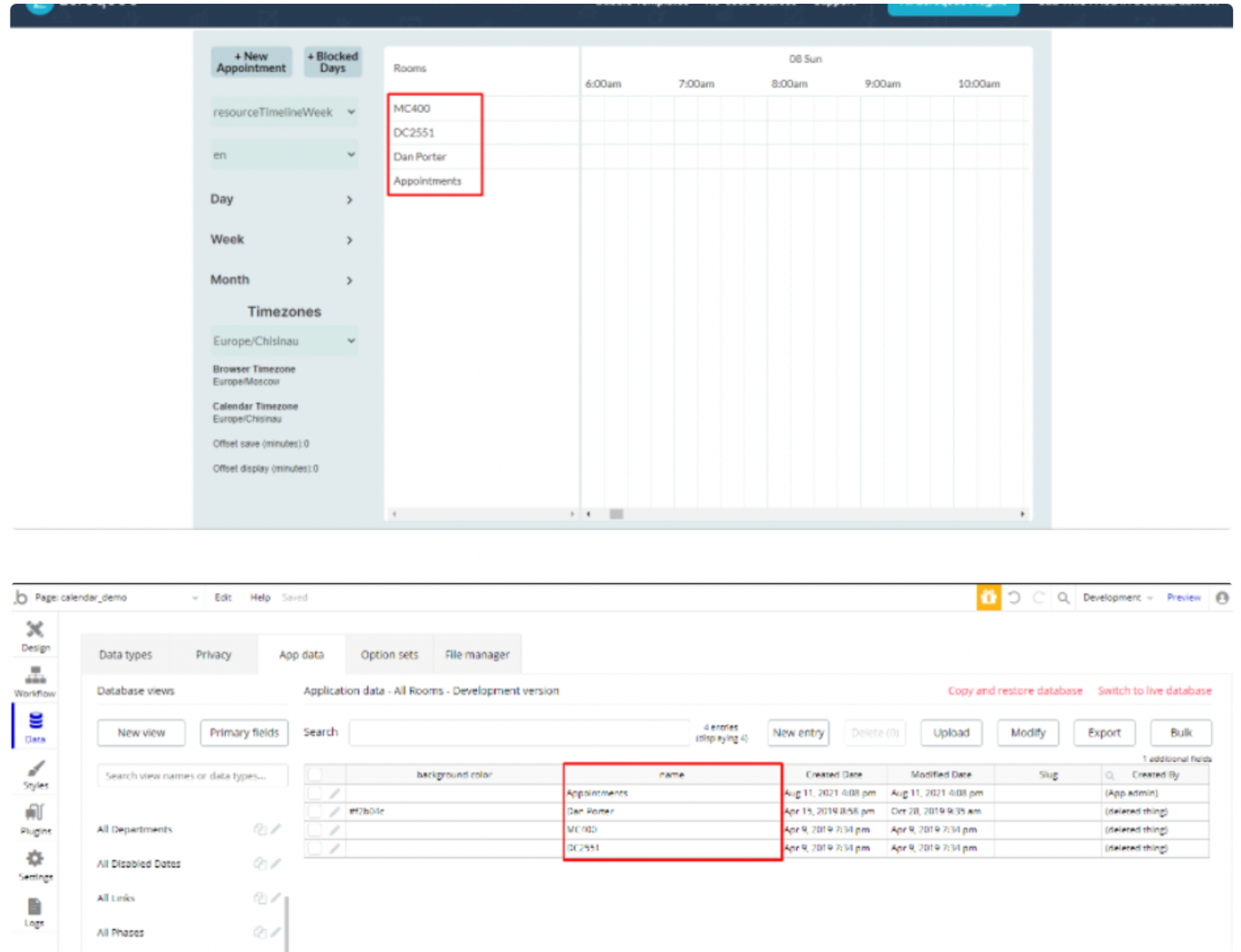
Resource label - Title of resource column

Res. order field - field for ordering resources. it can be a title or ID
Order Res. ascending - yes/no. Order resource ascending
States
modified event's new resource - in this state is stored a new resource of the modified event.
selected_resource - in this state is stored resource of a new event is created by selection in the calendar.
Get Events or Resources from API
In order to use a third-party API as event a number of rules must be followed. The screenshots show examples of correct data from the endpoint. If your endpoint provides all the required fields, you can use it as a data source.


Troubleshooting
If you are faced with a problem that the calendar does not load and gives errors related to time zones, try to put these lines in the application header.
javascript<script src="//dd7tel2830j4w.cloudfront.net/f1555755107112x324873268391724600/moment-timezone-with-data-1970-2030.min.js"></script>

Preventing double events
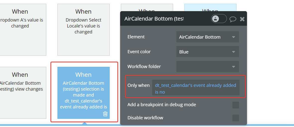
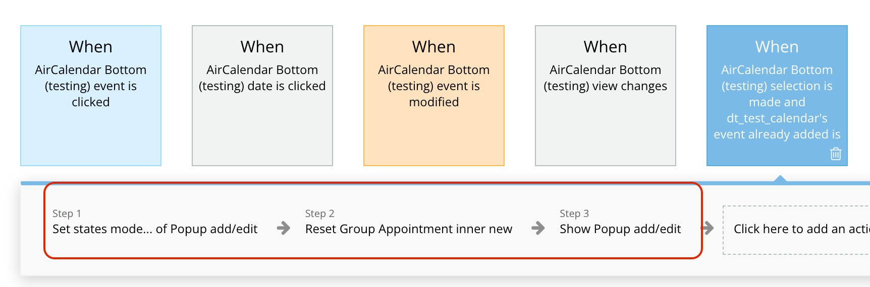
1. Start by creating a custom state on your page, and name it something like "Event Already Added." Then, add an event named "Bottom Event Already Added." Configure this event to display an alert and set the custom state to "yes.”
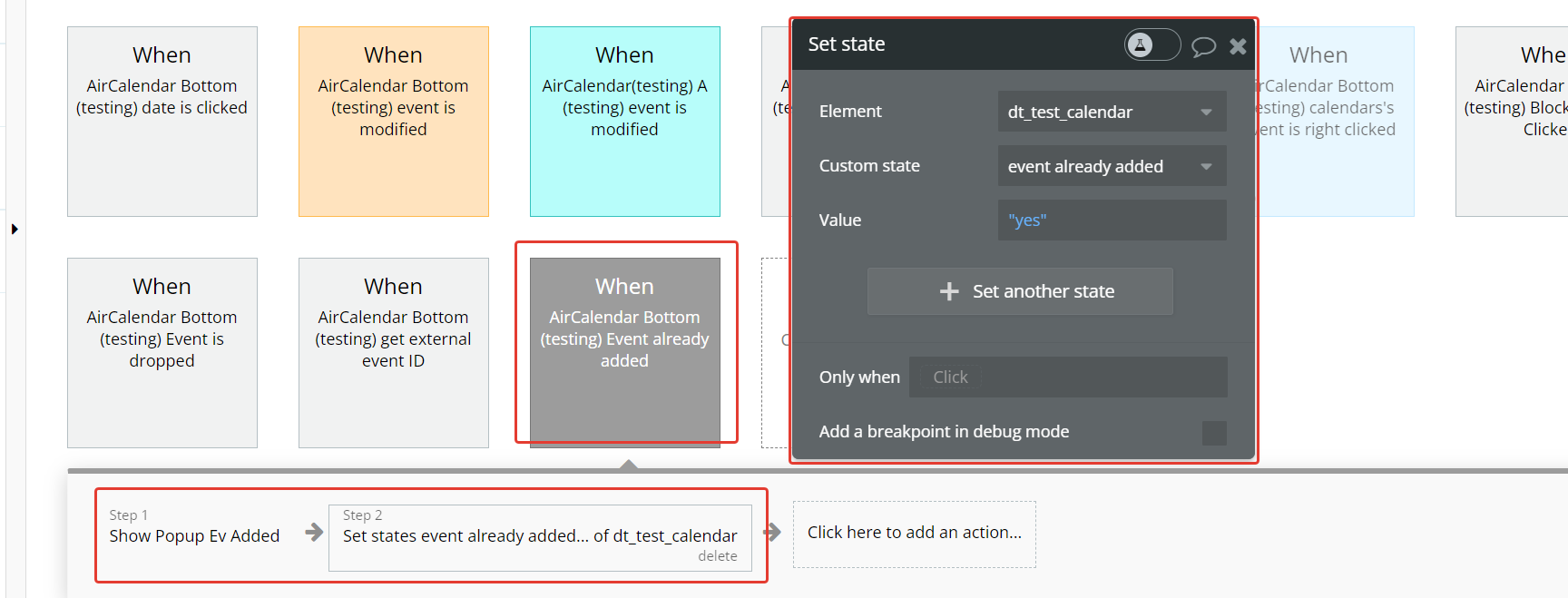
- After the alert is closed, implement a step to set the custom state back to "false." This ensures that the state reflects the correct status after the alert is dismissed.
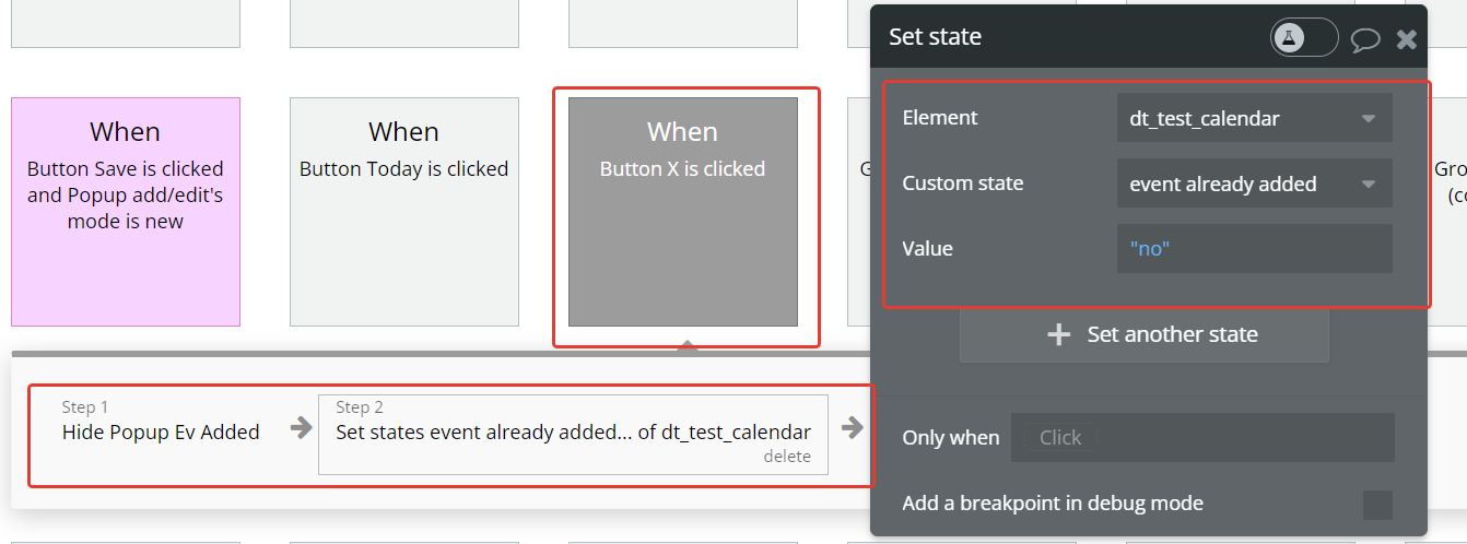
- Whenever a date is clicked, introduce a conditional check: if the state value is "no," initiate a workflow to create a new event. This condition ensures that a new event is only created when the state indicates that an event hasn't been added yet.
Use external events
1. Create a separate database for external events.

- In the element settings, turn on the checkbox "Dragging external events”
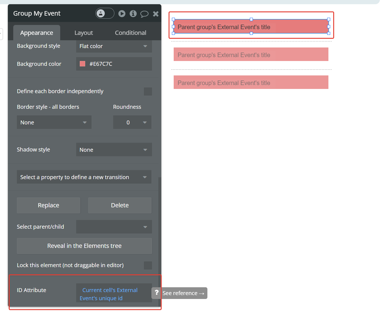
- Create RG for our external events and assign an ID, create a group in each cell of the RG - this is the draggable element.
- The group in the cell must specify the ID equal to the unique ID from the database.
- Setting up action ‘Use external events’.
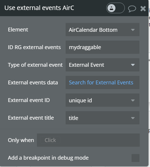
- When the action is called, the elements in the RG become draggable, when moving to the calendar, event "External event is dropped" is triggered, in which a new event is added to the main event database. Calling the action again disables external draggable elements.
Using recurring events
- In the event database, create a separate field (yes/no) to indicate whether the event is recurring.

- In the event database, create a separate field (list of texts) to add the days of the week on which this event should be repeated. The names of the days of the week are indicated only in English.
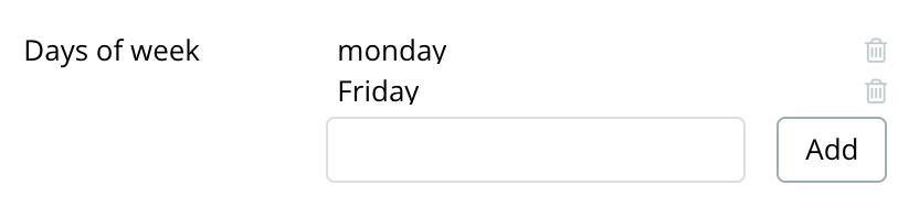
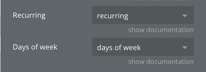
- In the plugin element settings, specify the fields added in paragraphs 1 and 2.
- Specify the date and time of the start and end of the recurring events. If the event is recurring, the dates will determine when the recurring events begin and end. In this case, time determines the duration of each of the recurring events.


- In this user case, we received recurring events from 10/09 to 11/20 every Monday and Thursday.
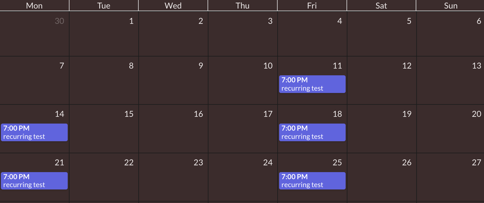
Each event starts at 7:00 pm and ends at 9:59 pm
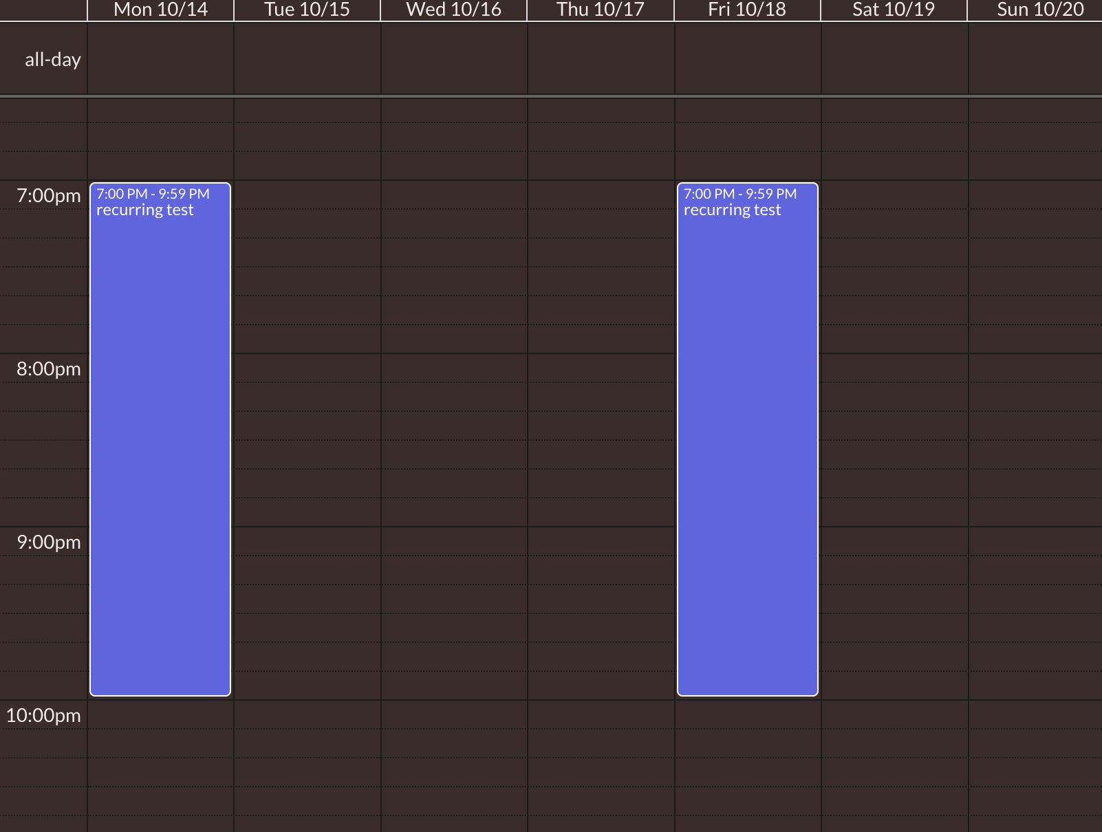
Calendar views
Air Calendar provides 9 different views plus two custom views that you can define yourself. Below are the different views, actions, triggers, and states.
DayGrid view
A DayGrid view is a view with one or more columns, each representing a day. The pre-configured DayGrid views are dayGridDay and dayGridWeek.
dayGridDay: A view with one column listing the available events in the day. By default, it shows one day but you can create a custom view dayGridDay view to show any number of days. e.g. a 3-day dayGridDay.

dayGridWeek: A view with two or more columns each representing a day. By default, this will show a one-week view. But you can create a custom dayGridWeek view to show any number of weeks, e.g. a 2-week dayGridWeek.

dayGridMonth: This is a monthly view that displays the current month’s days, and usually a few days of the previous and next months, in a table-like format. There is no custom dayGridMonth view.

TimeGrid view
A TimeGrid view displays one or more horizontal days as well as an axis of time, usually midnight to midnight, on the vertical axis. The two predefined TimeGrid views are the timeGridWeek and timeGridDay views.
timeGridDay: A view that displays horizontal days with a time axis. You can create a custom timeGridDay view with a different number of days.

timeGridWeek: A view that displays horizontal days with a time axis. You can create a custom timeGridWeek view with a different number of weeks.

List view
A list view displays events in a simple vertical list for a specific interval of time.
There are 4 preset list views: listDay, listWeek, listMonth, and listYear.
You can create a custom list view that displays a different number of days, weeks, months, or years.

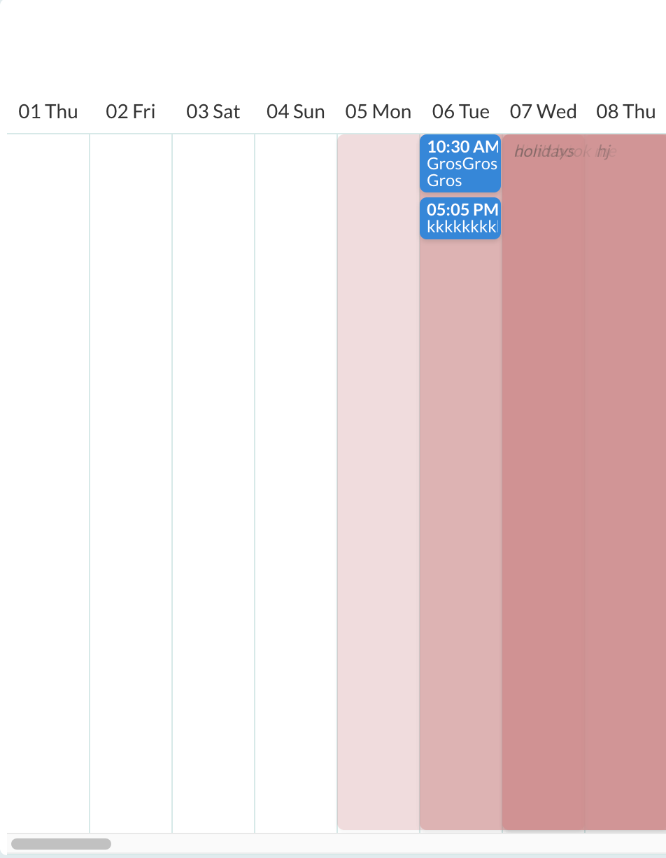
Timeline View
The following pre-configured timeline views are available: timelineDay, timelineWeek.
If you need a different duration or views (months, years), make a custom view with type
'timeline':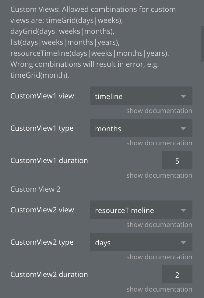
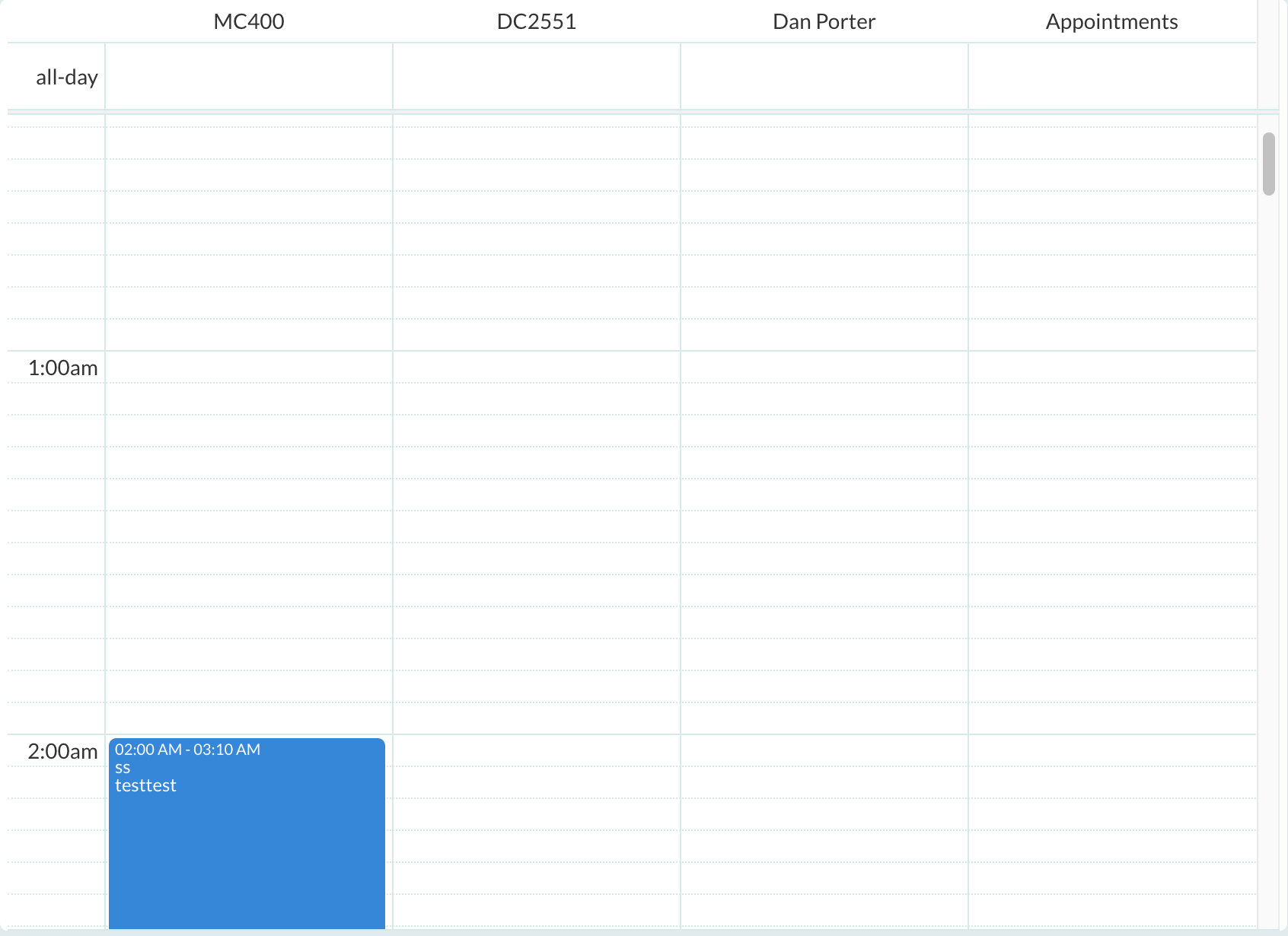
ResourceTimeGrid View
TimeGrid view and DayGrid view with the ability to display resources as columns.
ResourceTimeline View
The following pre-configured timeline views are available: ResourceTimelineDay, ResourceTimelineWeek.
If you need a different duration, make a custom view with type
'resourceTimeline'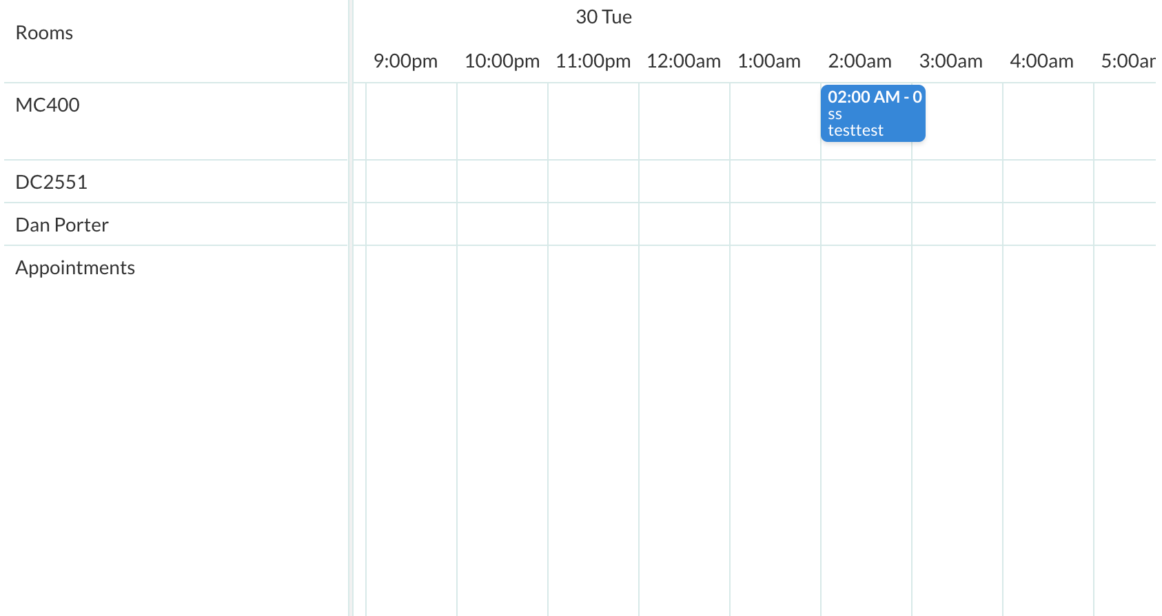

Changelogs
Update 30.09.26 - Version 2.145.0
- Added 1-minute Slot duration option & fixed crash with empty Slot duration
Update 03.08.26 - Version 2.144.0
- Add "Fit height to content" support - calendar height follows the current view.
Update 29.05.26 - Version 2.143.0
- Updated timezone library to version 0.5.48.
Update 13.03.26 - Version 2.142.0
- fixed multiple use of styles.
Update 06.03.26 - Version 2.141.0
- Bubble Plugin Page Update (Category).
Update 18.12.25 - Version 2.140.0
- updated 'date to display at first'.
Update 01.12.25 - Version 2.139.0
- Bubble Plugin Page Update (Description).
Update 12.11.25 - Version 2.138.0
- Patched Year view minDate bug.
Update 29.10.25 - Version 2.137.0
- Bubble Plugin Page Update (Description).
Update 29.10.25 - Version 2.136.0
- Bubble Plugin Page Update (Recommendations).
Update 17.09.25 - Version 2.135.0
- fixed event 'blocked event clicked'.
Update 26.08.25 - Version 2.134.0
- fixed fields 'Calendar background color' and 'Calendar text color'.
Update 21.08.25 - Version 2.133.0
- Bubble Plugin Page Update (Logo).
Update 20.08.25 - Version 2.132.0
- The issue with event colors has been fixed..
Update 07.08.25 - Version 2.131.0
- Migrate plugin editor to the latest version.
Update 29.07.25 - Version 2.130.0
- updated scripts.
Update 02.07.25 - Version 2.129.0
- Bubble Plugin Page Update (Logo).
Update 19.06.25 - Version 2.128.0
- Fixed state 'hovered_event'.
Update 11.06.25 - Version 2.127.0
- Fixed "calendars's event is right clicked" event.
Update 10.06.25 - Version 2.126.0
- Marketing update (minor change).
Update 20.05.25 - Version 2.125.0
- Minor update (Marketing update).
Update 09.04.25 - Version 2.124.0
- Fixed updating "current event" and "modified event" states for external databases, fixed 'blocked event'.
Update 20.03.25 - Version 2.123.0
- Added 'multiMonthYear color' field.
Update 12.03.25 - Version 2.122.0
- Added event 'Event overlap blocked'.
Update 05.02.25 - Version 2.121.0
- Internal update.
Update 28.01.25 - Version 2.120.0
- Added field 'Current day cells color'.
Update 15.01.25 - Version 2.119.0
- Updated moment.js.
Update 09.01.25 - Version 2.118.0
- Fixed styles and removed field "Event display type".
Update 03.12.24 - Version 2.117.0
- Added "Event limit fit" field.
Update 28.11.24 - Version 2.115.0
- Fixed custom views displaying dates.
Update 27.11.24 - Version 2.114.0
- Updated duration of recurring events, removing default popup when moving events.
Update 20.11.24 - Version 2.113.0
- Fixed 'multiMonthYear' view mode.
Update 14.11.24 - Version 2.112.0
- Minor update (Marketing update).
Update 11.11.24 - Version 2.111.0
- Fixed adding calendar events for v6.1.15 and added multiple calendars ids option.
Update 06.11.24 - Version 2.110.0
- Minor update (Marketing update).
Update 31.10.24 - Version 2.109.0
- Fixed event time display in 'timegrid' mode.
Update 28.10.24 - Version 2.108.0
- Added 'multiMonthYear' view mode.
Update 18.10.24 - Version 2.107.0
- Minor update (Marketing update).
Update 14.10.24 - Version 2.106.0
- Minor fixes.
Update 08.10.24 - Version 2.105.0
- Updated "Use external events" action & "Selected end date" state.
Update 13.09.24 - Version 2.104.0
- Fixed "document.write()" console warn.
Update 09.09.24 - Version 2.103.0
- Optimization of the plugin for the new version library 6.1.15.
Update 28.08.24 - Version 2.102.0
- Minor update (Marketing update).
Update 26.08.24 - Version 2.101.0
- Upgraded the plugin library version to v.6.1.15.
Update 30.07.24 - Version 2.100.0
- Added event 'calendar is loaded'.
Update 16.07.24 - Version 2.99.0
- Minor update (Marketing update).
Update 28.06.24 - Version 2.98.0
- Updated demo/service links.
Update 13.06.24 - Version 2.97.0
- Added field 'Show events end time", updated states "view's current date".
Update 06.06.24 - Version 2.96.0
- Minor update.
Update 30.05.24 - Version 2.95.0
- Updated 'Event limit (month view)' field.
Update 28.05.24 - Version 2.94.0
- Fixed "resourceTimeline" views - date click bug.
Update 21.05.24 - Version 2.93.0
- Owner's timezone field made dynamic
Set a time zone from the provided timezones by the plugin’s state
“timezones” .Update 21.05.24 - Version 2.92.0
- Added "Resource group name" field.
Update 17.05.24 - Version 2.91.0
- Restored 'Selected Day(s) color' field.
Update 26.04.24 - Version 2.90.0
- updated description.
Update 25.04.24 - Version 2.89.0
- added state 'clicked resource id'.
Update 15.04.24 - Version 2.88.0
- added new values to 'Slot duration' and 'Slot Label interval', updated the time format.
Update 05.04.24 - Version 2.87.0
- removed unused states.
Update 04.04.24 - Version 2.86.0
- updated description.
Update 02.04.24 - Version 2.85.0
- Added "Recurring Events" functionality.
Update 29.03.24 - Version 2.84.0
- Fixed calendar version conflict.
Update 12.03.24 - Version 2.83.0
- Use external events.
Update 07.03.24 - Version 2.82.0
- Added field 'Color time indicator'.
Update 04.03.24 - Version 2.81.0
- Added checkbox 'Clickable resource', state 'clicked resource name'.
Update 27.02.24 - Version 2.80.0
- minor fixes.
Update 14.02.24 - Version 2.79.0
- Added field "Disable adding events", event 'Event already added'.
Update 12.02.24 - Version 2.78.0
- Added dropdown 'Current time'.
Update 31.01.24 - Version 2.77.0
- Added 'Dragging external events' checkbox.
Update 29.01.24 - Version 2.76.0
- updated resource Timeline modes and current time.
Update 24.01.24 - Version 2.75.0
- updated description.
Update 17.01.24 - Version 2.74.0
- minor fixes.
Update 16.01.24 - Version 2.73.0
- updated navlinks in "ResourceTimeline" modes.
Update 27.12.23 - Version 2.72.0
- Languages library update.
Update 27.12.23 - Version 2.71.0
- updated description.
Update 25.12.23 - Version 2.70.0
- updated description.
Update 22.12.23 - Version 2.69.0
- fixed timezone.
Update 19.12.23 - Version 2.68.0
- updated description.
Update 14.12.23 - Version 2.67.0
- timezone updated.
Update 07.12.23 - Version 2.66.0
- updated display of navlinks and date range title.
Update 01.12.23 - Version 2.65.0
- Added ability to use list in "event resource field" field.
Update 27.11.23 - Version 2.64.0
- Fixed calendar version conflict.
Update 15.11.23 - Version 2.63.0
- Fixed Drag-and-drop effect.
Update 01.11.23 - Version 2.62.0
- Added tooltip for events, fixed date format in the header.
Update 19.10.23 - Version 2.61.0
- Updated description.
Update 03.10.23 - Version 2.60.0
- Added possibility to change the day header format.
Update 03.10.23 - Version 2.59.0
- updated description.
Update 28.09.23 - Version 2.58.0
- Fixed the display of content in event.
Update 18.09.23 - Version 2.57.0
- updated description.
Update 12.09.23 - Version 2.56.0
- minor updates.
Update 11.09.23 - Version 2.55.0
- Added field 'Enable Header Borders'.
Update 02.08.23 - Version 2.54.0
- Fixed "Allow dragging between resources" field and minor fixes.
Update 19.07.23 - Version 2.53.0
- minor fixes.
Update 11.07.23 - Version 2.52.0
- updated description.
Update 28.06.23 - Version 2.51.0
- Added "resource Time Grid" mode to "Custom View 1(2)" fields.
Update 22.06.23 - Version 2.50.0
- updated the description.
Update 21.06.23 - Version 2.49.0
- Minor fixes.
Update 13.06.23 - Version 2.48.0
- Fixed CSS to the "AirCalendar" element..
Update 24.02.23 - Version 2.47.0
- minor fixes.
Update 23.02.23 - Version 2.46.0
- deleted the icons.
Update 22.02.23 - Version 2.45.0
- updated the description.
Update 02.02.23 - Version 2.44.0
- Updated description.
Update 20.01.23 - Version 2.43.0
- Updated description.
Update 10.01.23 - Version 2.42.0
- minor fixes.
Update 20.12.22 - Version 2.41.0
- Fixed "Title has html content" option.
Update 26.10.22 - Version 2.40.0
- changed "background event field" to "blocked event field".
Update 23.10.22 - Version 2.39.0
- Deprecated "eventResize".
Update 16.10.22 - Version 2.38.0
- minor fixies.
Update 13.10.22 - Version 2.37.0
- Updated description.
Update 03.10.22 - Version 2.36.0
- minor fixes.
Update 28.09.22 - Version 2.35.0
- adapted to the new responsive engine.
Update 19.09.22 - Version 2.34.0
- Adjusted common part.
Update 29.08.22 - Version 2.33.0
- Updated common part.
Update 18.08.22 - Version 2.32.0
- Added dynamic change option possibility.
Update 09.08.22 - Version 2.31.0
- Removed “Hide time axis” field.
Update 22.07.22 - Version 2.30.0
- minor changes.
Update 07.07.22 - Version 2.29.0
- Added possibility to activate displayed weekends separately
🛠️ Fixed displaying of current time indicator.
Update 22.06.22 - Version 2.28.0
- Updated description.
Update 09.05.22 - Version 2.27.0
- Added text in description.
Update 14.02.22 - Version 2.26.0
- Added posibility to change first day of the week and width of resource column


Update 20.01.22 - Version 2.25.0
- Added action to set the max number of displayed events

Update 20.01.22 - Version 2.24.0
- updated title.
Update 02.12.21 - Version 2.23.0
- Fixed display time of "Now Indicator".
Update 04.11.21 - Version 2.22.0
- fixed error in uploading headers.
Update 01.10.21 - Version 2.21.0
- Full Calendar updated to 5.9.0
⚒fixed: current timezone display. On the data switch, the hour position is kept.
⚒fixed: part of scripts are transferred to the global header.
➕ updated: Full Calendar library version updated to 5.9.0
Update 13.09.21 - Version 2.20.0
- reworked additional libraries.
Update 29.08.21 - Version 2.19.0
- Fix in resource ordering.
Update 13.08.21 - Version 2.18.0
- Fixed: "not ready" error, military time issue, resource sorting. Added: event "blocked event clicked", action "show/hide weekends".
What was done:
🛠fixed: "not ready" error
🛠fixed: military time issue
🛠fixed: resource sorting
➕ added: event "blocked event clicked",
➕ added: action "show/hide weekends".
Update 28.07.21 - Version 2.17.0
- Updated description.
Update 12.07.21 - Version 2.16.0
- Added the possibility to use dynamic colors from DB.
➕ added possibility to use dynamic colors in related fields.

The colors in DB should be indicated in HEX format, for example #DB2F1F
Update 09.06.21 - Version 2.15.0
- Added timezone support
What was done:
➕ added timezone support. Added a field with the time zone of the page owner for the correct saving of events. It is needed to specify the page owner time zone in this filed in order to use this feature.

The "timezone offset display seconds" and "timezone offset save seconds" states the difference between the owner's time zone and the current calendar time zone.
"Timezone offset display seconds" - used for correct time display.
"Timezone offset save seconds" - used to save time correctly.


❗
IMPORTANT: We strongly recommend making a backup of the database in order to avoid data loss while configuring the updated plugin functionality. It is also necessary to remove and then install the plugin element so that the latest update takes effect and no errors appear. Please be aware that removing the plugin element will impact the previous element settings (fields, checkboxes, etc.). Therefore, before reinstalling the plugin element please make sure you remember all the plugin element settings.
:::
Update 03.06.21 - Version 2.14.0
- dayGridView rendering fix
What was done:
🛠fixed: dayGridView rendering
Update 31.05.21 - Version 2.13.0
- Fixed issue with date field.
Update 22.05.21 - Version 2.12.0
- Fixed plugin element settings
What was done:
🛠fixed: day header render
🛠fixed: error when the background color of the event is not changed
🛠fixed: displaying of event content then end time is not set
Update 07.05.21 - Version 2.11.0
- Updated icon.
Update 30.04.21 - Version 2.10.0
- Roll back to previous version.
Update 29.04.21 - Version 2.9.0
- Rollback code to v2.0. Fixed minor issues. Added action "Paste from clipboard" .
Update 28.04.21 - Version 2.8.0
- HTML is customized to be as close as possible to the design from Seanhoots. Added getUTCFullYear error fix.
What was done:
🛠fixed: getUTCFullYear error when the Remember view checkbox is activated
🛠fixed: calendar design was customized as close as possible to the Seanhoots (old versions)
🛠fixed: removed outer borders from the week view
➕added: Google Calendar events functionality
➕added: the "Today" circle
Update 22.04.21 - Version 2.7.0
- Fixed any issues after updating the library. Added the possibility to import events from Google Calendar and the possibility to change touch delay for mobile devices.
What was done:
🛠 fixed: colors changed in settings now work
🛠 fixed: information message in the left corner is removed
🛠 fixed: before the update, the color of the circle in the list view was taken by the color of the borders. now, if no border color is assigned to the event, the default color of the event will be used.
➕ added: possibility to import events from google calendar. Instruction on how to get API key and calendar id: https://fullcalendar.io/docs/google-calendar.
➕ added: possibility to change press delay for mobile devices.
Update 19.04.21 - Version 2.6.0
- Added a possibility to change the event display type. Fixed word-wrap in HTML titles. Now users have the possibility to change the view type of an event from four types:
- block ( it seems to display type in older versions of the calendar),
- background ( is used for "blocked" events on our demo page),
- inverse-background (new view type. Like'background', but fills the reverse space)
- list-item (new view type added in v5 of Fullcalendar and used by default ).
The default view is set to 'block' because this view was used in older versions. The type can be changed in the same way as the title or colour of the event.
Update 13.04.21 - Version 2.5.0
- fixed: HTML in header element is now rendered not as text fixed: if the duration is 30 minutes or less, the title is di.
Update 12.04.21 - Version 2.4.0
- Minor fixes.
Update 12.04.21 - Version 2.3.0
- Updated description.
Update 10.04.21 - Version 2.2.0
- Updated Library 5.6.0 and bugs fixed.
Update 09.12.19 - Version 2.1.2
- Added Render action. Added spinner when calendar is temp. disabled. Bug fix when scheduler is disabled..
Update 02.11.19 - Version 2.1.1
- Re-arranged resource and event id fields on the property editor.
Update 02.11.19 - Version 2.1.0
- Added event id field (enabling support for google calendar). No GPL license needed if Scheduler is not enabled.
Update 30.10.19 - Version 2.0.0
- Added Scheduler (timeline and resource views). Allow select overlap option. Allow html in event title. Added new field for html content. Added ability to temporary freeze calendar after drag/resize. Added action for freezing calendar for certain number of seconds. Bug fixes for event editable in conditions. Removed 'local' as default timezone.
Update 01.05.19 - Version 1.1.1
- Initial date optional field. Updated library files which fixes bug of calendar sometimes not showing correctly..
Update 30.04.19 - Version 1.1.0
- Added new event specific properties (resize, dragging, overlap).
Update 26.04.19 - Version 1.0.0
- Initial public release.
Update 22.04.19 - Version 0.6.0
- Added more features.
Update 17.04.19 - Version 0.5.0
- Added event limit option..
Update 16.04.19 - Version 0.4.0
- Exposed new state "more linked clicked date".
Update 09.04.19 - Version 0.3.0
- New features.
Update 07.04.19 - Version 0.2.0
- Add allDayDefault.
Update 07.04.19 - Version 0.1.0
- Feature update.
Update 07.04.19 - Version 0.0.1
- Initial Beta release.