
✅
Link to plugin page: https://zeroqode.com/plugin/datatables-1550378900350x360527788313673700
Demo to preview the plugin:
✅
Introduction
The Excel Table / Data Grid plugin for Bubble applications allows users to create, edit, and display data in a spreadsheet-like interface within their Bubble apps. It supports features like data export in PDF or CSV format, advanced filtering, sorting, and extensive customization options. The plugin offers a familiar spreadsheet environment with responsive design capabilities, making it ideal for apps requiring robust data handling and presentation.
Key features include:
- Create and display Excel-like data tables with customizable columns and rows
- Sort and filter table data according to various criteria
- Export data in PDF or CSV format with customizable settings
- Apply conditional formatting and styling options
- Multi-language support with 50+ languages
- Responsive design features for optimal display on different devices
- Row and column selection capabilities
- Advanced pagination and search functionality
Prerequisites
No external API keys or accounts are required for this plugin. The plugin includes all necessary libraries and dependencies for seamless integration with your Bubble application. Simply install the plugin and start using it immediately.

How to setup
Setting up the Excel Table / Data / Grid plugin is straightforward:
- Install the Plugin: Add the plugin to your Bubble application from the plugin marketplace
- Add the Table Element: Drag the "Table" element from the plugin onto your page
- Configure Basic Settings: Set up the table language, pagination options, and basic styling
- Populate Data: Use the "Add" action to populate your table with data in key-value format
- Customize Appearance: Configure colors, fonts, borders, and other visual elements to match your app design
- Set Export Options: Configure CSV and PDF export settings including filename and orientation
The plugin automatically handles all DataTables library dependencies, so no additional setup is required.
How to use this plugin
❗
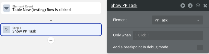
When the row is pressed, the Table Row event gets the unique id of that row. So doing a search for X: first item (in properties of the search we will use unique id= this row).
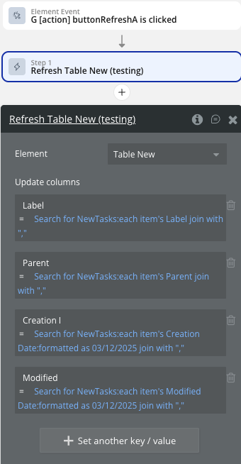
Refresh table after modifying the database
❗
IMPORTANT: You should use exactly the same number of columns (fields) search as in the initial add table event.
❗
WARNING: Just like with the Add Table event, for the Refresh Table event, when adding columns to the Table in the workflow in order to display the list of items correctly, add join with and "," at the end of the data item.
Plugin Element - Table
The plugin contains a powerful Table visual element that should be used on a page to display and manage data in a spreadsheet-like interface.
Fields
Title | Description | Type |
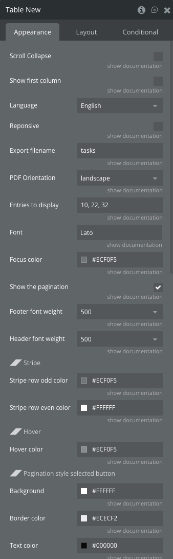
Scroll Collapse | Determines how the scrollable body of the table behaves when the content doesn't fill the available space.
When set to true:
- If the table's content is shorter than the scrollable area, the scrollable body will collapse down to the height of the rows.
- This can create a more compact appearance when there are few rows, as it eliminates unnecessary empty space.
When set to false:
- The scrollable body will maintain its full height regardless of the content's length.
- This can be useful when you want to maintain a consistent layout regardless of the number of rows.
| Checkbox (yes/no) |
Show first column | Controls the visibility of the first column in the table.
When set to true:
- The first column of the table will be hidden from view.
- This can be useful when the first column contains data that you don't want to display initially, such as ID numbers or other internal identifiers.
When set to false:
- All columns, including the first one, will be visible. | Checkbox (yes/no) |
Language | Available options: Afrikaans, Albanian, Amharic, Arabic, Armenian, Azerbaijan, Bangla, Basque, Belarusian, Catalan, Chinese-traditional, Chinese, Croatian, Czech, Danish, English, Estonian, Filipino, Finnish, French, Galician, Georgian, German, Greek, Gujarati, Hebrew, Hindi, Hungarian, Icelandic, Indonesian-Alternative, Indonesian, Irish, Italian, Japanese, Kazakh, Korean, Kyrgyz, Latvian, Lithuanian, Macedonian, Malay, Nepali, Norwegian-Bokmal, Norwegian-Nynorsk, Pashto, Polish, Portuguese-Brasil, Portuguese, Romanian, Russian, Serbian, Sinhala, Slovak, Slovenian, Spanish, Swahili, Swedish, Tamil, Telugu, Thai, Turkish, Ukrainian, Urdu, Uzbek, Vietnamese, Welsh | Dropdown |
Reponsive | Added option automatically hide columns When a column does not fit on the page, it is hidden. The last column in the table being used as the show / hide control for the row details. | Checkbox (yes/no) |
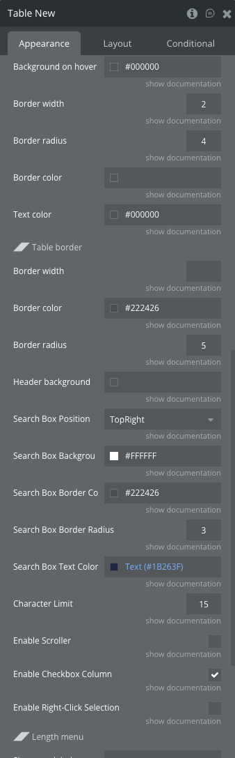
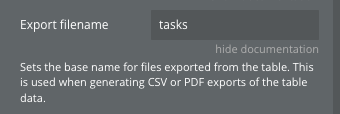
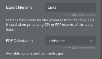
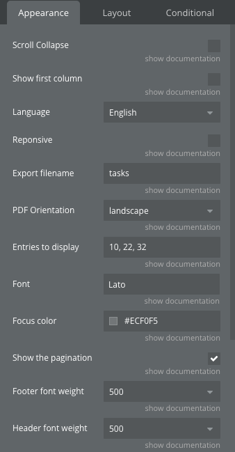
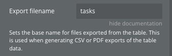
Export filename | Sets the base name for files exported from the table. This is used when generating CSV or PDF exports of the table data. | Text (optional) |
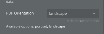
PDF Orientation | Available options: portrait, landscape | Dropdown |
Entries to display | List of numbers separated by a comma | Text |
Font | Font to be used in the table (type in the name) (OPTIONAL) | Text (optional) |
Focus color | Color in HEX format to be used for border when table input elements are focused (OPTIONAL) | Color (optional) |
Show the pagination | Enable or disable table pagination. | Checkbox (yes/no) |
Footer font weight | Available options: bold, bolder, lighter, normal, 100, 200, 300, 400, 500, 600, 700, 800, 900 | Dropdown |
Header font weight | Available options: bold, bolder, lighter, normal, 100, 200, 300, 400, 500, 600, 700, 800, 900 | Dropdown |
◢◤ Stripe | ||
Stripe row odd color | Sets the background color for odd-numbered rows (1st, 3rd, 5th, etc.) | Color (optional) |
Stripe row even color | Sets the background color for even-numbered rows (2nd, 4th, 6th, etc.). | Color (optional) |
◢◤ Hover | ||
Hover color | Sets the background color of a table row when the user hovers over it with their cursor. | Color (optional) |
◢◤ Pagination style selected button | ||
Background | The pagination_background property sets the background color of the active pagination button in the table's pagination controls. This helps to visually distinguish the current page from other available pages. | Color (optional) |
Border color | Sets the border color of the active pagination button in the table's pagination controls. This helps to further highlight and distinguish the current page from other available pages. | Color (optional) |
Text color | Sets the text color of the active pagination button in the table's pagination controls. | Color (optional) |
◢◤ Pagination style buttons | ||
Background on hover | Sets the background color of pagination buttons when a user hovers over them with their cursor. | Color (optional) |
Border width | Sets the border width of the buttons in the table's pagination controls. | Number (optional) |
Border radius | Sets the border radius of the buttons in the table's pagination controls. | Number (optional) |
Border color | Sets the border color of the buttons in the table's pagination controls. | Color (optional) |
Text color | Sets the text color of the buttons in the table's pagination controls. | Color (optional) |
◢◤ Table border | ||
Border width | Border for table and pagination element. | Number (optional) |
Border color | Sets the border color for the table | Color (optional) |
Border radius | Sets the border radius for the table | Number (optional) |
Header background | Color of table’s header background | Color (optional) |
Search Box Position | The position of the search box Available options: TopRight, TopLeft, BottomRight, BottomLeft | Dropdown |
Search Box Background | Search Box Background | Color (optional) |
Search Box Border Color | Search Box Border Color | Color (optional) |
Search Box Border Radius | Search Box Border Radius | Number (optional) |
Search Box Text Color | Search Box Text Color | Color (optional) |
Character Limit | Defines the maximum number of characters to display in a table cell before truncating the text and appending an ellipsis (…). This ensures that the table remains visually clean and prevents overflow of lengthy text. | Number (optional) |
Enable Scroller | Provides virtual scrolling capabilities for large data sets, allowing the table to load data dynamically as the user scrolls, which can significantly improve performance for tables with many rows. | Checkbox (yes/no) |
Enable Checkbox Column | Controls whether a checkbox column is added to the DataTable. When enabled, each row will have a checkbox in the first column, allowing users to select rows. This feature is useful for performing batch operations on selected rows. | Checkbox (yes/no) |
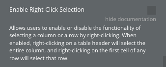
Enable Right-Click Selection | Allows users to enable or disable the functionality of selecting a column or a row by right-clicking. When enabled, right-clicking on a table header will select the entire column, and right-clicking on the first cell of any row will select that row. | Checkbox (yes/no) |
◢◤ Length menu | ||
Show row labels | When yes display: 50 rows, 20 rows, 10 rows, Show All Rows.
When False display: 50, 20, 10, Show All | Checkbox (yes/no) |
Entries Label Text | Custom text to display for the Length menu.
To use custom text write pattern: «left text _MENU_ right text».
The «_MENU_» is required.
By default «show _MENU_ entries" is displayed if English language is selected. | Text (optional) |
❗
Important:
Make sure that the font name is written correctly, ex: Arial, TahomaIf there are several dataTable elements on the page, you can set them for the different fonts.If the font is not one of the standard browser fonts or has not been used on the page before, the element will fall back to the standard font.
❗
Important:
If there are several dataTable elements on the page, only one focus color can be set.
Colors are set in HEX value, ex: #EB4034, #12A83D
Exposed States
Title | Description | Type |
Row | Published when a row is clicked, containing the first element of the clicked row's data(usually the ID) | Text |
Error | Published when an error occurs. It can have two possible values:
A message indicating which fields should have been filled if there's a mismatch between the number of added rows and the number of fields.
The message "Trigger "Add" action before using "Refresh"" if an exception is caught. | Text |
List of styles | List of CSS classes applied to the table element. | Text |
Selected Rows | Published when rows are selected or deselected, containing a list of IDs from the selected rows. | Text |
Selected columns | Published when columns are selected or deselected (if right-click selection is enabled), containing a list of selected column indexes. | Number |
Element Events
Title | Description |
Row is clicked | Triggered when a row is clicked. |
Error Happened | Triggered when an error occurs, either due to a mismatch in the number of fields or when an exception is caught. |
Row is selected | Triggered when rows are selected or deselected. |
Column is selected | Triggered when columns are selected or deselected (if right-click selection is enabled). |
ㅤ | ㅤ |
Element Actions
Add
Populates the table with initial data and sets up the table structure with columns and rows.
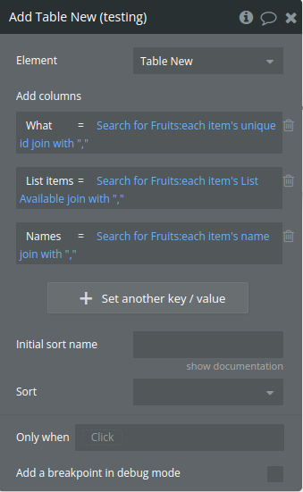
Title | Description | Type |
Add columns | An array from the Database with keys and values | List of key/value reperesenting text |
Initial sort name | Column title for the initial sorting of the table | Text (optional) |
Sort | Available options: Increasing, Decreasing | Dropdown (optional) |
Refresh
Updates the existing table with new data while preserving the table structure and formatting.
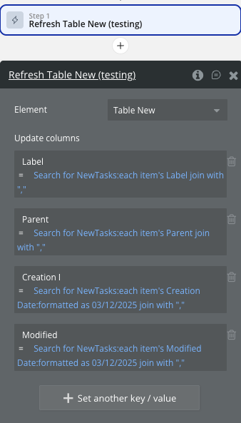
Title | Description | Type |
Update columns | An array from the Database with keys and values | List of key/value reperesenting text |
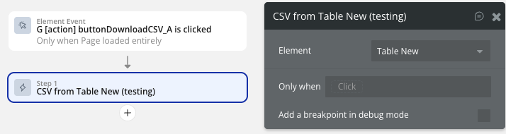
CSV from
Exports the current table data as a CSV file for download.
No additional fields required. Uses the filename set in the table properties.
PDF from
Exports the current table data as a PDF file for download.
No additional fields required. Uses the filename and orientation settings from table properties.
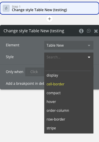
Change style
Dynamically changes the visual styling of the table by adding or removing CSS classes.
Title | Description | Type |
Style | Available options: display, cell-border, compact, hover, order-column, row-border, stripe | Text |
Workflow example
Here are some basic workflow examples to get you started with the Excel Table / Data / Grid plugin:
Basic Table Setup
- Add the Table element to your page
- Set up the basic properties like language, pagination, and styling
- Create a workflow to populate the table using the "Add" action
❗
IMPORTANT: Initialise the plugin element only with the "Page is loaded" event. Use the "Add" action.
❗
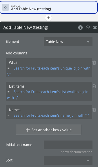
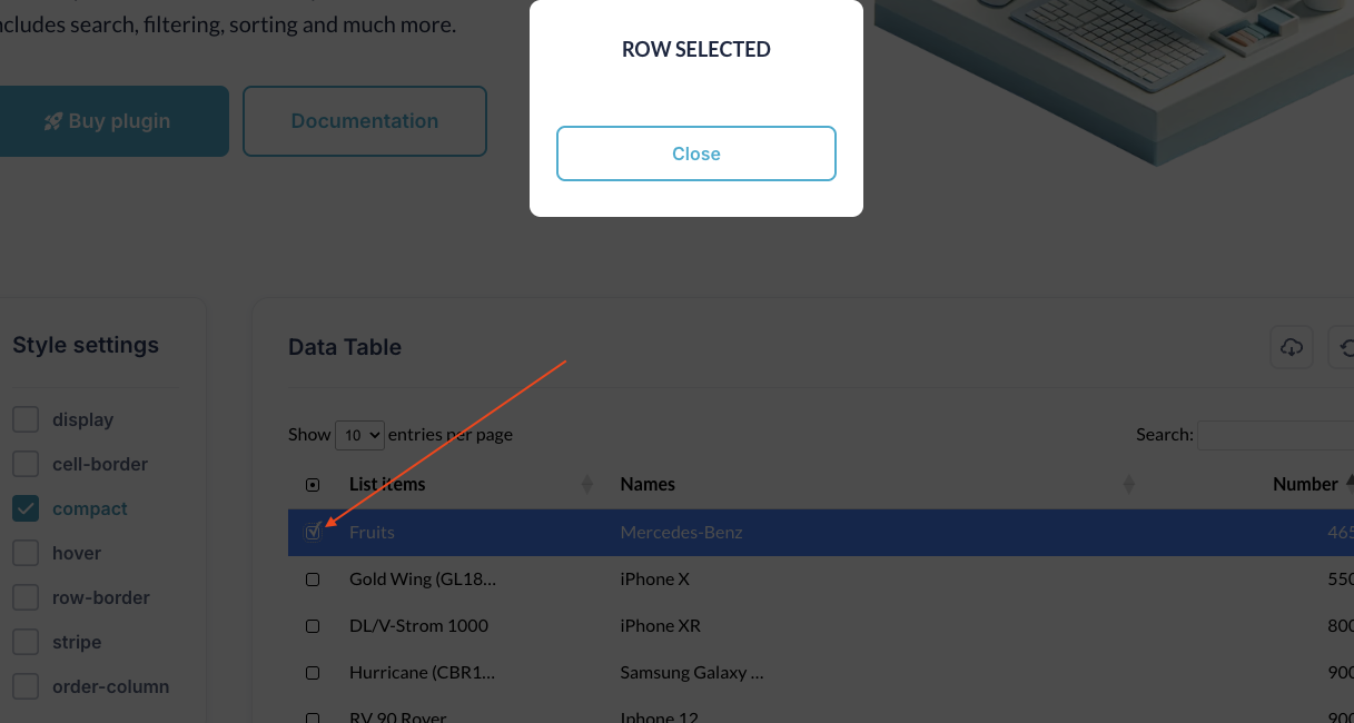
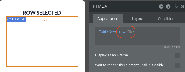
In order to display the list of items correctly, when adding columns to the Table in workflow, at the end of the data item add join with and ",". See the image below.
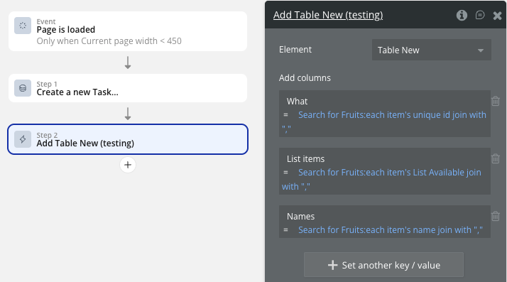
- Define your column structure using key-value pairs where keys are column headers
- Provide data for each column as comma-separated values in the value field
- Set initial sorting if needed
❗
IMPORTANT: Date sorting is available only if the date is formatted as yyyy/mm/dd or yy/mm/dd
❗
IMPORTANT: uniqueID MUST be the first field ONLY IF you want to use an on-click event.
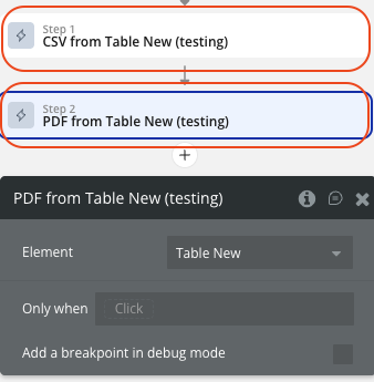
Export Functionality
- Add buttons for CSV and PDF export
- Set up workflows that trigger the "CSV from" or "PDF from" actions
- Configure the export filename in the table properties
- Set PDF orientation (portrait/landscape) as needed
- The files will automatically download to the user's device
Advanced Interactions
- Enable checkbox selection for bulk operations.
- Use the "Row is clicked" event to show detailed information
- Implement right-click selection for power users
- Use selected rows state to perform batch actions
- Apply conditional styling using the "Change style" action based on data conditions

Changelogs
Update 17.03.26 - Version 2.64.0
- added field 'Selected row color'.
Update 05.03.26 - Version 2.63.0
- added fields 'Font Size', 'Font Weight', 'Font Color'.
Update 02.03.26 - Version 2.62.0
- added the ability to dynamically change table styles.
Update 10.12.25 - Version 2.61.0
- updated to version 4.
Update 22.10.25 - Version 2.60.0
- Updated "Show all" option label to "All".
Update 03.10.25 - Version 2.59.0
- Added "Show row labels" and "Entries Label Text" fields.
Update 15.09.25 - Version 2.58.0
- Translation Fixes.
Update 08.07.25 - Version 2.57.0
- Bubble Plugin Page Update (Logo).
Update 12.06.25 - Version 2.56.0
- Marketing update (minor change).
Update 14.11.24 - Version 2.55.0
- Minor update (Marketing update).
Update 01.11.24 - Version 2.54.0
- Fixed "Refresh" action bug.
Update 28.10.24 - Version 2.53.0
- Minor update (Marketing update).
Update 22.07.24 - Version 2.52.0
- Minor update.
Update 27.06.24 - Version 2.51.0
- Added fields 'Initial sort name' and 'Sort' to action 'Add'.
Update 25.06.24 - Version 2.50.0
- Searchbox styles, clip text, lazy loading on scroll, checkbox column and focus group on right-click.
Update 19.06.24 - Version 2.49.0
- Minor update.
Update 10.06.24 - Version 2.48.0
- Updated demo/service links.
Update 09.04.24 - Version 2.47.0
- minor update.
Update 16.01.24 - Version 2.46.0
- Added "Responsive" option and style fields.
Update 19.10.23 - Version 2.45.0
- Updated description.
Update 18.09.23 - Version 2.44.0
- updated description.
Update 13.09.23 - Version 2.43.0
- minor updates.
Update 11.09.23 - Version 2.42.0
- updated plugin name.
Update 06.09.23 - Version 2.41.0
- Obfuscation.
Update 10.07.23 - Version 2.40.0
- updated description .
Update 26.06.23 - Version 2.39.0
- updated the service URL.
Update 17.06.23 - Version 2.38.0
- Updated the description .
Update 16.06.23 - Version 2.37.0
- Updated the description .
Update 21.02.23 - Version 2.36.0
- updated the description.
Update 02.02.23 - Version 2.35.0
- Updated description.
Update 20.01.23 - Version 2.34.0
- Updated description.
Update 19.09.22 - Version 2.33.0
- Adjusted common part.
Update 29.08.22 - Version 2.32.0
- Updated common part.
Update 09.03.22 - Version 2.31.0
- adjusted common part.
Update 28.07.21 - Version 2.30.0
- Updated description.
Update 19.07.21 - Version 2.29.0
- Updated icon.
Update 18.05.21 - Version 2.28.0
- Updated documentation.
Update 03.05.21 - Version 2.27.0
- Added new 'row-border' style and fixed input focus color.
Update 27.04.21 - Version 2.26.0
- Added new style features.
Update 15.03.21 - Version 2.25.0
- Updated name.
Update 15.03.21 - Version 2.24.0
- Updated description.
Update 13.03.21 - Version 2.23.0
- Updated plugin name.
Update 03.03.21 - Version 2.22.0
- Updated description.
Update 09.02.21 - Version 2.21.0
- Updated icon.
Update 08.02.21 - Version 2.20.0
- Updated Name.
Update 19.10.20 - Version 2.19.0
- Updated icon.
Update 18.09.20 - Version 2.18.0
- Added optional Font propriety in dataTable element.
❗
Important:
Make sure that the font name is written correctly, ex: Arial, TahomaIf there are several dataTable elements on the page, you can set them for the different fonts.If the font is not one of the standard browser fonts or has not been used on the page before, the element will fall back to the standard font.
- Added optional Focus color propriety in dataTable element for the Search input.
- Removed deprecated propriety fields from the dataTable element.
Update 10.09.20 - Version 2.17.0
- Removed unnecessary table elements from the page.
Update 19.08.20 - Version 2.16.0
- Fixed columns visibility when 'Show first column' checkbox is not selected.
Update 10.08.20 - Version 2.15.0
- Modified standard table styles
- Deprecated max height and auto-resize proprieties in dataTable element.
Update 22.07.20 - Version 2.14.0
- Fixed Refresh action.
Update 23.04.20 - Version 2.13.0
- Buttons styles fix.
Update 15.04.20 - Version 2.12.0
- Improvements and stability Update.
Update 17.02.20 - Version 2.11.0
- fixed bug with cvs function..
Update 29.01.20 - Version 2.10.0
- Add functions for recalculate parameters for cell.
Update 23.01.20 - Version 2.9.0
- Fix - improved dynamically resizing function. Thancks.
Update 06.01.20 - Version 2.8.0
- Desc: New field: Entries to display. New field: Use max height.
Update 13.12.19 - Version 2.7.0
- fixed some issues with styles.
Update 10.12.19 - Version 2.6.0
- Fixed plugin styles overwriting default bubble styles.
Update 07.10.19 - Version 2.5.0
- bug fix - no errors when fill first cells with blank content.
Update 26.08.19 - Version 2.4.0
- Fixed French language.
Update 01.03.19 - Version 2.3.0
- Minor improvements.
Update 17.02.19 - Version 2.2.0
- Transferred to Zeroqode.
Update 23.09.18 - Version 2.1.4
- Fixed minor bug that export error..
Update 23.09.18 - Version 2.1.3
- Update: 09/23/2018 –
- Now dataTable supports empty DB or empty searches.
- Changed Row selector to a drop-down
- Improved responsive layout settings
- Added new feature to table options “Scroll collapse”
Update 19.09.18 - Version 2.1.2
- Minor bugs on new design.
Update 19.09.18 - Version 2.1.1
- Updates on new table design.
Update 19.09.18 - Version 2.1.0
- New table design.
Update 15.09.18 - Version 2.0.3
- Added export options (CSV & PDF).
Update 06.09.18 - Version 2.0.2
- Bug fixes.
Update 30.08.18 - Version 2.0.1
- Support multiple datatables - Bug fixes.
Update 23.08.18 - Version 2.0.0
- BIG UPDATE -- BEFORE UPDATE READ DOCUMENTS OR THIS WILL CAUSE ERROR ON YOUR PAGE!!!!.
Update 14.08.18 - Version 1.0.4
- Fixed on-click bug..
Update 12.08.18 - Version 1.0.3
- Added +70 languages.
Update 11.08.18 - Version 1.0.2
- Uniqueid is not a must anymore..
Update 11.08.18 - Version 1.0.1
- Added on-click event.
Update 09.08.18 - Version 1.0.0
- Release.
Update 04.08.18 - Version 0.1.0
- Added update function.
Update 04.08.18 - Version 0.0.2
- update.
Update 04.08.18 - Version 0.0.1
- Release.