Link to the plugin page: https://zeroqode.com/plugin/dot-spinners-plugin-for-bubble-1739747593129x173672362312819360
Demo to preview the plugin:
Introduction
This Plugin allows you to add up to 14 different beautiful loading animations to your app, thereby enhancing the user experience.
Based upon https://github.com/nzbin/three-dots/blob/master/LICENSE via MIT license.

How to setup
- Add the Spinner Element to the Page
- In the Design tab, locate the Spinner element.
- Drag and drop the Spinner onto your page.

- Configure the Spinner Properties
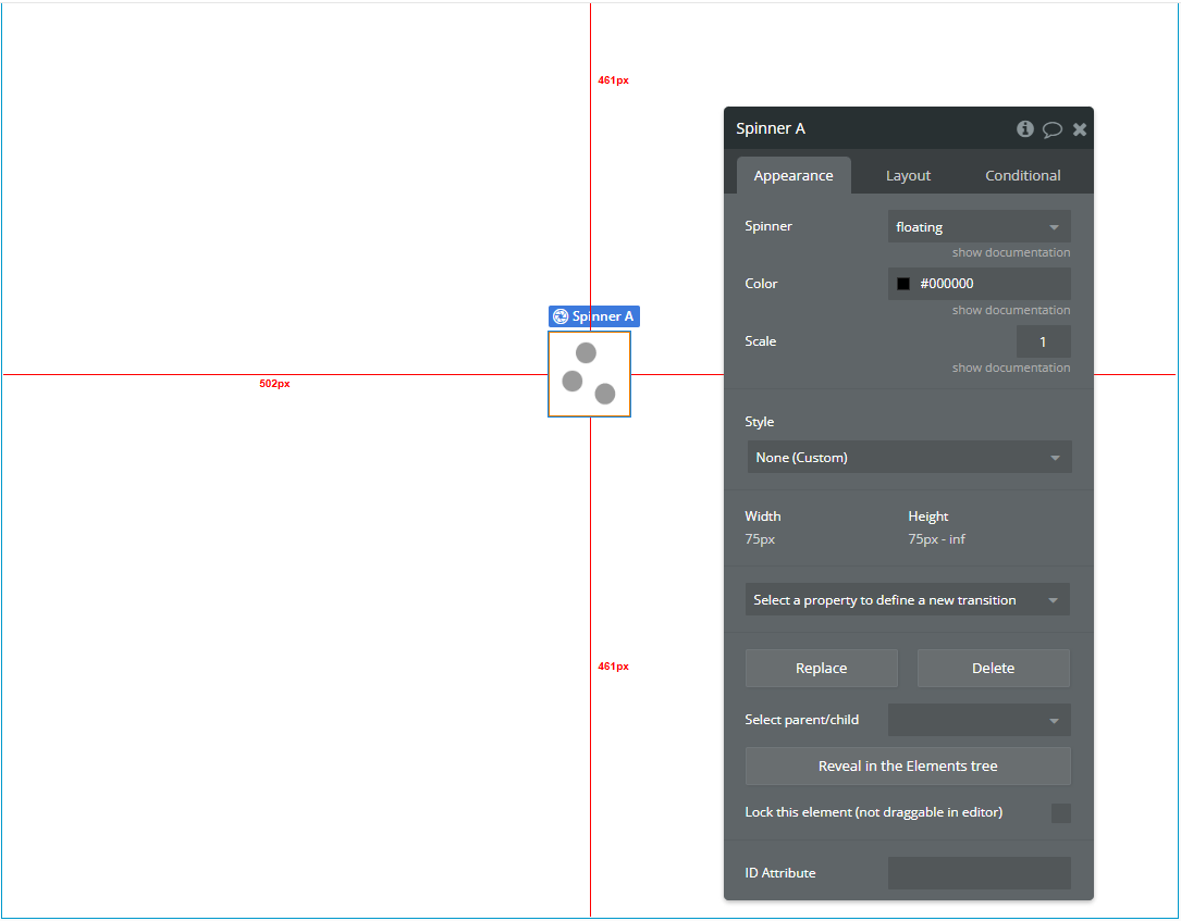
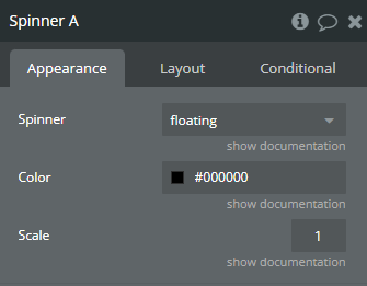
- Spinner: Select the spinner style from the dropdown list (e.g., dots, pulse, bounce, etc.).
- Color: Set the color of the dots using the color picker or hex code (e.g., #9880FF).
- Scale: Adjust the overall size of the spinner (e.g., 1 is default, 2 doubles the size, 0.5 reduces it).
Click on the Spinner element and adjust its properties:
- Control the Spinner via Workflows
- Example:
- Action 1: Show Spinner A
- Action 2: Run your process (API call, data loading, etc.)
- Action 3: Hide Spinner A
You can show or hide the spinner dynamically using workflows:
Event: When a button is clicked
Plugin Element Properties
Spinner

Fields:
Title | Description | Type |
Spinner | Specify the type of Spinner that you want . Available options: elastic, pulse, flashing, collision, revolution, carousel, typing, windmill, bricks, floating, fire, spin, falling, stretching | Dropdown |
Color | Spinners color | Color |
Scale | Spinner scale | Number |

