
Link to component page:
Introduction
Ink Transition Scroll Effect reveals an image through a hand-drawn ink-brush sprite animation when the component enters the viewport. A decorative frame is layered on top of the image and can be recolored to any value. The reveal is driven by a native
IntersectionObserver and a CSS @keyframes animation with steps() timing — no ScrollMagic, no GSAP, no external dependencies.Built with React + framer-motion (Framer’s bundled stack). The ink sprite, photo frame, and image are stacked as three layers; the sprite plays once per viewport entry (configurable) and unmasks the image as it sweeps across.
Based on Ryan Yu’s CodePen, ported to Framer with native browser APIs.
How to setup
- Drag onto canvas — the component inserts at its intrinsic size of
400 × 250(matches the original landscape1440:900frame aspect). For portrait, use250 × 400.
- Configure properties — set an
Image, pickFrameorientation (landscape / portrait), chooseFrame Color. Other defaults work out of the box.
- Preview — scroll the component into view. The ink animation plays once and stays revealed.
Component Properties
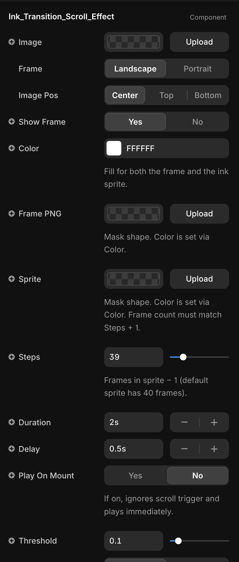
Title | Description | Type |
Image | Image revealed by the ink transition. Falls back to a built-in sample if not set. | ResponsiveImage |
Frame | Picks the default frame asset: landscape or portrait. Ignored if a custom Frame PNG is uploaded. | Enum |
Image Pos | object-position for the image — Center, Top, or Bottom. Useful for portraits where the focal point isn’t centered. | Enum |
Show Frame | Toggles the decorative frame layer on/off. | Boolean |
Color | Solid fill color for both the frame and the ink sprite. Each PNG is used as a CSS mask; only the alpha channel matters. | Color |
Frame PNG | Custom frame silhouette. Only alpha is used — color comes from Color. | ResponsiveImage |
Sprite | Horizontal sprite sheet for the ink animation. All frames must be equal width, no gaps. Only alpha is used — color comes from Color. | ResponsiveImage |
Steps | Number of CSS steps() for the animation. Formula: Steps = sprite frame count − 1. Default sprite has 40 frames → 39. | Number |
Duration | How long the ink sweep takes, in seconds. | Number |
Delay | Delay before the animation starts after the viewport trigger fires. | Number |
Play On Mount | If on, plays immediately on mount and ignores the scroll trigger. Hides Threshold and Trigger Once. | Boolean |
Threshold | IntersectionObserver threshold (0–1). Fraction of the component that must be visible to trigger the animation. | Number |
Trigger Once | If on, the animation plays a single time. If off, it replays each time the component re-enters the viewport. | Boolean |
Layer Stack
The component renders three stacked layers, bottom to top:
- Image —
<img>withobject-fit: cover. Hidden (opacity: 0) until the trigger fires, then revealed underneath the ink.
- Frame — a
<div>filled withFrame Colorand masked by the frame PNG. Adds the hand-drawn border around the image.
- Ink Sprite — the animated layer. Starts as a static first frame covering the image, sweeps horizontally through all sprite frames via CSS
steps(), then fades out at 100%.
Custom Sprite
The default sprite is a 40-frame horizontal strip. To use your own:
- Prepare a PNG/WebP with equal-width frames laid out left to right, no padding.
- Upload it to the
Spriteslot.
- Set
StepstoframeCount − 1.
The component recomputes the sprite container width (
(Steps + 1) × 100%) and the start/end translateX offsets so the first and last frames align perfectly with the container edges.Viewport Trigger
The component uses a native
IntersectionObserver keyed off the root <div>:- When the element crosses the
Threshold, internal state flips to active and the CSS animation starts.
Trigger Once: true— disconnects the observer after the first hit (matches the originalScrollMagic .reverse(false)behavior).
Trigger Once: false— resets when the element leaves the viewport. The sprite node is re-keyed so the next entry restarts the animation cleanly.
- Environments without
IntersectionObserver(older browsers, SSR pre-hydration) fall through to active immediately — the component never renders empty.
Recoloring (Frame & Ink)
Both the frame and the ink sprite share a single
Color prop. The PNG is applied as a CSS mask-image and the visible color comes from background-color. This means:- Monochrome PNGs (the built-in ink frame and ink sprite) recolor cleanly to any value.
- Full-color PNGs are flattened to a single tone — only the alpha channel is preserved.
- This also fixes the cream-tint issue in the default sprite: the sprite PNG was baked on an off-white paper background (~
#F9F8F1), which would show as a yellowish glow during the animation. Because the mask uses only alpha, the sprite’s RGB is discarded and the result is clean against any page background.
- For a full-color overlay, turn off
Show Frameand stack a separate image layer in Framer instead.
Layout Annotations
typescript@framerSupportedLayoutWidth fixed
@framerSupportedLayoutHeight fixed
@framerIntrinsicWidth 400
@framerIntrinsicHeight 250
The component is resized with Framer’s native handles. Default intrinsic size matches the original
frame-size(400px) SCSS mixin (1440:900 aspect). The internal markup is width: 100%; height: 100%, so it fills whatever size the canvas gives it.Default Assets
Hardcoded fallback URLs live at the top of the source:
typescriptDEFAULT_FRAME_LANDSCAPE
DEFAULT_FRAME_PORTRAIT
DEFAULT_SPRITE
DEFAULT_IMAGE
They are used only when the corresponding control is empty. Override them either through property controls (recommended) or by editing the constants directly (affects every instance in the project).
Known Limitations
Frame Colorflattens color PNGs to a single tone (mask uses alpha only).
- Sprite sheets must be horizontal and uniformly spaced.
Stepsmust match the sprite’s frame count minus one — mismatches cause clipped or duplicated frames.
- In
Trigger Once: falsemode, the animation only re-fires after the element fully exits the viewport.
Not Included
The original CodePen had three additional effects that are intentionally out of scope:
- Liquify title using SVG
feTurbulence+feDisplacementMap.
- Fade-in text reveal with
data-delaystaggers.
- Final stamp graphic.
These can be built as separate code components using the same
IntersectionObserver + framer-motion pattern.Changelogs
1.0.0 — Initial release. Ink sprite transition,
IntersectionObserver trigger, recolorable frame mask, configurable steps / duration / delay, landscape and portrait variants.