
Link to plugin page:
Introduction
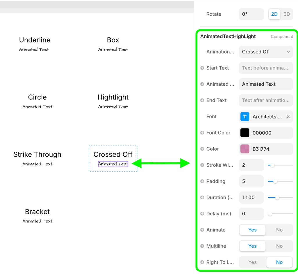
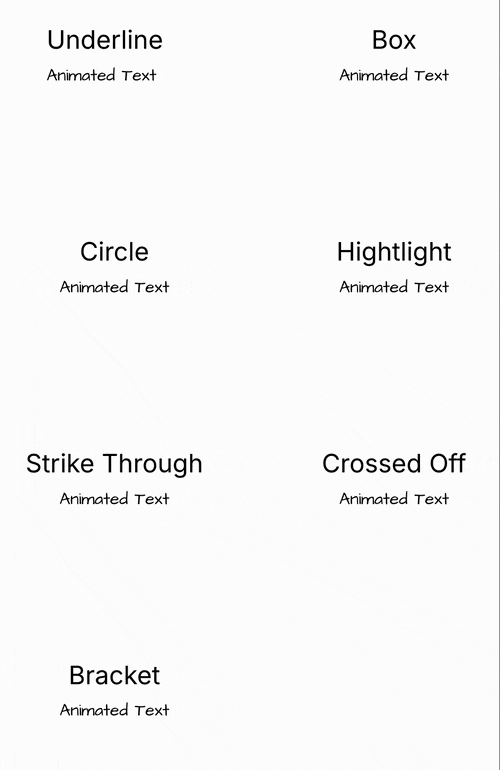
The AnimatedTextHighLight component provides beautiful animated text annotations for your Framer projects. Create eye-catching text highlights with various annotation styles including underlines, boxes, circles, highlights, strike-throughs, crossed-off text, and custom brackets. The component supports multiple animation triggers, customizable styling options, and responsive behavior, making it perfect for landing pages, presentations, and interactive websites where you want to draw attention to specific text elements.
The component uses the robust rough-notation library to create smooth, hand-drawn style annotations that can be triggered on page load, hover, click, or when scrolling into view.
How to setup
Setting up the AnimatedTextHighLight component is straightforward:
- Install the plugin from the Framer plugin library
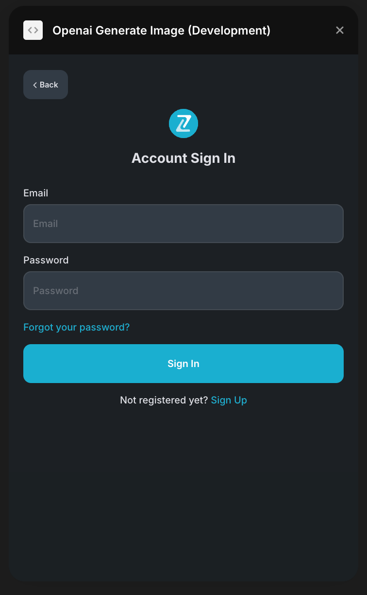
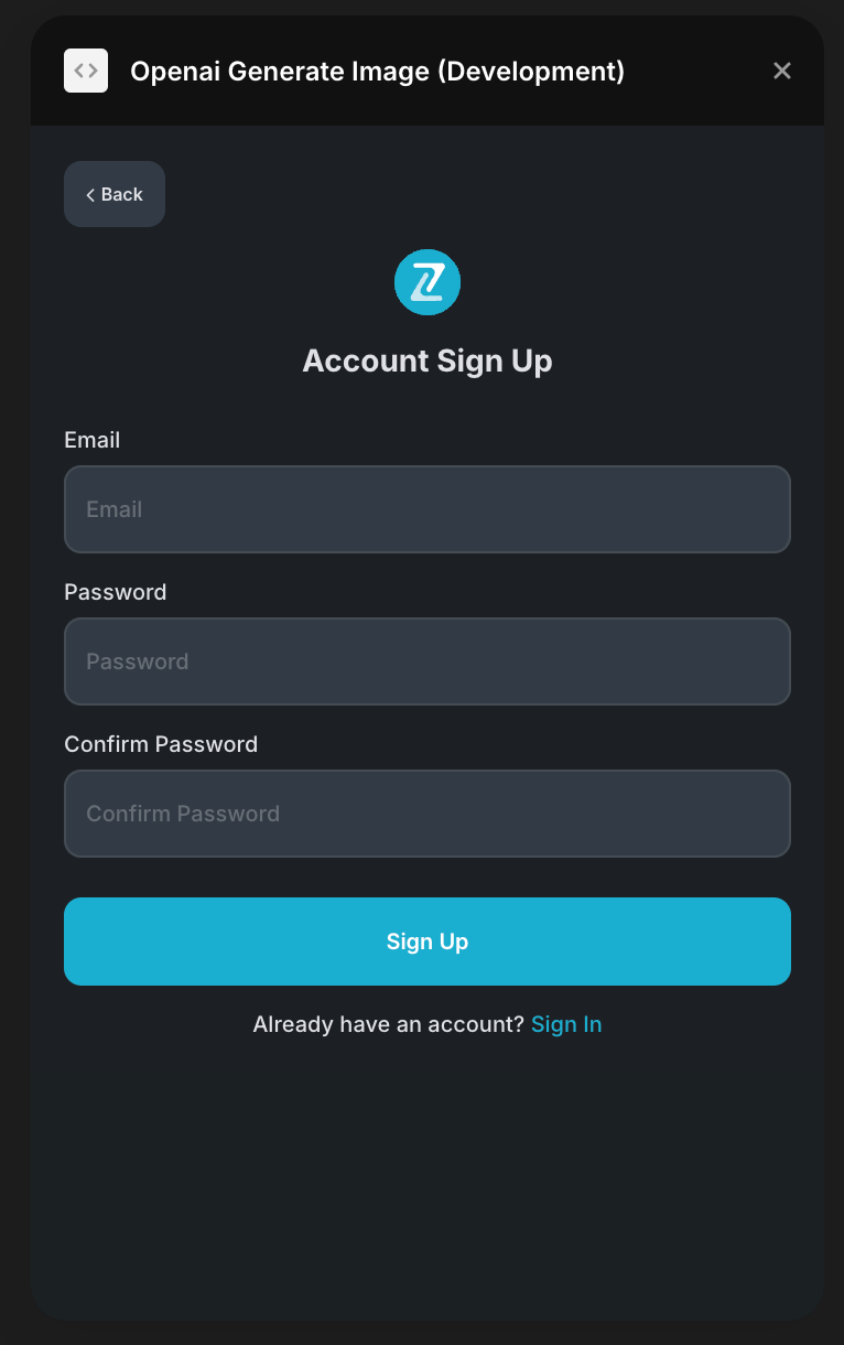
- To start using the plugin, you need to create or log in to your Zeroqode account. Select Sign In or Sign Up.
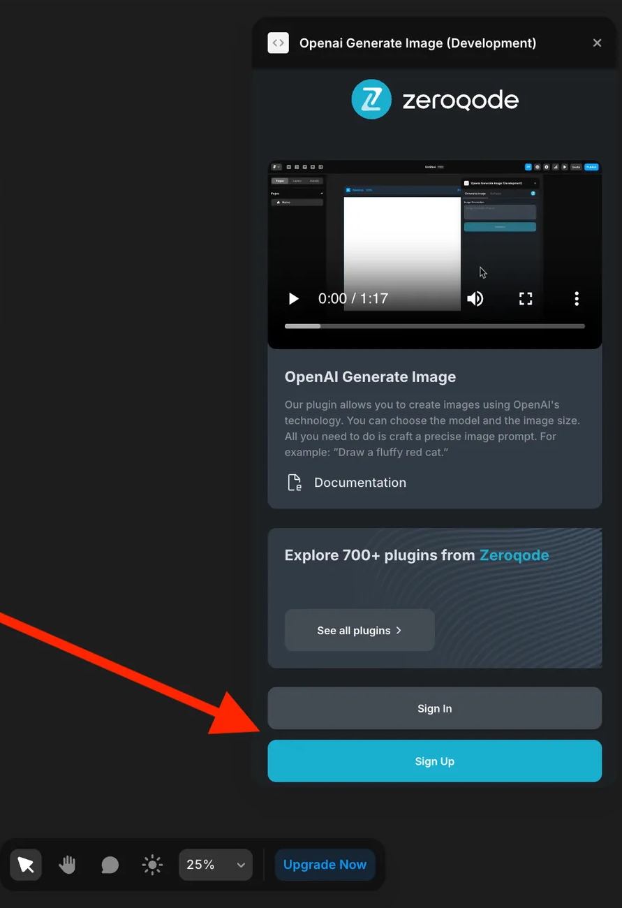
- Enter your account details.
- A subscription to all our plugins is required. Once subscribed, you will gain access to all our plugins.
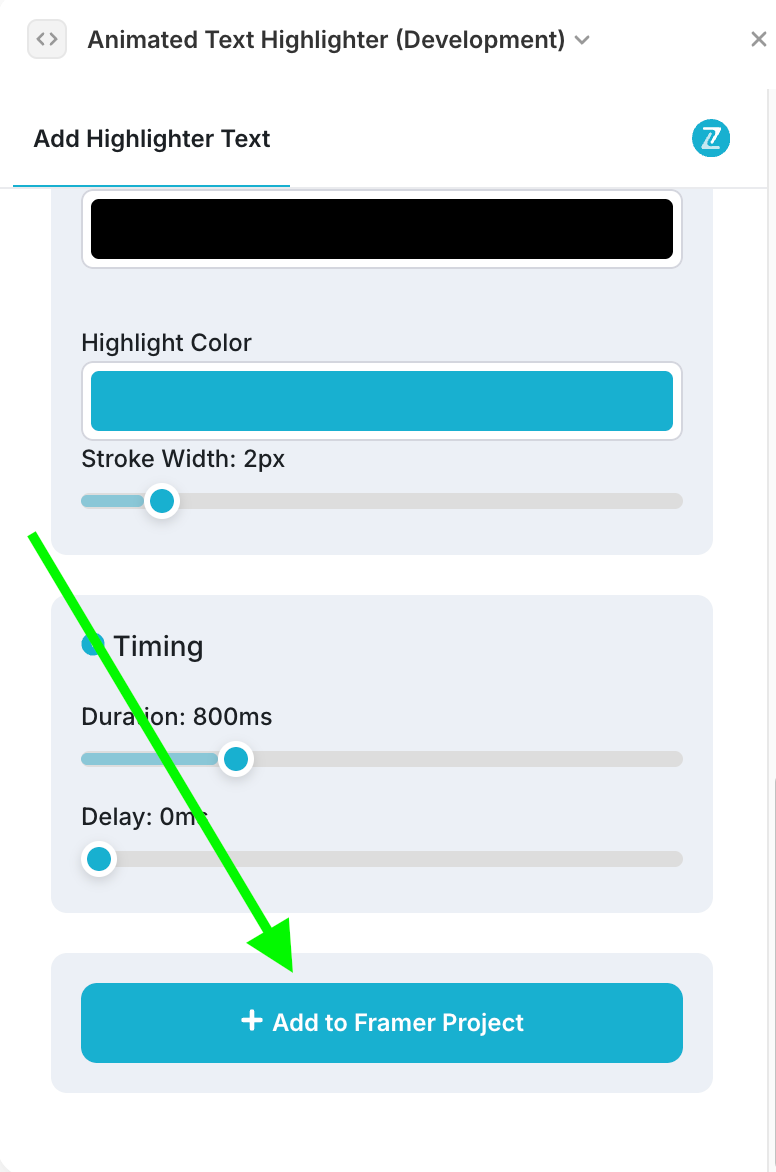
- Add Component: In the plugin interface, click the “Add to Framer Project” button to inject the necessary code into your project.
- Configure Text: Set your “Animated Text” in the properties panel - this is the text that will be highlighted
- Choose Animation Type: Select from underline, box, circle, highlight, strike-through, crossed-off, or bracket
- Set Trigger: Choose when the animation should appear (page load, hover, click, or scroll into view)
- Customize Styling: Adjust colors, stroke width, duration, and other visual properties
- Preview: Use Framer’s preview mode to test your animated text highlight
The component works immediately after adding it to your project with sensible defaults, and all customization is done through the properties panel.
Component Properties
The component contains comprehensive property controls for complete customization of text content, animation behavior, and visual styling.
Animated Text HighLight
Fields:
Title | Description | Type |
Animation Type | Type of annotation to apply to the text | Dropdown |
Start Text | Text that appears before the animated portion | Text |
Animated Text | The main text that will be highlighted with animation | Text |
End Text | Text that appears after the animated portion | Text |
Font | Font styling options including family, size, weight, line height, letter spacing, and alignment | Font |
Font Color | Color of the text content | Color |
Color | Color of the annotation/highlight | Color |
Stroke Width | Thickness of the annotation line in pixels | Number |
Padding | Padding around the annotation in pixels | Number |
Duration (ms) | Animation duration in milliseconds | Number |
Delay (ms) | Delay before animation starts in milliseconds | Number |
Animate | Enable or disable animation effects | Boolean |
Multiline | Allow text to wrap across multiple lines | Boolean |
Right To Left | Draw annotation from right to left instead of left to right | Boolean |
Iterations | Number of drawing iterations for the annotation | Number |
Bracket Sides | Configure which sides of bracket to show (Left, Right, Top, Bottom) | Object |
Show Trigger | When the annotation should appear | Dropdown |
Hide On Mouse Leave | Hide annotation when mouse leaves (hover trigger only) | Boolean |
Disable in Canvas | Turn off annotation library when editing in Framer | Boolean |
Fire Once on Scroll | Show annotation once when scrolling into view and keep visible | Boolean |