
Demo to preview the settings
Introduction
A very advanced plugin that gives you the possibility to use dataTables to display your Bubble database!
Params
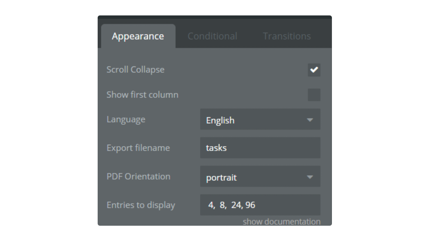
- Show the first column: If you want to use on-click events, you must leave this checkbox unchecked. (It hides the first column, which it's for uniqueid).
- +70 Languages: Afrikaans, Albanian, Amharic, Arabic, Armenian, Azerbaijan, Bangla, Basque, Belorussian, Catalan, Chinese-traditional, Chinese, Croatian, Czech, Danish, English, Estonian, Filipino, Finnish, French, Galician, Georgian, German, Greek, Gujarati, Hebrew, Hindi, Hungarian, Icelandic, Indonesian-Alternative, Indonesian, Irish, Italian, Japanese, Kazakh, Korean, Kyrgyz, Latvian, Lithuanian, Macedonian, Malay, Nepali, Norwegian-Bokmal, Norwegian-Nynorsk, Pashto, Polish, Portuguese-Brasil, Portuguese, Romanian, Russian, Serbian, Sinhala, Slovak, Slovenian, Spanish, Swahili, Swedish, Tamil, Telugu, Thai, Turkish, Ukrainian, Urdu, Uzbek, Vietnamese, Welsh
- Export Filename: name of the CSV file which is exported.
- PDF orientation: type of table orientation portrait or landscape.
- Entries to display: number of entry rows to display in the table. List of numbers separated by a comma:
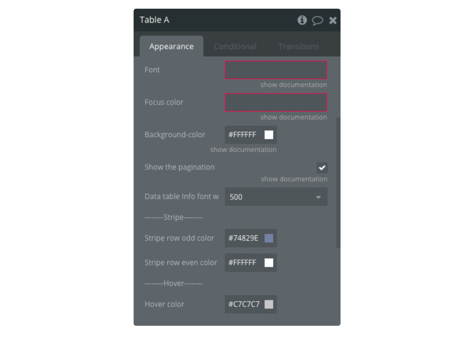
- Font: Change the font style for the table (optional).
Important:
Make sure that the font name is written correctly, ex: Arial, TahomaIf there are several dataTable elements on the page, you can set them for the different fonts.If the font is not one of the standard browser fonts or has not been used on the page before, the element will fall back to the standard font.
- Focus color: Change the color for the Search input field.
Important:
If there are several dataTable elements on the page, only one focus color can be set.
Colors are set in HEX value, ex: #EB4034, #12A83D
- Header and footer color: Change the color of the top (header) and bottom(footer) of the table
- Show the pagination: Enable or disable table pagination
- Table Info font-weight: Font weight of table information
- Stripe row odd color: Changes the color of all odd lines in stripe style.
- Stripe row even color: Changes the color of all even lines in stripe style.
- Hover color: Change the color of the lines on the hover.
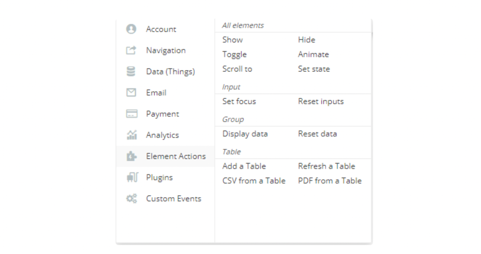
Actions
- Add: action to create a table. Add columns - An array from the Database with keys and values
- Refresh: action to refresh the table with new data. Update columns - An array from the Database with keys and values
- CSV from: action to download the data in CSV.
- PDF from: action to download the data in PDF.
- Change style: action to change the table style.
Style - Dropdown list with available styles
1.
display- The display class is a short-cut for specifying thestripe hover order-column row-borderas the class name for a table. This is shown in the example below. 2.cell-border- Cells with a border 3.compact- Increase the data density by reducing the cell padding 4.hover- Highlight a row when hovered over 5.order-column- Highlight the cells in the column currently being ordering upon 6.row-border- Rows with a border 7.stripe- Zebra striped rows
How to use this plugin
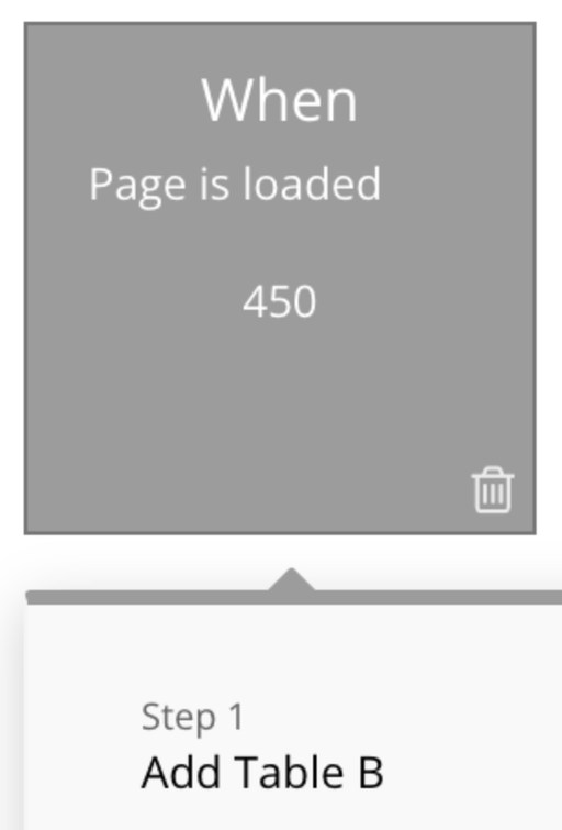
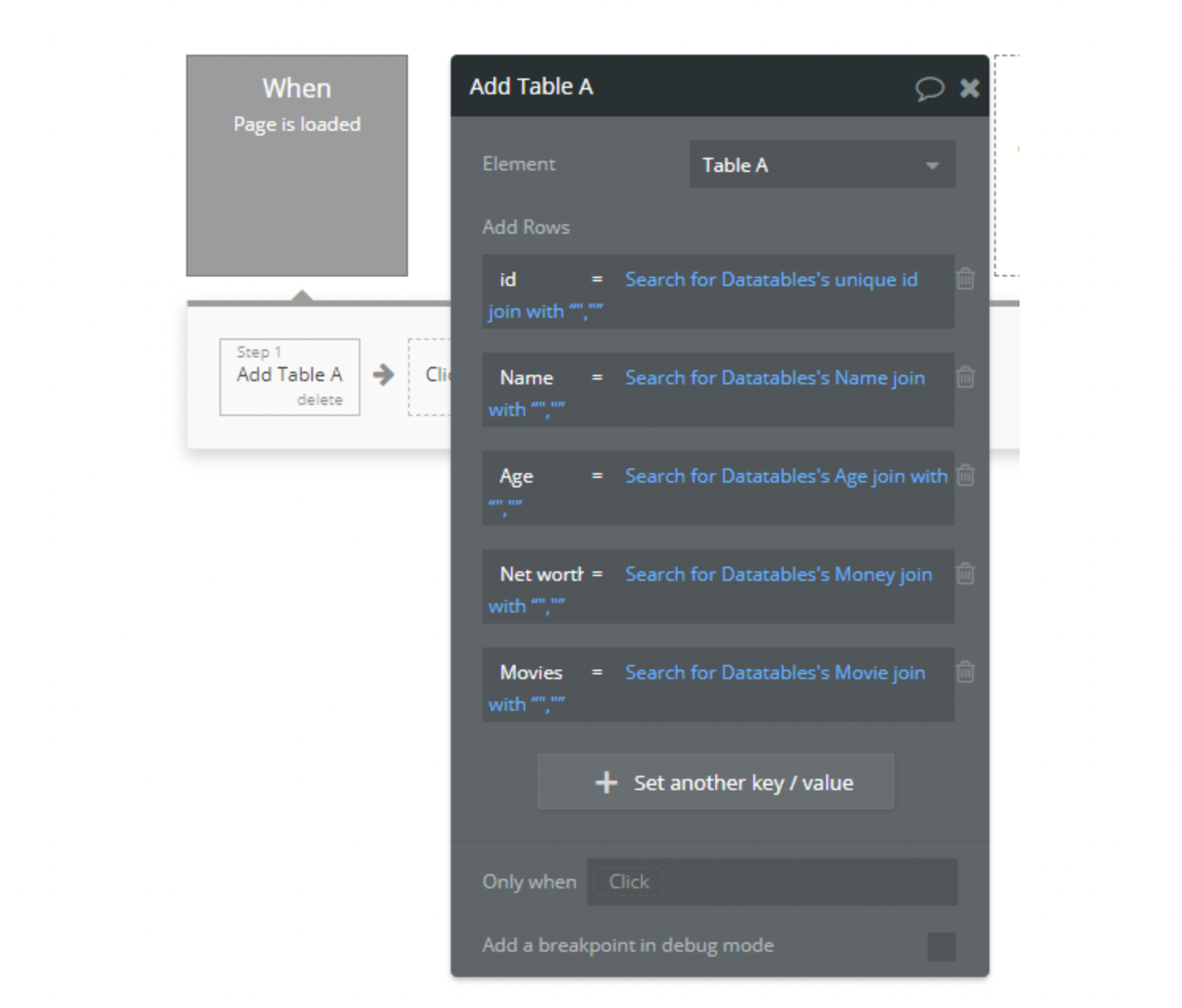
IMPORTANT: Initialise the plugin element only with the "Page is loaded" event. Use the "Add Table A" action.
IMPORTANT: Date sorting is available only if the date is formatted as yyyy/mm/dd or yy/mm/dd
IMPORTANT: uniqueID MUST be the first field ONLY IF you want to use an on-click event.
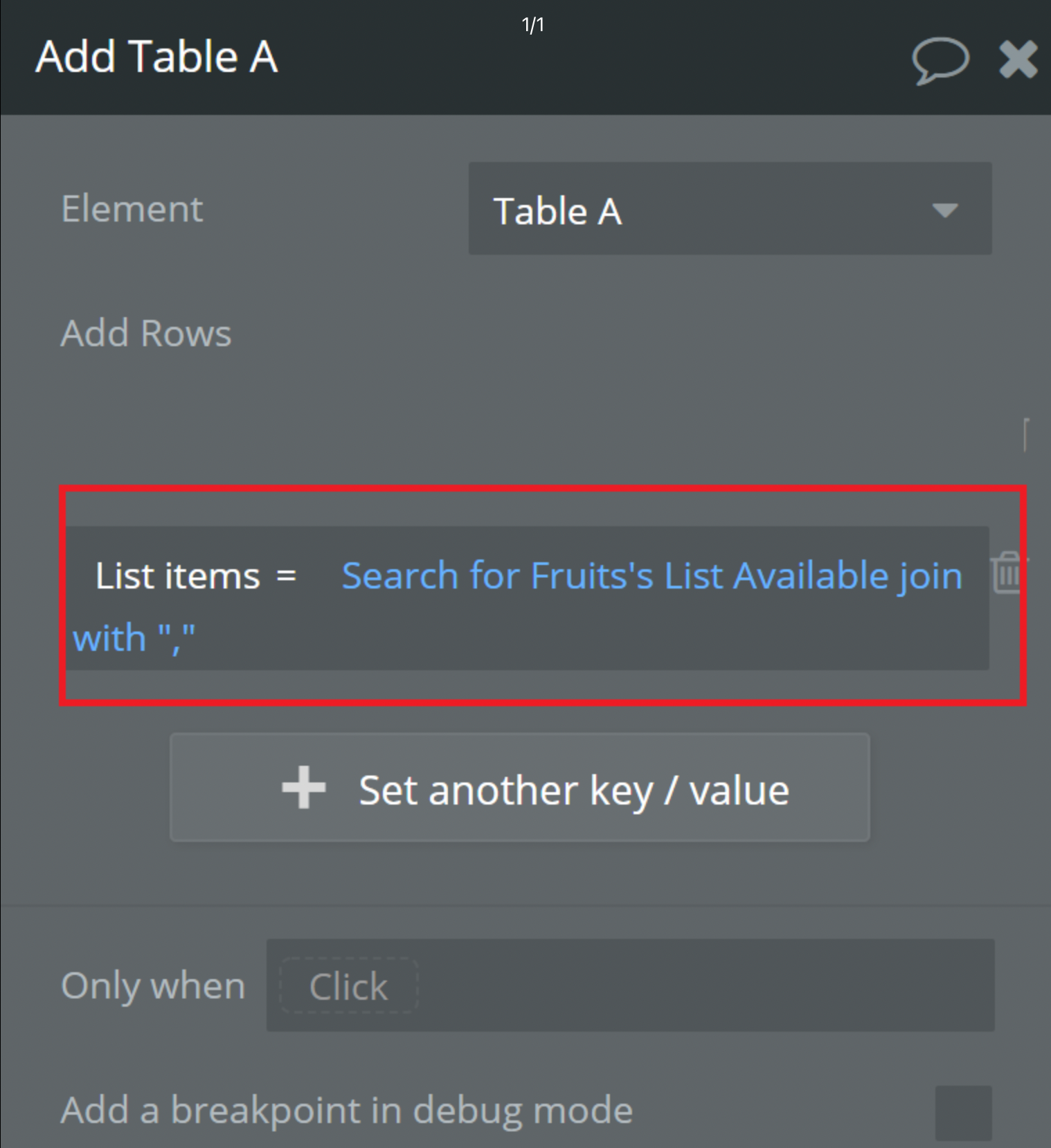
In order to display the list of items correctly, when adding columns to the Table in workflow, at the end of the data item add join with and ",". See the image below.
Changelogs
Update: 08/11/2018:
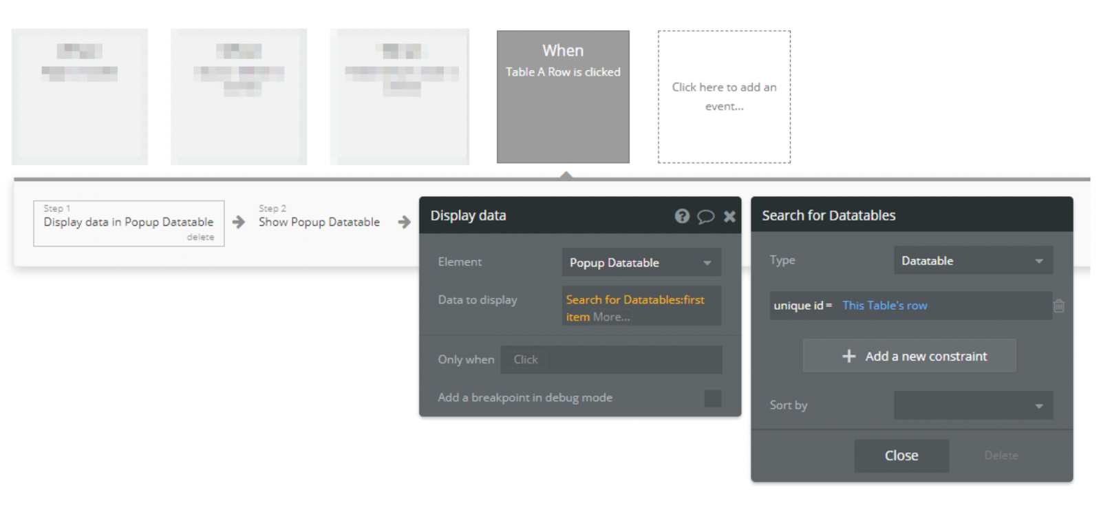
On-click row added!
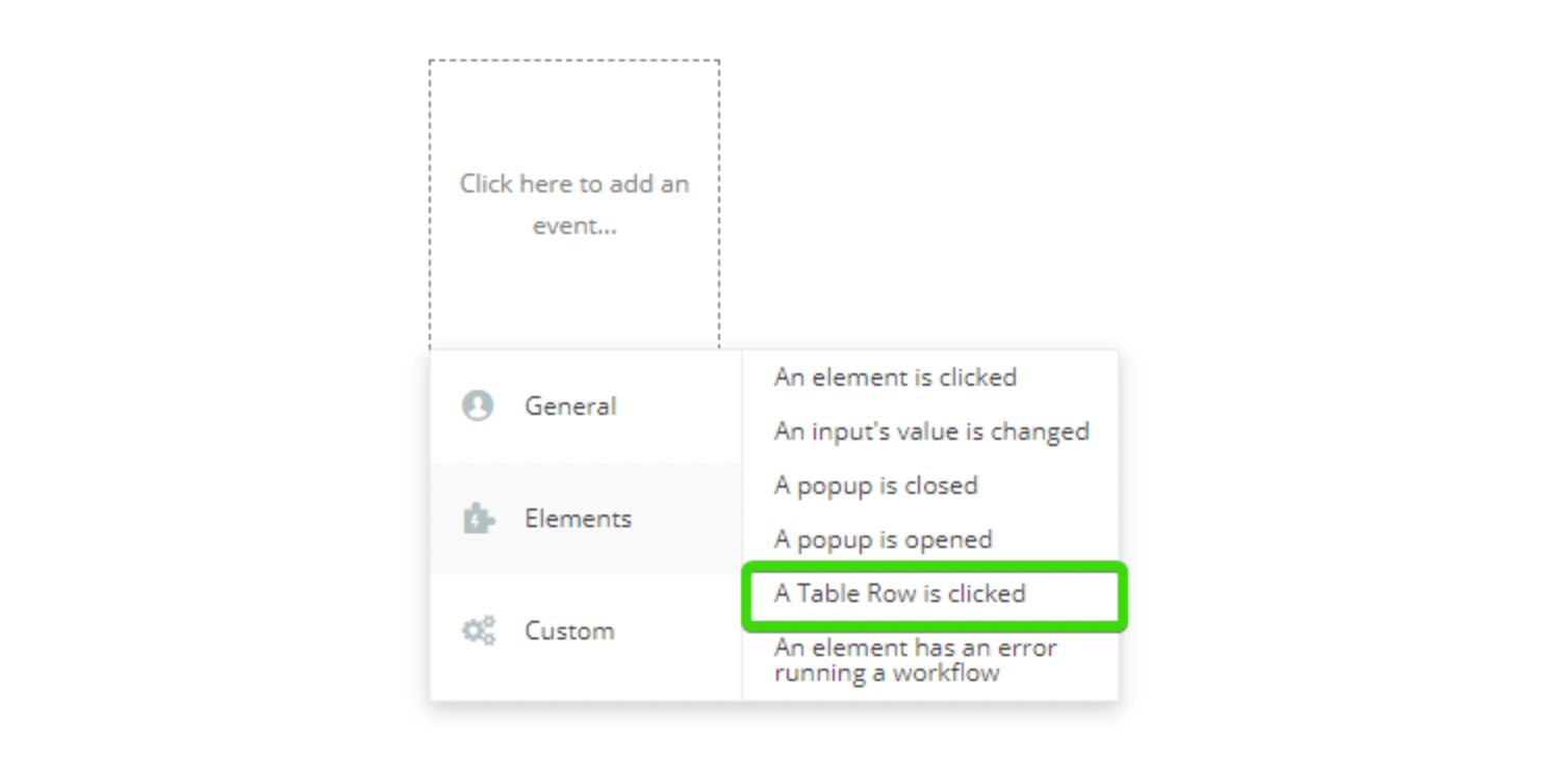
How to use: When the row is pressed, the Table Row event gets the unique id of that row. So doing a search for X: first item (in properties of the search we will use unique id= this row).
Refresh table after modifying the database:
IMPORTANT: You should use exactly the same number of columns (fields) search as in the initial add table event.
WARNING: Just like with the Add Table event, for the Refresh Table event, when adding columns to the Table in the workflow in order to display the list of items correctly, add join with and "," at the end of the data item.
Update: 08/30/2018 –
- Added support to multiple dataTables on the same page.
- Bug fixes.
Update: 09/06/2018 –
- Bug fixes.
- Live edits are now supported:
Update: 09/15/2018 –
- Added export options: CSV and PDF.
Update: 09/23/2018 –
- Now dataTable supports empty DB or empty searches.
- Changed Row selector to a drop-down
- Improved responsive layout settings
- Added new feature to table options “Scroll collapse”
Update: 03/19/2019 –
- Updated Demo Page with on click events
- Updated links to Demo Page
Update: 07/22/2020 –
- Fixed Refresh a Table action
Update: 08/07/2020 –
- Modified standard table styles
- Deprecated max height and auto-resize proprieties in dataTable element.
Update: 09/18/2020 –
- Added optional Font propriety in dataTable element.
Important:
Make sure that the font name is written correctly, ex: Arial, TahomaIf there are several dataTable elements on the page, you can set them for the different fonts.If the font is not one of the standard browser fonts or has not been used on the page before, the element will fall back to the standard font.
- Added optional Focus color propriety in dataTable element for the Search input.
- Removed deprecated propriety fields from the dataTable element.
Update: 03/05/21
- Added new 'row-border' style and fixed input focus color.
Update: 16/01/24 - Version 2.46.0
- Added "Responsive" option and style fields.